Guys, been testing the GUI and started to work on some layouts to help out if welcome.


 alphathree
All 46 comments
Personally this looks much better to me, much more clean and aesthetic.
 unknownids
on 11 Sep 2017
unknownids
on 11 Sep 2017
thanks for your feedback. I think simple changes would go long ways in the UX and UI. From aesthetic to things like showing the list of transactions as default. Also, filtering and sorting dont have to be primary components on the UI. Can be secondary. Icons also help, maybe even a way of collpasing the left column would make sense so its more minimal.
alphathree
on 11 Sep 2017
collapsed column sample

alphathree
on 11 Sep 2017
Looks very nice. Any chance you could mock it up to show two sync bars? When used locally, there are two synchronizations that take place. There is the sync status of the daemon downloading and building your local copy of the blockchain. And there's the wallet syncing with the blockchain. I think it would be helpful to see a Network Status and a Wallet Status.
Also, in the collapsed view, the unlocked balance should probably be black or bold, since it's arguable just as important as the total balance.
And the date should probably be YYYY/MM/DD, so people around the world aren't confused.
Whatever. I'm nitpicking. Looks clean. Could maybe use a teeny less white space. And the squared-off top bar screams Windows, but otherwise I like it a lot.
 scoobybejesus
on 11 Sep 2017
scoobybejesus
on 11 Sep 2017
thanks for feedback.
ill take those comments for sure. Im not from the team, but hopefully I can
contribute and gets picked.
I agree with the sync component. i want something that works collapsed and
expanded. will update.
the window chrome on top is the default I see on mac and linux, so kept
that as it was today.
On Mon, Sep 11, 2017 at 6:40 PM scoobybejesus notifications@github.com
wrote:
Looks very nice. Any chance you could mock it up to show two sync bars?
When used locally, there are two synchronizations that take place. There is
the sync status of the daemon downloading and building your local copy of
the blockchain. And there's the wallet syncing with the blockchain. I think
it would be helpful to see a Network Status and a Wallet Status.Also, in the collapsed view, the unlocked balance should probably be black
or bold, since it's arguable just as important as the total balance.And the date should probably be YYYY/MM/DD, so people around the world
aren't confused.Whatever. I'm nitpicking. Looks clean. Could maybe use a teeny less white
space. And the squared-off top bar screams Windows, but otherwise I like it
a lot.—
You are receiving this because you authored the thread.
Reply to this email directly, view it on GitHub
https://github.com/monero-project/monero-core/issues/869#issuecomment-328666766,
or mute the thread
https://github.com/notifications/unsubscribe-auth/ASsaoRC09L7ij6wAuUKZ7xHrdjuFt_Zzks5shajTgaJpZM4PSB5r
.
alphathree
on 11 Sep 2017
did some updates, still thinking about the connection states.

alphathree
on 12 Sep 2017
I like this design, as it's quite aesthetic and more elegant than the current design.. However, would you be able to code / implement this yourself?
 dEBRUYNE-1
on 12 Sep 2017
dEBRUYNE-1
on 12 Sep 2017
thanks, im a product designer. not a coder!
On Tue, Sep 12, 2017 at 7:28 AM dEBRUYNE-1 notifications@github.com wrote:
I like this design, as it's quite aesthetic and more elegant than the
current design.. However, would you be able to code / implement this
yourself?—
You are receiving this because you authored the thread.
Reply to this email directly, view it on GitHub
https://github.com/monero-project/monero-core/issues/869#issuecomment-328811647,
or mute the thread
https://github.com/notifications/unsubscribe-auth/ASsaoY_u0MQVdVLQPYcbBbqWL8VzFWqbks5shlzLgaJpZM4PSB5r
.
alphathree
on 12 Sep 2017
some updates
synced/connected state

Syncing State

Daemon Loading

On this example a message appears and would fade out, messaging about the daemon

This latest notification message on top could be used as a status indicator, so a whole popup doesnt block the wallet. If thats technically possible. So would be a background thing.
We could also use the top bar as status for things like the daemon, since its something quite technical, I dont think the regular user should be exposed that much to some things.
Sample below

alphathree
on 12 Sep 2017
Looks great! Much better than the existing GUI.
I was going to suggest displaying the name of the currently open wallet.
How about an estimated time to sync?
 apezio
on 14 Sep 2017
apezio
on 14 Sep 2017
Maybe also add estimated value of XMR in $?
 0x63dev
on 18 Sep 2017
0x63dev
on 18 Sep 2017
yes @apezio name of the wallet is handy for sure. It could even be on the window chrome on top. Ill include that in a version. I was thinking time to sync, and remaining blocks could appear as a hover information. So if you want the detail you have it, without adding stuff to the UI.
@0x63dev yes, for sure valuable info.maybe it could appear as a hover initially. Hovering over the balances, we show the USD Estimate. As an initial implementation.
alphathree
on 18 Sep 2017
@alphathree Maybe show it \w same font size but green color under unlocked balance?
0x63dev
on 18 Sep 2017
Maybe also add estimated value of XMR in $?
Sure, but where would we get that info? Kraken, Polo, Bitfinex, PurpleCatSlaveTradeExchange? What about people that don't transact in USD or care about the USD value? What about ten years from now when your car note is priced in BTC?
I don't think it's wise to start adding extraneous information to the GUI. If someone cares about the value in fiat they'll know where to find that information.
Possibly, we should consider making it easier to copy the values from the balance (top left) or transactions list so that they can paste it into a calculator.
 QuickBASIC
on 1 Oct 2017
QuickBASIC
on 1 Oct 2017
Thanks @alphathree, looks nice! Did you create the icons yourself or are they public domain / CC? Can you make seperate svg files for each icon?
I noticed that your mock-up of the _History_ tab doesn't include the transaction BlockHeights. I should point out that there is an issue with using dates -- they can be highly inaccurate and even out of order it seems. Only _BlockHeight_ is reliable for ordering. See #679
Shouldn't the icon for Receiving have an arrow pointing to the coin instead of away from it
I agree with @geozdr, the current icon is unclear. Seems to rely on "moving right" = "send" and "move left" = "receive", but that is not intuitive to me. I'd suggest that "receive" somehow indicate an arrow "coming into" a box, wallet, coin, etc.
RE: New features:
The more straightforward and focused the design changes are, the more likely this is to be implemented. So please try and stay with current functionality rather than suggesting new features :-)
I was going to suggest displaying the name of the currently open wallet.
@apezio This feature request should be discussed here: #655
Maybe also add estimated value of XMR in $?
@0x63dev Fiat exchange rate feature should be discussed in #621
Finally: Any changes like this to the GUI are likely to interfere with / delay the launch of an official mobile wallet. So we might want to consider how important / urgent this is in relation to that effort.
 jonathancross
on 20 Oct 2017
jonathancross
on 20 Oct 2017
hi. was hoping it gets picked to put more time. Some icons were done, some need to check. But didnt spend time in production level asests or versions.
If we want to implement this design (which would be great) i would need to spend spme time doing a production level design and assets. ill do it in the next days.
ok. ill add block height.
i can prepare some options for the icon and we review whats best.
Yes. name of the opened wallet its useful.
ill send uodates as I can and if its useful better :)
On 19 Oct 2017, at 23:32, Jonathan Cross notifications@github.com wrote:
Thanks @alphathree, looks nice! Did you create the icons yourself or are they public domain / CC? Can you make seperate svg files for each icon?
I noticed that your mock-up of the History tab doesn't include the transaction BlockHeights. I should point out that there is an issue with using dates -- they can be highly inaccurate and even out of order it seems. Only BlockHeight is reliable for ordering. See #679
Shouldn't the icon for Receiving have an arrow pointing to the coin instead of away from it
I agree with @geozdr, the current icon is unclear. Seems to rely on "moving right" = "send" and "move left" = "receive", but that is not intuitive to me. I'd suggest that "receive" somehow indicate an arrow "coming into" a box, wallet, coin, etc.
RE: New features:
The more straightforward and focused the design changes are, the more likely this is to be implemented. So please try and stay with current functionality rather than suggesting new features :-)I was going to suggest displaying the name of the currently open wallet.
@apezio This feature request should be discussed here: #655
Maybe also add estimated value of XMR in $?
@0x63dev Fiat exchange rate feature should be discussed in #621
Finally: Any changes like this to the GUI are likely to interfere with / delay the launch of an official mobile wallet. So we might want to consider how important / urgent this is in relation to that effort.
—
You are receiving this because you were mentioned.
Reply to this email directly, view it on GitHub, or mute the thread.
alphathree
on 20 Oct 2017
Any considerations for the use of the Monero symbol "ɱ" or ɱ in addition to the stock ticker symbol XMR? Expressing 10.75ɱ or 10.75 XMR depending on preference?
 acrelab
on 22 Oct 2017
acrelab
on 22 Oct 2017
@jonathancross , made some changes, let me know if I prepare the assets for Dev.
I usually use Zeplin for sending specs and assets, with an email, i can send you an invite to that repository and specs.
I updated:
- Added wallet name at the top of the app
- added block height
- updated icons

alphathree
on 23 Oct 2017
possible first run. No transaction history. it could contain some basic help for the user.

how the expansion of the icons would work.

Possible hover tooltip. In this case showing the remaining blocks when syncing. Can also show the label of the icons. (Transactions, Send, Receive, Tools, Settings, etc)

alphathree
on 23 Oct 2017
Hey guys,
Has anyone started working on this UI?
I was thinking if we could create the GUI in Electron, we'd have much more control over the frontend, however this would result in bigger package size..
 zhlyzv
on 23 Oct 2017
zhlyzv
on 23 Oct 2017
@alphathree Cool designs..!
Ill be willing to pick up the code side of things - any way we can get in touch?
 basjoe
on 23 Oct 2017
basjoe
on 23 Oct 2017
sure, send me an email to
i usually work with Zeplin, so deliver assets, specs, etc.
On 23 Oct 2017, at 16:36, basjoe notifications@github.com wrote:
@alphathree Ill be willing to pick up the code side of things - any way we can get in touch?
—
You are receiving this because you were mentioned.
Reply to this email directly, view it on GitHub, or mute the thread.
alphathree
on 23 Oct 2017
@defunkt1721 I personally haven't started on anything and I assume any major redesign should be discussed on IRC with devs like @Jaqueeee, @luigi1111 and @fluffypony
jonathancross
on 25 Oct 2017
is there an easy URL to access that IRC channel? @jonathancross
will ping them. I have specs and assets ready.
alphathree
on 26 Oct 2017
@alphathree
https://mattermost.getmonero.org is relayed or you can use https://webchat.freenode.net.
QuickBASIC
on 26 Oct 2017
thank you @QuickBASIC just sent a message there, will keep on pushin :)
alphathree
on 26 Oct 2017
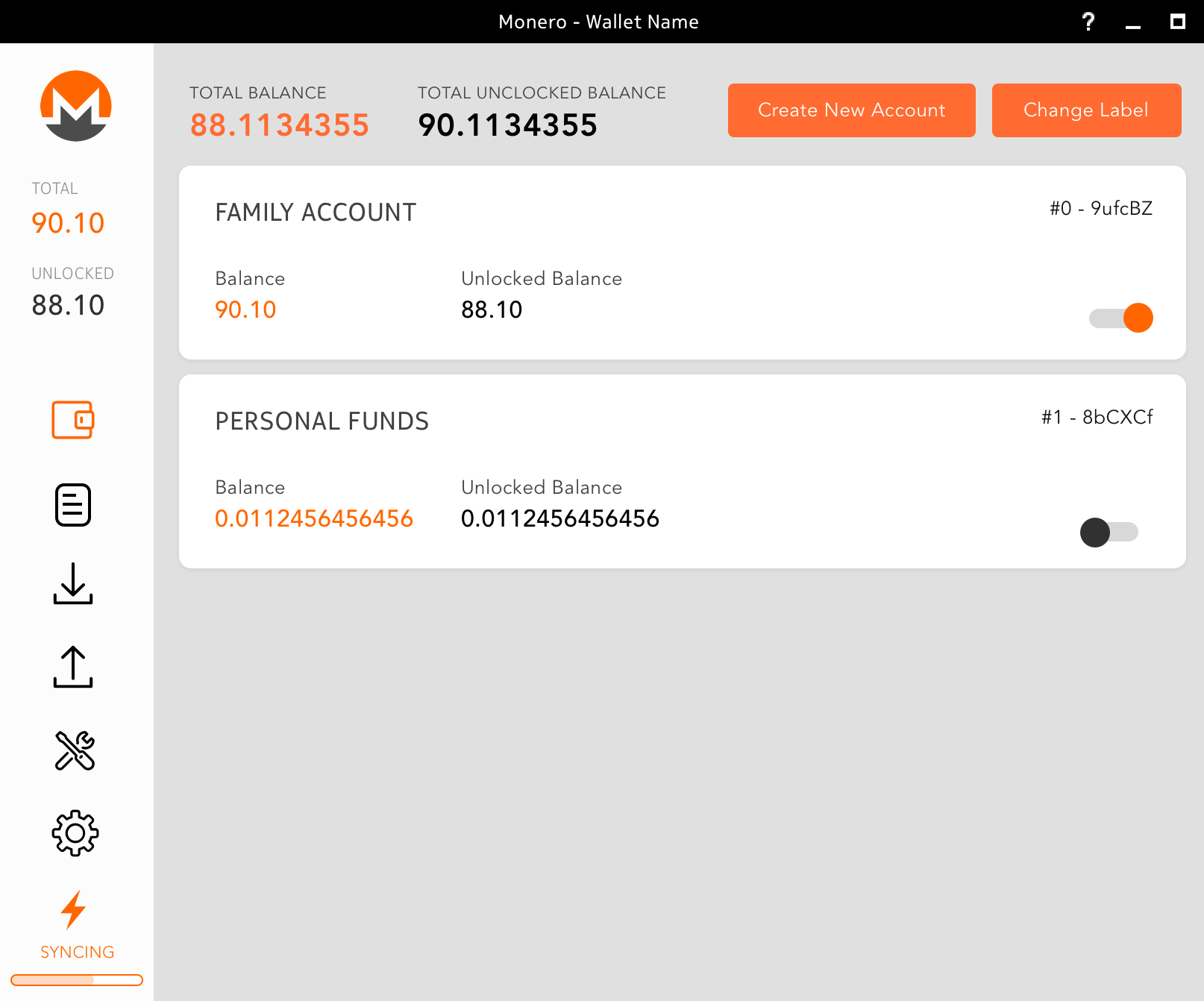
update considering latest features. have some questions. are accounts the same as wallets? or users have wallet files and accounts ?
alphathree
on 26 Oct 2017
@alphatree accounts are different than addresses. Each account is identified by its unique mnemonic seed. Under these accounts are addresses. One account can contain multiple sub-addresses.
Does that answer your question?
 SamsungGalaxyPlayer
on 26 Oct 2017
SamsungGalaxyPlayer
on 26 Oct 2017
@ alphathree What you are referring to as an "account" is more specifically called a "subaddress."
One wallet will contain one private spend key and one private view key. From the private spend key, ultimately, the header address and the subaddresses are derived.
I tried to simplify the answer for you, as did @SamsungGalaxyPlayer, whose answer is also correct, though we sort of come at it differently.
scoobybejesus
on 26 Oct 2017
got it.
thanks @SamsungGalaxyPlayer @scoobybejesus
alphathree
on 26 Oct 2017
@alphathree email sent btw.
basjoe
on 26 Oct 2017
heres a draft of the UX part of the proposal and rationale.
_
Monero Proposal_0.1.pdf
_
alphathree
on 1 Nov 2017
simplified version of transactions im exploring. the idea is to put most of the tx data after "details"

alphathree
on 1 Nov 2017
@alphatree thanks for your work!
I'm not sure if I agree that the proposal to fix problem 3 in the PDF is intuitive. The switch makes it appear as if a user could theoretically select multiple accounts at the same time. Perhaps highlight the selected one with an orange outline instead? Maybe a normal radio button?
SamsungGalaxyPlayer
on 1 Nov 2017
@SamsungGalaxyPlayer agree the switch is not perfect. maybe some kind of custom radio button could work as well. or something depicting activated/deactivated. makes sense to explore that for sure. thanks for your feedback.
alphathree
on 1 Nov 2017
I assumed the slider would only let you enable one wallet into the active position. Perhaps something like this https://healthycities.zendesk.com/hc/en-us/article_attachments/209780927/met-green-500px.png or a similar icon to indicate a wallet is active or something.
unknownids
on 1 Nov 2017
@unknownids was thinking something similar! will explore then. accounts are a powerful concept. but adds another layer of complexity. so definitely worth brainstorming the whole impact/behavior/design of them.
alphathree
on 1 Nov 2017
Interested to help, how?
 tracyarciaga
on 16 Nov 2017
tracyarciaga
on 16 Nov 2017
yep
On 16 Nov 2017, at 08:04, tracyarciaga notifications@github.com wrote:
Interested to help, how?
—
You are receiving this because you were mentioned.
Reply to this email directly, view it on GitHub, or mute the thread.
alphathree
on 16 Nov 2017
What's your name on IRC?
On 16 Nov 2017 8:04 am, "tracyarciaga" notifications@github.com wrote:
Interested to help, how?
—
You are receiving this because you were mentioned.
Reply to this email directly, view it on GitHub
https://github.com/monero-project/monero-core/issues/869#issuecomment-344890390,
or mute the thread
https://github.com/notifications/unsubscribe-auth/ASsaoco0pVI58OrWYBGVdxWwOnl_Y40fks5s3BbPgaJpZM4PSB5r
.
alphathree
on 16 Nov 2017
looks great! how can I help?
 m-henderson
on 19 Dec 2017
m-henderson
on 19 Dec 2017
I guess someone needs to implement it. I'm here to support as well from
strategy and design. UX and Visual.
On 19 Dec 2017 12:48 pm, "Michael" notifications@github.com wrote:
looks great! how can I help?
—
You are receiving this because you were mentioned.
Reply to this email directly, view it on GitHub
https://github.com/monero-project/monero-gui/issues/869#issuecomment-352798332,
or mute the thread
https://github.com/notifications/unsubscribe-auth/ASsaob0Z5hIsf16_ZuhAdzIqsaIVU2h3ks5tB9rOgaJpZM4PSB5r
.
alphathree
on 19 Dec 2017
@alphathree is this just a wireframe or have you written the code to produce this UI?
m-henderson
on 19 Dec 2017
i can provide wires and visual design and prototype when makes sense to develop that. not final code.
would be great to have a dev help with this.
On 19 Dec 2017, at 16:59, Michael notifications@github.com wrote:
@alphathree is this just a wireframe or have you written the code to produce this UI?
—
You are receiving this because you were mentioned.
Reply to this email directly, view it on GitHub, or mute the thread.
alphathree
on 19 Dec 2017
Sleek look! Some feedback:
I think you should keep the text descriptions of each section tab. This makes it easier for new comers and old goers alike. If you're worried about space, make the text small. Small text is better than no text (or even hover text).
I'd suggest that pressing "Details" expands the history item area with additional info instead of using a popup like it currently does. And rather than using up and down arrows for send and receive, use + and - to indicate debit from or credit to your account.
Your send form doesn't seem to include transaction priority or the "sweep unmixable" button.
Some additional areas for hover info:
- Syncing - # blocks remaining, also once https://github.com/monero-project/monero-gui/issues/750 is done, some additional information that differentiates between necessary interaction with the remote node vs syncing the blockchain locally.
- Unlocked balance - display help info as to what that means (honestly I knew at one point, but I've forgotten what this means. I assume its waiting for confirmations?)
Details should include ring size, number of confirmations, and the receiving address if available (is it against monero policy to store the address you sent a transaction to?).
 fresheneesz
on 27 Dec 2017
fresheneesz
on 27 Dec 2017
+proposal
 cdiv1e12
on 30 Mar 2018
cdiv1e12
on 30 Mar 2018
Related issues
 yakitorifoodie
·
7Comments
cdiv1e12
·
10Comments
yakitorifoodie
·
7Comments
cdiv1e12
·
10Comments
 GreatWhiteMuffloN
·
8Comments
GreatWhiteMuffloN
·
8Comments
 jmgranner
·
6Comments
jmgranner
·
6Comments
 snaggen
·
9Comments
snaggen
·
9Comments
Most helpful comment
heres a draft of the UX part of the proposal and rationale.
_
Monero Proposal_0.1.pdf
_