Modernflyouts: Store Images
We need better images for MS Store:
The images need to have the labels in the image and preferably show windows original vs Modern flyouts.
There can only be 10 screenshots with the following requirements:
- 1366 x 768 pixels or larger recommended
- Supports 4K images (3840 x 2160)
- Max upload 10 files
- Landscape or portrait
- Accepted file types: .png
- Less than 50 MB
Additionally there are other features the store allows which i haven't used yet but we can decide to make:
Banner for store page (which they call superhero art):
Requirements:
16:9 Super hero art appears at the top of your Store listing (or after any trailers finish playing) for customers on Windows 10, version 1607 or later (which includes Xbox). Learn more
Must not include the product's title
Required if you want one of your trailers to appear at the top of the Store listing
Accepted file types: .png
Less than 50 MB
A Trailer:
Requirements:
Trailers are only shown to customers on Windows 10, version 1607 or later (including Xbox)
Max upload 15 trailers
Each trailer must include one video, a title and a thumbnail
Video file types: .mp4 (recommended), .mov
Thumbnail files must be .png files, 1920 x1080 pixels
Title character limit: 255
Do not include IARC age rating info
Learn more about trailer requirements
 Samuel12321
All 54 comments
Thanks for the information! I will do the image editing and make some good user friendly & attractive trailers and screenshots.
Should we upload the video directly to store or are they required to be uploaded to some media hosting sites (such as YouTube)?
 ShankarBUS
on 25 Sep 2020
ShankarBUS
on 25 Sep 2020
All direct to store
Samuel12321
on 25 Sep 2020
https://github.com/ShankarBUS/ModernFlyouts/issues/55#issuecomment-699619222
@Samuel12321, What do you say?
 Cyberdroid1
on 27 Sep 2020
Cyberdroid1
on 27 Sep 2020
We got too many documentation (Wiki, images, README, release notes) work for v0.6. There is not much feature wise. But at least this attract some users 😂
ShankarBUS
on 27 Sep 2020
Can we add this to v1 milestone/project?
Cyberdroid1
on 27 Sep 2020
In the ReadMe images, we have a section of media flyout images. Can we please change the image to show another file playing as that file (please don't get offended) looks a bit unprofessional. Can we replace it with some other file like used in here - https://github.com/ShankarBUS/ModernFlyouts/issues/6#issuecomment-665917276
It would be great to keep the files generic.

👆 This section
Cyberdroid1
on 27 Sep 2020
I'm offended, JK
I know they look silly and unprofessional.
But I had to put what I had at that time. I don't have that much media on my system. All of them are old and outdated. Can you provide some good sample media? I don't have the time to pick them 😅.
I'll focus on fixing the issues, can you help me with the media selection and what sample images to put?
ShankarBUS
on 27 Sep 2020
What do you say about Kalimba by Mr Scruff? Sample Music in Windows 7. ( One of my favorites too, XD )
I will send the mp3 on Telegram as GitHub doesnt support mp3 files.
Cyberdroid1
on 27 Sep 2020
I also need a video file to showcase the timeline properties support we provide. Can you pack the audio (.MP3) and a video file (.MP4 preferably) as a *.zip file on GitHub?
ShankarBUS
on 27 Sep 2020
Hmm, video file. Ok, will see to it.
Cyberdroid1
on 27 Sep 2020
Here you go. Tell if it works as intended.
Cyberdroid1
on 27 Sep 2020
Thanks @Cyberdroid1, I will use these medias to make the screenshots for the next release 👍.
ShankarBUS
on 27 Sep 2020
@Samuel12321, What do you say?
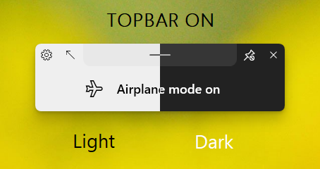
Brilliant. Perhaps a caption above stating light and dark theme is needed but otherwise great.
Samuel12321
on 27 Sep 2020
We can add captions with the same font being used in the flyout. Light color font for Dark theme, and dark color font for Light theme.
Cyberdroid1
on 28 Sep 2020
great
Samuel12321
on 28 Sep 2020
I have merged the light and dark pictures. Just add captions and it is ready to go.
Cyberdroid1
on 6 Oct 2020
Cool pal! 😁
ShankarBUS
on 6 Oct 2020
Hey @Samuel12321, Can you update the README to include these?
We have to redo these images for v0.8 though
ShankarBUS
on 6 Oct 2020
Redo? Will there be a new design of the flyouts?
Cyberdroid1
on 6 Oct 2020
Could be? I prefer taking new screenshots for every releases.
For v0.8 we need to update the store images (1366x768 res images) and trailers. While doing so we should also update the images on README
The current images on README will be moved into respective Wiki pages
ShankarBUS
on 6 Oct 2020

☝☝☝ Doesn't look exactly appealing, 😅
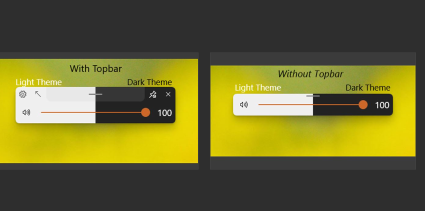
This looks better, but can we make the heading more big and bold, please?
And preferably use the font SEGOE UI LIGHT, it looks thinner.
Also, there should be black text to show white, and white text to show dark.
The space left in bottom should contain the text of Light/Dark theme.
And, the caps lock image in the readme also needs to be redone, because it is currently old.
Cyberdroid1
on 25 Oct 2020
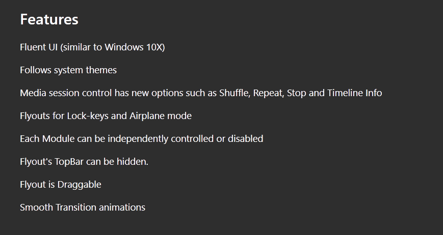
Some changes in features text, as there is a LOT OF TEXT currently. We need to keep it short and simple.

We don't have to tell the user each and every thing. There should be some excitement in the person's mind too, I hope you get my point.
Cyberdroid1
on 25 Oct 2020
Some changes in features text, as there is a LOT OF TEXT currently. We need to keep it short and simple.
We don't have to tell the user each and every thing. There should be some excitement in the person's mind too, I hope you get my point.
Agreed, have updated this
Samuel12321
on 25 Oct 2020
☝☝☝ Doesn't look exactly appealing, 😅
i know
I agree with all your other suggestions. I don't currently have time to do a lot of work with the images. However if anyone has improved images i am very happy to use them instead.
Samuel12321
on 25 Oct 2020
@Samuel12321,
Don't worry I'm planning to add Wiki before v0.8 release. I'll update the screenshots and README together with it 😄
Take care pal 👊
ShankarBUS
on 26 Oct 2020

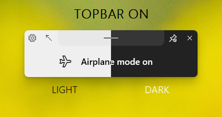
Tried this. What do you say?
Cyberdroid1
on 26 Oct 2020
What font did you use?
Looks neat but too thin. Could you try semi-light font weight?
ShankarBUS
on 26 Oct 2020
i agree, it think its too thin.
I also think the light / dark text should be above, or at least fully below the flyout.
Samuel12321
on 26 Oct 2020
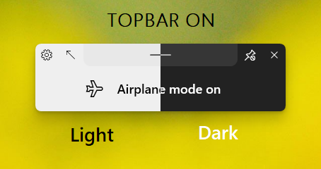
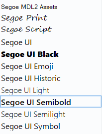
I used SEGOE UI LIGHT
Cyberdroid1
on 26 Oct 2020
This is SEGOE UI SEMILIGHT
Cyberdroid1
on 26 Oct 2020
Keeping the text of Light/Dark above the flyout wont be suitable, since there is already text of TOPBAR ON.
Cyberdroid1
on 26 Oct 2020
Below is fine, before it was sort of half way
i still think it's still slightly too thin.
Personally i also think the Dark text should be used under dark and light under light.
Samuel12321
on 26 Oct 2020
It's still too thin. What about Segoe UI Regular?
Oh oh oh!!!, what about making it similar to the text in the airplane mode flyout?
ShankarBUS
on 26 Oct 2020
More contrast = more readabilty, thats why exchange in color.
Cyberdroid1
on 26 Oct 2020
It's still too thin. What about
Segoe UI Regular?Oh oh oh!!!, what about making it similar to the text in the airplane mode flyout?
Not the same font, not at all!
Let me try with Regular
Cyberdroid1
on 26 Oct 2020
@Cyberdroid1,
Not the same font, not at all!
wut?
I don't understand the statement clearly.
And what image editor did you use?
ShankarBUS
on 26 Oct 2020
Not the same font as that of the Airplane text!
BTW, did this

Cyberdroid1
on 26 Oct 2020
And what image editor did you use?
Glad you asked, it is MS Paint. 🤣🤣🤣
Cyberdroid1
on 26 Oct 2020

Looks boring in regular, TBH
Cyberdroid1
on 26 Oct 2020
@Cyberdroid1,
Not the same font as that of the Airplane text!
You don't want it to look like the text style in airplane mode flyout?
MS Paint
Bruuuuuuuhhhhhhhhhh!!!!!!
ShankarBUS
on 26 Oct 2020
Segoe UI SemiBold 16px how bout dat?
ShankarBUS
on 26 Oct 2020
Bruuuuuuuhhhhhhhhhh!!!!!!
I have a good experience with that, 😂
You don't want it to look like the text style in airplane mode flyout?
Um, no actually. Variety of style, fresh.
Cyberdroid1
on 26 Oct 2020
Segoe UI SemiBold16px how bout dat?
Let me try.
Cyberdroid1
on 26 Oct 2020
Oooof, this fat
Cyberdroid1
on 26 Oct 2020
Oh shit! Fallback!
ShankarBUS
on 26 Oct 2020
i think it is almost right, just slightly too fat
Samuel12321
on 26 Oct 2020
BTW, did this
What do you say about this?
👎for no, 👍 for yes
Cyberdroid1
on 26 Oct 2020
i prefer the segoe
Samuel12321
on 26 Oct 2020
i prefer the segoe
FYI, this IS Segoe, XD. I understand what you mean.
Anyone of these?
Cyberdroid1
on 26 Oct 2020
what about segoe ui symbol
Samuel12321
on 26 Oct 2020
Umm, doesnt look much different to me.
Cyberdroid1
on 26 Oct 2020
i think it's fine
Samuel12321
on 27 Oct 2020
i'll add this one to the store
Samuel12321
on 27 Oct 2020

and
Why is it present twice in store?
Cyberdroid1
on 29 Oct 2020
Related issues
 Poopooracoocoo
·
4Comments
Cyberdroid1
·
4Comments
Poopooracoocoo
·
4Comments
Cyberdroid1
·
4Comments
 toineenzo
·
4Comments
Poopooracoocoo
·
4Comments
toineenzo
·
4Comments
Poopooracoocoo
·
4Comments
 Dr-Chronosphere
·
4Comments
Dr-Chronosphere
·
4Comments
Most helpful comment
I'm offended, JK
I know they look silly and unprofessional.
But I had to put what I had at that time. I don't have that much media on my system. All of them are old and outdated. Can you provide some good sample media? I don't have the time to pick them 😅.
I'll focus on fixing the issues, can you help me with the media selection and what sample images to put?