Mobile: Android Adaptive Icon Slightly Misaligned
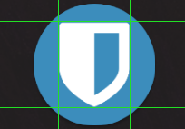
The Android app's adaptive icon is not centered when used in a circle. For example on my Google Pixel which uses the circle variation looks like:

I'm not a designer, but the top two corners of the shield icon look like they're too close to the edge of the circle frame. It would look better to me for the shield icon to be a little smaller and more centered so the spacing around it is even.
 simondemartini
All 3 comments
It is actually center aligned properly. What you're seeing is an illusion created by the shape of the icon, making it seem like it is off-center.
 kspearrin
on 18 Nov 2018
kspearrin
on 18 Nov 2018
While it may be technically centered, I think we could compensate for that illusion of misalignment by either moving the shield down a little. Or we might be able to decrease the size of the shield so there is more padding between the top corners of the shield and the edges of the circle.
Here's a (very rough) idea of a lowered and slightly smaller shield to be more visually centered:

simondemartini
on 18 Nov 2018
Thanks @simondemartini to bring up this issue. The visually aligned version looks indeed very nice.
I was showing the app to some people (I recently adopted it), and got some feedback about it "looking like malware" because of this _misalignment_.
If it's welcome, I'll do a PR to help with this.
 Sotilrac
on 9 Feb 2019
Sotilrac
on 9 Feb 2019
Related issues
 edouardmenayde
·
7Comments
edouardmenayde
·
7Comments
 filbranden
·
11Comments
filbranden
·
11Comments
 fabianski7
·
3Comments
fabianski7
·
3Comments
 exploit-io
·
4Comments
exploit-io
·
4Comments
 DarkArc
·
8Comments
DarkArc
·
8Comments
Most helpful comment
While it may be technically centered, I think we could compensate for that illusion of misalignment by either moving the shield down a little. Or we might be able to decrease the size of the shield so there is more padding between the top corners of the shield and the edges of the circle.
Here's a (very rough) idea of a lowered and slightly smaller shield to be more visually centered:
