Mlflow: [FR] Configure tracking UI layout
Description / Motivation
We use a lot of long parameter, tag and metric names, as well as values. By default, they seem are capped at ~13-14 characters each by the CSS rule
style="display: inline-block; max-width: 120px;". This makes the overview page very difficult to read.Additionally, the columns
Date,User,Run Name,SourceandVersiontake up roughly half of the table width, while they only have one line each. We use lots of params, so the space could be used better.Thirdly, the list of Tags defaults to showing 3 items and a link to "show 5 more". That seems inconsistent with the params and metrics column. Also, the latter two columns show unnecessary spacing, while the Tags column does not.
Proposed Changes
- Either make the
max-widthper item configurable for the UI or, possibly better, allow styling with additional style sheets. That would allow a fix like:
span.run-table-container.underline-on-hover.metric-param-sort-toggle {
    max-width: 200px !important;
}
Possible solutions:
- allow collapsing the meta columns into one column
- give the user control over which columns to display
Apply the styling and more/less logic of the "Tags" columns to the "Parameters" and "Metrics". Ideally, add a configuration or UI control to switch off the "more/less? logic
 eliasmistler
All 3 comments
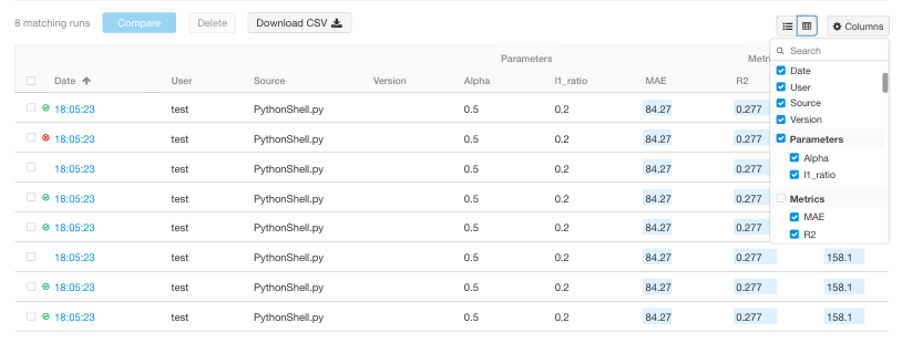
Thank you for the feature request, agree space could be used better.
Also here attached a mockup for users controlling which columns to display:
cc @Zangr
 gioa
on 17 Sep 2019
gioa
on 17 Sep 2019
I propose to handle this in a new component for the runs, I detailed what I implemented and proposed changes there https://github.com/mlflow/mlflow/issues/2084
 rom1504
on 12 Nov 2019
rom1504
on 12 Nov 2019
Resolved by #2251
 Zangr
on 17 Jul 2020
Zangr
on 17 Jul 2020
Related issues
 drorata
·
5Comments
drorata
·
5Comments
 slavakurilyak
·
3Comments
slavakurilyak
·
3Comments
 nkarpovdb
·
5Comments
nkarpovdb
·
5Comments
 calio
·
5Comments
calio
·
5Comments
 samuel100
·
5Comments
samuel100
·
5Comments
Most helpful comment
Thank you for the feature request, agree space could be used better.
Also here attached a mockup for users controlling which columns to display:

cc @Zangr