Mkdocs-material: Left Navigation Sidebar Disappears When Returning to Big Viewport
__I checked that...__
- [x] ... the documentation does not mention anything about my problem
- [x] ... the problem doesn't occur with the default MkDocs template
- [x] ... the problem is not in any of my customizations (CSS, JS, template)
- [x] ... there are no open or closed issues that are related to my problem
Description
When tabs are enabled, ifyou are in any sub-page that belongs to a tab and you go from desktop layout to mobile, you use the side menu and navigate all the way back to the uppermost navigation level, and you go back to desktop layout, the left sidebar navigation disappears completely
Expected behavior
The left sidebar navigation should remain visible after switching back to desktop layout.
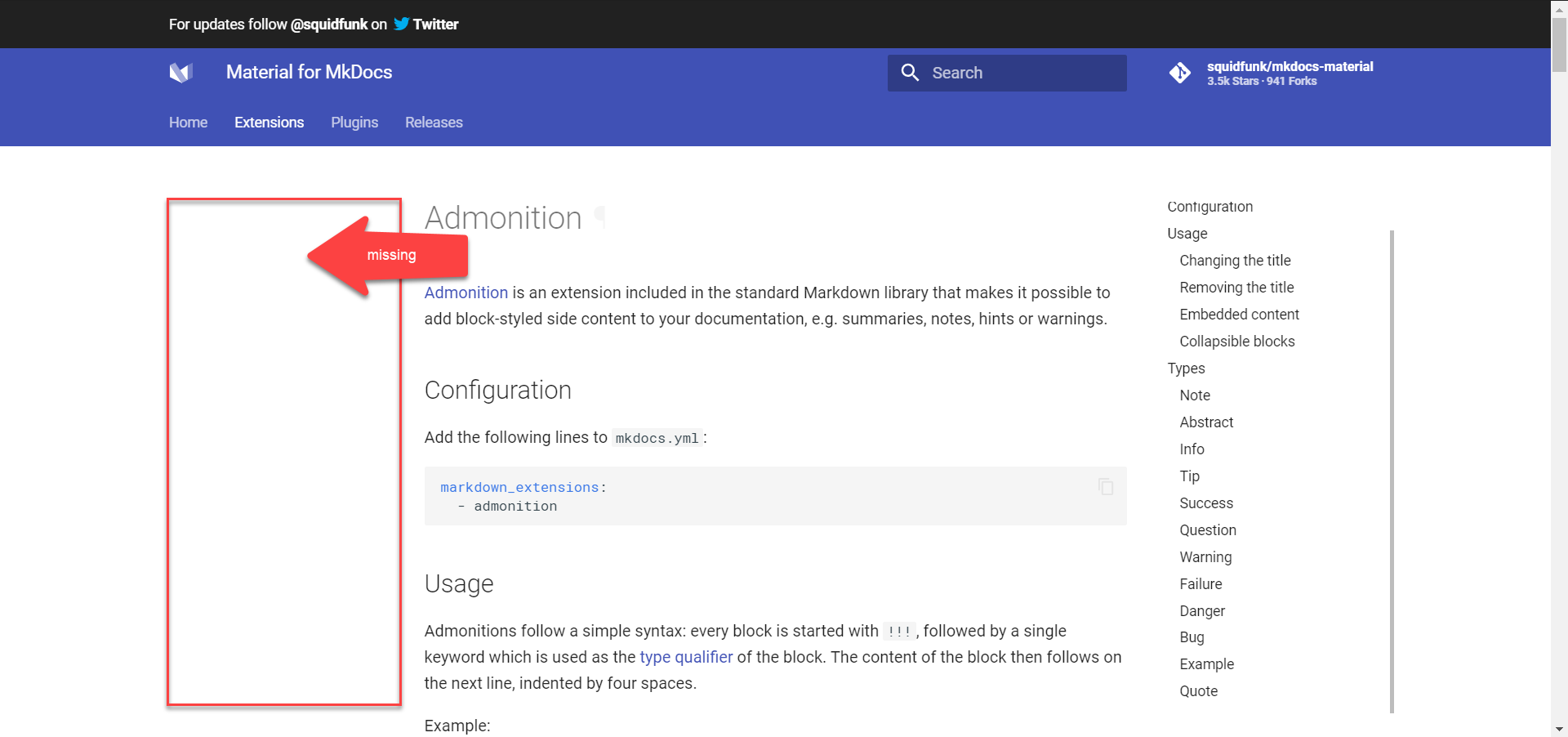
For example in your documentation site for MkDocs Material Theme it should look like:

Actual behavior
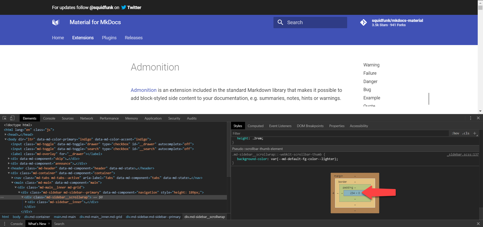
The left sidebar navigation disappears completely. As can be observed in the HTML inspector for Chrome, all elements nested inside
<div
  class="md-sidebar md-sidebar--primary"
  data-md-component="navigation"...>
    ...
</div>
have a height of zero, which is why they aren't visible as can be seen below:
The previously mentioned containing div however still retains it's height as can be seen below:

Steps to reproduce the bug
I reproduced the bug using your documentation site and also using my own dummy site with no theme overriding or any other customizations. I will add images for both sites so you can see.
Preconditions
- Tabs feature is enabled
Steps
Go to Extensions page of Squidfunk's MkDocs Material site
Squidfunk's

My site equivalent

Shrink window to trigger mobile layout
Click on side menu button to make side menu appear
Squidfunk's

My site equivalent

Click on back arrow to navigate all the way to the topmost navigation level
Squidfunk's

My site equivalent

Click outside the side menu to close it
- Expand window so that it returns to desktop layout
- Sidebar menu not visible anymore
Squidfunk's
My site equivalent

Package versions
For my minimal project:
- Python: 3.6.5 :: Anaconda, Inc.
- MkDocs: 1.1
- Material: 5.1.3
Project configuration
For my minimal project:
site_name: My Docs

theme:
  name: 'material'
  features:
    - tabs

nav:
  - index.md
  - Extensions:
    - Admonitions: extensions/admonitions.md
System information
- OS: Windows 10
- Browsers:
- Chrome Version 81.0.4044.122 (Official Build) (64-bit)
- Firefox 74.0.1 (64-bit)
 SSBB231
All 9 comments
Thanks for reporting. Yeah, that's a bug. However, this bug exists since we introduced tabs three years ago and you're the first one creating an issue for this. I've already seen this some time ago but then forgot about it. Unfortunately, there's no easy way to fix it, as we would have to keep track of the currently open navigation pane and re-activate the respective checkbox (as this is the way its implemented) when moving back to desktop.
I would consider it being an edge case that is not worth fixing.
 squidfunk
on 27 Apr 2020
squidfunk
on 27 Apr 2020
Actually this is not an issue using MkDocs 1.0.4 and MkDocs Material 3.0.3 which worked just perfectly. Sorry it's been a while since I last updated MkDocs and your theme 😅
SSBB231
on 27 Apr 2020
That’s very unlikely, as the business logic for tabs was never changed after they were introduced. Do you have a deployed site with 3.0.3 that works as you would expect?
squidfunk
on 27 Apr 2020
Hey! Took me some time but I managed to deploy to heroku
here's the link: https://mkdocs-material-tabs-bug.herokuapp.com/extensions/admonitions/.
It works as expected even with version 4.6.3
Maybe it's a Tabbed extension issue from a recent update?
SSBB231
on 27 Apr 2020
Okay, so, first I really want to thank you for providing such a detailed explanation, including the screenshots explaining the problem. It helped to understand the problem at hand. Also, thanks for taking the time to deploy the docs.
Then, I have to apologize for being too quick on that matter - I really thought there's no easy fix, but we seem to have done it right in the beginning and at some point introduced the bug. For this reason, we can try to re-introduce the missing CSS and see, if this will fix the issues. The _tabs.scss has changed slightly as of v5, so the CSS might need to be a little different. My guess is, that the following CSS might fix it:
@media only screen and (min-width: 76.25em) {
  .md-tabs--active ~ .md-main .md-nav[data-md-level="1"] {
    display: block;
  }
}
If you'd like to take a shot at this yourself, you're more than welcome to submit a PR 😄
squidfunk
on 28 Apr 2020
No worries! I know how these issues can pile up and some aren't even helpful, so I get where you come from haha. I'm glad I was helpful 👍. I'll give it a try and submit a pull request in due time. For now, I gotta get back to work 😅. Maybe I'll check it out in the evening
SSBB231
on 28 Apr 2020
Fixed in d3452aff21a27f3d719cb5bac626a7c7de81c0e5 - that was surprisingly easy.
squidfunk
on 29 Apr 2020
Awesome! I tried the fix you suggested and it also worked 👍, guess you beat me at adding it to the repo haha
SSBB231
on 29 Apr 2020
Released as part of 5.1.4
squidfunk
on 30 Apr 2020
Related issues
 LinusGeffarth
·
3Comments
LinusGeffarth
·
3Comments
 NJAldwin
·
3Comments
NJAldwin
·
3Comments
 BamBalaam
·
4Comments
BamBalaam
·
4Comments
 yannduran
·
4Comments
yannduran
·
4Comments
 ghost
·
3Comments
ghost
·
3Comments