Mini-media-player: Offset progress bar
Hello,
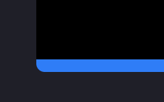
I have set quite a steep radius of my Lovelace cards so the progress bar extends beyond the edge.

Can you add an option to reduce the width/thickness of the progress bar?
 agneevX
All 13 comments
Hello, are you using card-mod or any other tools to style create the border radius?
The card is using the default --ha-card-border-radius theme variable to handle the border-radius.
Simply setting border-radius manually on the card won't work since we need to style the border-radius on multiple places (done through the ha-card-border-radius variable).
 kalkih
on 29 Jul 2020
kalkih
on 29 Jul 2020
ha-card-border-radius: "18px"
is mentioned in my theme yaml and is shown on all cards including your graph card, so its really weird it won't show here.
agneevX
on 29 Jul 2020
Hmm okay, I'll update HA later tonight and see if something broke.
Would you mind sending me your card config where you have the issue?
kalkih
on 29 Jul 2020
This is present in any config, e.g.
entity: media_player.bedroom_tv
hide:
  power: true
  progress: true
idle_view:
  when_idle: true
  when_standby: true
type: 'custom:mini-media-player'
My theme is a modified version of JuanMTech's Google Dark Theme.
agneevX
on 29 Jul 2020
Are you sure that's the right config? You're hiding the progress?
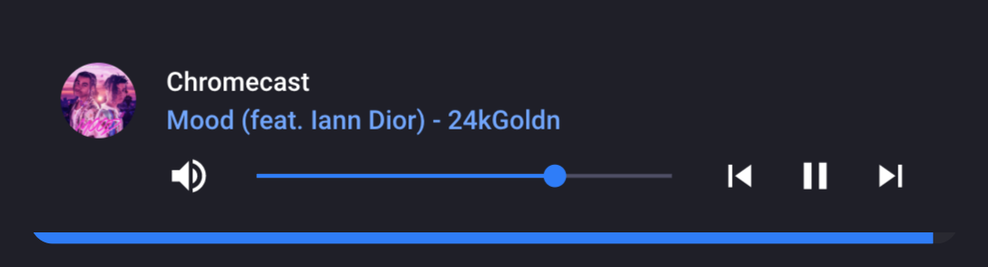
Anyway, I'm not able to reproduce on the latest version of the card + latest HA.
kalkih
on 29 Jul 2020
Sorry, my bad:
artwork: cover
entity: media_player.spotify
hide:
  power: true
idle_view:
  when_idle: true
  when_standby: true
info: scroll
type: 'custom:mini-media-player'
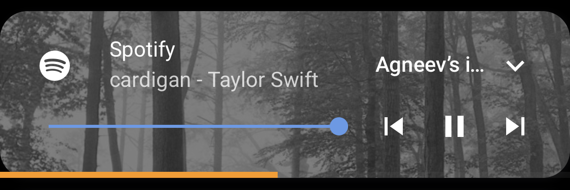
I'm on the latest version of the card and HA too. This has always been an issue since I installed the card ~3 months back.
agneevX
on 30 Jul 2020
Which theme is that? The font and the second line look different.
agneevX
on 30 Jul 2020
It looks like this issue is affecting Safari/WebKit as the issue is not reproducible in Chrome/Chromium, but isn't a caching issue as its reproducible in Incognito Safari.
Are you sure that the graph card and the media player card have the same code for the radius?
agneevX
on 30 Jul 2020
Yep, you're right, I can see it in Safari too, will look into it.
I remember I fixed this a while back, might have been in mini-graph-card? Was caused by a weird bug in webkit back then.
kalkih
on 30 Jul 2020
Time for a new release??
agneevX
on 30 Jul 2020
Yes, in the coming days.
kalkih
on 30 Jul 2020
Can you tell me which option in the theme controls the color of the progress bar? Also can you share your theme?
agneevX
on 31 Jul 2020
mini-media-player-accent-color, falls back to accent-color
https://github.com/kalkih/mini-media-player/blob/06424f033d30ddf9a8bae655e07bb6b71c80ce22/src/style.js#L10
https://github.com/kalkih/mini-media-player/blob/06424f033d30ddf9a8bae655e07bb6b71c80ce22/src/components/progress.js#L162
It's a modified version of another theme (Soft UI or something?), don't remember the original, sorry 😒 , but here it is 😃
Soft - Dark:
  ### Main Interface Colors ###
  primary-color: "#2F7EFD"
  light-primary-color: "#6FA6FE"
  primary-background-color: "#1F1F28"
  secondary-background-color: var(--primary-background-color)
  divider-color: "#2F2F3D"
  ### Text ###
  primary-text-color: "#FFFFFF"
  secondary-text-color: "#6FA6FE"
  text-primary-color: "#FFFFFF"
  disabled-text-color: "#4E4E66"
  ### Sidebar Menu ###
  sidebar-background-color: var(--primary-background-color)
  sidebar-icon-color: "#B6B6C1"
  sidebar-text-color: "#F1F1F1"
  sidebar-selected-background-color: var(--primary-background-color)
  sidebar-selected-icon-color: "#6FA6FE"
  sidebar-selected-text-color: var(--sidebar-selected-icon-color)
  ### States and Badges ###
  state-icon-color: "#2F7EFD"
  state-icon-active-color: "#FBCD41"
  state-icon-unavailable-color: var(--disabled-text-color)
  ### Sliders ###
  paper-slider-knob-color: "#2F7EFD"
  paper-slider-knob-start-color: var(--paper-slider-knob-color)
  paper-slider-pin-color: var(--paper-slider-knob-color)
  paper-slider-active-color: var(--paper-slider-knob-color)
  paper-slider-secondary-color: var(--light-primary-color)
  ### Labels ###
  label-badge-background-color: "#23232E"
  label-badge-text-color: "#F1F1F1"
  label-badge-red: "#6FA6FE"
  ### Cards ###
  paper-card-background-color: var(--primary-background-color)
  card-background-color: var(--primary-background-color)
  ha-background-color: var(--primary-background-color)
  paper-listbox-background-color: var(--primary-background-color)
  ### Toggles ###
  paper-toggle-button-checked-button-color: "#2F7EFD"
  paper-toggle-button-checked-bar-color: "#6FA6FE"
  paper-toggle-button-unchecked-button-color: var(--paper-toggle-button-checked-button-color)
  paper-toggle-button-unchecked-bar-color: "#3E4756"
  ### Table row ###
  table-row-background-color: var(--primary-background-color)
  table-row-alternative-background-color: var(--secondary-background-color)
  ### Custom
  paper-font-body1_-_font-weight: 500
  paper-font-display1_-_font-weight: 500
  paper-font-display2_-_font-weight: 500
  paper-font-display3_-_font-weight: 500
  mini-media-player-accent-color: var(--primary-color)
  mini-media-player-name-font-weight: 500
  # mini-media-player-button-color: red
  # mini-media-player-progress-height: 4px
  ha-card-border-radius: 12px
  ha-card-box-shadow: none
  ha-card-background: transparent
  ch-background: var(--primary-background-color)

  bc-font-size-heading: 2em
  bc-font-size-entity-value: 1.2em
  bc-spacing: 6px
Related issues
 quantummobile
·
3Comments
quantummobile
·
3Comments
 twistp
·
5Comments
twistp
·
5Comments
 darkkatarsis
·
4Comments
darkkatarsis
·
4Comments
 bramkragten
·
4Comments
bramkragten
·
4Comments
 kbrohkahn
·
3Comments
kbrohkahn
·
3Comments