Minetest: Reconsider confirmation on new player registration
See #258 and #3167
I and others are finding how this was implemented #6849 annoying.
The retyping of the password is useful to avoid mistyping and being locked out of the server afterwards, but would be better done as another field ('retype password') below the password field on the existing menu page. This way when doing testing on a local server with a blank password there isn't an extra step to go through where you need to (confusingly) re-type your blank password, you just leave both blank.
The part about making clear it is a registration on a server is less important. It may be useful the first time for a newbie, but after that is known and unnecessary, and probably annoying for that player. We can put this information about server accounts in documents instead.
EDIT: See below. The differentiation of registration from login is important, as is making registration clearer.
 paramat
All 52 comments
258 was:
Just talked with a new player who was confused by the login interface--maybe have an intermediate step that says "successfully registered with server:
Very low priority. Later the more important issue is stated:
There should be, eg, a retype password field on registration so you don't mistype your password.
3167 was:
To prevent someone from mistyping a password on joining a server for the first time and getting locked out.
A duplicate of the only important issue here.
paramat
on 13 Apr 2018
I still don't understand how this ever fixed #258. By the time you reach the confirmation screen, you already entered a name and password, so would have connected to the server and have registered. The real issue is that the name / password fields look like a log in, and log in and registration are very often separate things.
It does fix #3167, but I would ask that it at least be made entirely optional.
 Ezhh
on 13 Apr 2018
Ezhh
on 13 Apr 2018
@paramat No, #258 is not "very low priority". It's huge and should be reopened because it was never fixed.
Ezhh
on 13 Apr 2018
I probably misunderstand then, edited.
paramat
on 13 Apr 2018
258 was "maybe have an intermediate step that says "successfully registered with server:" which is not what the PR did, and i see what you mean now, the confirmation is after registration (i didn't realise that), so that makes no sense.
@srifqi
paramat
on 13 Apr 2018
Re-opened #258
Good points by Wuzzy2 https://github.com/minetest/minetest/issues/258#issuecomment-321723595
I think this needs reworking.
paramat
on 13 Apr 2018
Ugh i made a mess of this and have been corrected now :)
paramat
on 13 Apr 2018
I think the current confirmation approach is fine for dealing with #3167. It's just that it should be optional.
I'm not sure about switching to an extra field on the main screen, because that would always be there, even when you don't need it, and that could cause some confusion, especially since there certain'y isn't space on that screen to add an explanation.
Ezhh
on 13 Apr 2018
I'm against trimming anything of the registration confirmation dialog before not anything is changed in the main menu to make the "Open or Create" account behaviour clearer. The dialog currently provides the players the information that their account is going to be created as soon they re-type the password for safety. This may also be an indicator for them for logging in on the wrong server or mistyped their name. Having the password confirmation field directly in the main menu does neither provide them any information about the account creation nor the indicators mentioned above.
 SmallJoker
on 13 Apr 2018
SmallJoker
on 13 Apr 2018
But apparently when you're at the confirmation screen you are already registered with the server? (see above).
Yes more than a retype field is needed.
paramat
on 13 Apr 2018
The server has not registered that new player before the new player clicks "Register and Join".
 srifqi
on 14 Apr 2018
srifqi
on 14 Apr 2018
@srifqi Technicalities of when the actual registration happens aside, the point is that they'd have connected anyway if they managed to get far enough to see the confirmation. So it doesn't fix the issue that how to register isn't clear from the Join Game tab.
I'm not in favour of removing it anyway, just in favour of it being an option so those who do not want it (for example, those making multiple accounts for quick testing) don't have to confirm all the time.
Ezhh
on 14 Apr 2018
How about add special case for empty password[1] for now? While we work on main menu formspec.
[1] https://github.com/minetest/minetest/commit/670f8afd1896c2a88d6aec926a82d561a8478412#comment-27010195
srifqi
on 14 Apr 2018
I never use an empty password, even for testing purposes, so that won't help me. What's the objection to it being a setting?
(Empty passwords do somehow need to be dealt with either way. I'd consider that a separate issue.)
Ezhh
on 14 Apr 2018
I was experimenting for this issue. Here is the result:

How about it? We can remove this confirmation dialog if we use it.
That's just a concept. There's no working codes right now.
srifqi
on 22 Nov 2018
This would still force clicking through to another menu and entering the password twice, whereas what I'd really love is for the whole confirmation step to be an optional setting. This approach would also add an extra step to click through just to sign in to a server, even after the initial registration.
Ezhh
on 22 Nov 2018
This “forced” extra step is a feature, not a bug.
There is a reason why virtually every website forces users to re-enter their password on registration. It's also silly to make this “optional”. This is just outsourcing UI design to the user.
If we don't do this this extra step, this is far to easy to lock yourselves out of your own account if you mistyped your password on registration. It's hard to recover an account if you screwed up already in registration, because of course you will not remember your own typos. I have lost a couple of account names because of a stupid typo in the registration step.
The dialog also serves another purpose: To clearly make visible the difference between account registration and logging in.
What I agree with that the whole interface could be made more user-friendly. I think the fatal flaw is that the same interface is used for registration and logging in. If the user does not have a clue about the internal workings of this system, the difference between registration and logging in is pretty much impossible to see.
Another flaw in the Minetest UI in general is that everything appears to be crammed into a tiny amount of space, which makes flexible layouts pretty much impossible.
 Wuzzy2
on 22 Nov 2018
Wuzzy2
on 22 Nov 2018
What I agree with that the whole interface could be made more user-friendly. I think the fatal flaw is that the same interface is used for registration and logging in. If the user does not have a clue about the internal workings of this system, the difference between registration and logging in is pretty much impossible to see.
I agree with this part very strongly. It's what the real issue is, and what this approach failed to in any way deal with.
However the confirmation interferes with testing and is really annoying. I have no objections with it being on by default; users who then choose to turn it off don't have grounds to complain if they mess up on registration.
Ezhh
on 22 Nov 2018
So, any other ideas?
srifqi
on 23 Nov 2018
Personally I really like your mockup and think it beats the current
implementation.
On Thu, Nov 22, 2018, 9:07 PM Muhammad Rifqi Priyo Susanto <
[email protected]> wrote:
So, any other ideas?
—
You are receiving this because you are subscribed to this thread.
Reply to this email directly, view it on GitHub
https://github.com/minetest/minetest/issues/7237#issuecomment-441143597,
or mute the thread
https://github.com/notifications/unsubscribe-auth/AWXKYmzcZLnHheb-95kTQleDI_JWnZidks5ux1hsgaJpZM4TSqEE
.
 ghost
on 23 Nov 2018
ghost
on 23 Nov 2018
The problem with the mock up is it adds a step for connecting to a server even after you've done the initial registration (and still doesn't really explain things to the player).
So, any other ideas?
The current Connect button really means "Log in and connect or register and connect", but we obviously can't put that on a button. Ideally you'd have the current fields as a log in, and then a button somewhere that says Register, but I have no idea how to fit this in the space. (I don't really think entering a new name/password combo in the boxes should then be barred as a method of registering - that would be a short cut for those who know how it works, and for those of us who need to register accounts a lot to test things.)
Ezhh
on 23 Nov 2018
The confirmation stage is a pain for me too, a setting to avoid it for developers would be good, maybe such a setting could control whether a confirmation appears on a new design of join menu?
Note that currently the confirmation also appears for the server admin when they first create a world, which is silly.
paramat
on 24 Nov 2018
So, add another setting to disable/enable it?
srifqi
on 23 Dec 2018
That's what I'd favour (on by default for regular players, but can be disabled by those who do a lot of testing and don't need it).
Ezhh
on 24 Dec 2018
So, I just tried to implement that connect server dialog and adding option to disable it. I also remove the confirmation on registration dialog completely.
When account_autoregister is disabled,
- If the player wants to register and the username already exists, it will give "username exists" error. (No "invalid password" error.)
- If the player wants to login and the username doesn't exist, it will give "username doesn't exist" error. (No account is created.)
(The wording may be wrong. We can fix it later.)
You can try it using srifqi/minetest@fb93a740ed7ac051d220e6e62bbe7b4a0efac3f2. You can disable connect server dialog by enabling account_autoregister.
Screenshots
srifqi
on 29 Dec 2018
This is still really bad in my opinion because it always forces players who have it active (which will be most players, since it will be the default) to click through an extra menu even after the first time they registered. You shouldn't prevent people from logging in on the Join Game tab if they know what they are doing.
Ezhh
on 30 Dec 2018
You shouldn't prevent people from logging in on the Join Game tab if they know what they are doing.
Of course, I don't. They can turn it off by enabling account_autoregister setting. Maybe, you want account_autoregister to be enabled by default? How about only change from "autoregister" to "only login" for Join Game tab and add a button to register? There are so many possible ways we could work on this.
Seeing this feature needs more consideration and we have entered feature freeze, how about we drop it for now and not include it for 5.0.0? We can readd or use another technique for another release.
srifqi
on 7 Jan 2019
The problem is that it would have to be turned off to prevent adding an extra step for non-first-time logins. What those of us who don't like the current confirmation seem to be asking for is an option to turn the current confirmation off, not another system that adds another step by default that can then be turned off.
But yes, seems it's now too late to get this fixed before 5.0, which is a huge shame and will increase my reluctance to update to 5.0.
Ezhh
on 7 Jan 2019
... an option to turn the current confirmation off, not another system that adds another step by default that can then be turned off.
Sorry. I just realized that. Here is a quick fix for it: srifqi/minetest@b29b067078f22067e020f36810c43b45024f4d28.
... seems it's now too late to get this fixed before 5.0, ....
I don't know. Seeing some devs agreeing with the idea to have an option to disable it, maybe, we can add the setting (enable_register_confirmation) as "bugfix"?
srifqi
on 8 Jan 2019
Other than from @Ezhh I don't see much request to introduce Yet Another Setting ™ to disable the confirmation dialogue.
However, the patch shown above by @srifqi looks very simple, so (just to silence this endless discussion) I would accept it as a feature before 5.0.0. Even though it's just a few lines; this has to be tested carefully.
SmallJoker
on 8 Jan 2019
Paramat has also mentioned it, and I believe some others have on IRC before.
Would really appreciate if this could be added.
Ezhh
on 8 Jan 2019
I support adding that simple setting for 5.0.0, then we can work on this issue further later. Please do open a PR.
I don't want to see Ezhh put off updating to 5.0.0 =)
As a dev this confirm step is rather irritating for me too as i often rapidly start new worlds.
paramat
on 12 Jan 2019
I just wanted to add, my two cents: It's a matter of hitting the enter key 3 times following the new world name, to start and dev a new world. I just noticed that.
ghost
on 12 Jan 2019
ghost
on 12 Jan 2019
I like it the way it is now. But I don't see a point in it when joining a local world. The setting would also be nice.
And if you mistype your password it isn't hard to request an admin change it with /setpassword
I just wanted to add, my two cents: It's a matter of hitting the enter key 3 times following the new world name, to start and dev a new world. I just noticed that.
There's no point in having it though. It's much easier to just hit Play Game once. You aren't going to mis-type an empty password. And I don't think singleplayer worlds are malicious
 LoneWolfHT
on 14 Jan 2019
LoneWolfHT
on 14 Jan 2019
I agree the dialog doesn't make a lot of sense when you're starting a server yourselves.
Wuzzy2
on 15 Jan 2019
but on the other hand it's only a matter of hitting the enter key a few
times. even if you're making a new world very frequently, it's not so
troublesome once you use this method.
in the past i always clicked. i was pleasantly surprised to find this
shortcut.
On Tue, Jan 15, 2019, 1:46 PM Wuzzy <[email protected] wrote:
I agree the dialog doesn't make a lot of sense when you're starting a
server yourselves.—
You are receiving this because you commented.
Reply to this email directly, view it on GitHub
https://github.com/minetest/minetest/issues/7237#issuecomment-454505232,
or mute the thread
https://github.com/notifications/unsubscribe-auth/AWXKYvVfXefpRIomT3qlUfRJX6sHf2Knks5vDiIVgaJpZM4TSqEE
.
ghost
on 15 Jan 2019
but on the other hand it's only a matter of hitting the enter key a few times. even if you're making a new world very frequently, it's not so troublesome once you use this method. in the past i always clicked. i was pleasantly surprised to find this shortcut.
It's easy to walk around a banana peel (In this case the confirmation form) lying on the floor. But wouldn't it be a better idea to just pick up the banana peel and throw it away?
I may be misunderstanding you though. Are you against the confirmation form being disabled when the user joins a private server?
LoneWolfHT
on 16 Jan 2019
No, nor am I against any setting, or anything at all. I was just sort of shocked when I realized I could type the world name, hit enter three times, and begin my work. All the while prior I'd been using the mouse, which was considerably more taxing.
I'm gonna be picky here for a second: The qualifier "private" server doesn't work, unless you specifically are referring to max_users = 1, or some other restriction. I think you mean "hosted" server (as opposed to singleplayer).
I really do find it humorous how much thought, time, and energy has gone into all of this over the... year.
Sat Jan 13 18:07:16 2018 +0700 > 792752997c5
ghost
on 16 Jan 2019
From an Android tester!
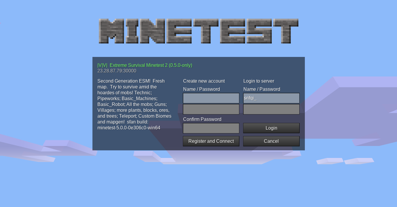
When I was first attempting connection to local server games and even the server device itself when hosted via tablet, I kept getting the password screen. You know the ,"You are about to join a server for the first time...please retype your password and click register..."
This message was very annoying and unnecessary for what I'm doing. Sometimes it wouldn't go away after I entered a password, sometimes it would go away when I entered nothing. It was awkward and didn't make sense. Is it the server password, is it the same password I would enter from the main menu, is it an entirely different password shared amongst servers as I've read about elsewhere? I'm sure its usefull, but it annoyed the crap out of me.
Haha! Seriously, just get rid of this ~crap~, by default, ASAP, STAT, and on the double!
[Edit: I just tested on an Android 5, 6, and 7 device, and all looked correct. Personally it all rendered fine. Sorry for my over-enthusiasm.]
ghost
on 17 Jan 2019
Any other Android users experiencing bugs like that? That experience may have been a bad network connection or user error.
This message was very annoying and unnecessary for what I'm doing.
Well, it's there as a password confirmation, this is standard practice and helps users to not be locked out of a server.
Is it the server password, is it the same password I would enter from the main menu,
This raises a good point, it being a separate screen is weird for a server password confirmation.
Considering the issues it is meant to address #258 #3167 both should be addressed in the initial screen.
So certainly i feel the current implementation is bad and needs changing.
Is it even worth having in 5.0.0? Perhaps we should just revert it and do it properly after release?
paramat
on 17 Jan 2019
See #8108
paramat
on 17 Jan 2019
While I agree that the usability of this is sub-par, please do not forget the reason why this dialog has been added in the first place: To prevent people from accidentally locking themselves out from a server when they mistyped their initial password without noticing. This is kind of important and as paramat said nicely, also pretty standard feature in most software.
So any proper solution to this problem should still consider this.
On the other hand, it seems this issue actually uncovers a much deeper issue here. Because the real problem might actually lie deeper:
You require a new password for every single server. Have fun remembering all of these. I already have trouble keeping track of my passwords for even 5 or so servers. Maybe the whole problem is the authentification system itself, in that it requires an user to physically type in passwords all the time. Especially with many servers FORCING you to set a password (even if you just wanted to “peek in” for 30 seconds or so). Maybe someone could come up with a different system to do authentification in a way that is actually usable, without sacrificing on security (I hope).
Wuzzy2
on 17 Jan 2019
Certainly the implementation will address both issues: Making registration clearer and adding password confirmation.
There's nothing stopping a player using the same password on multiple servers, even though it's best to do so, it's not required.
Generally, use of multiple passwords is wise, people just have to deal with remembering them.
Maybe the whole problem is the authentification system itself, in that it requires an user to physically type in passwords all the time.
This is reasonable and not a problem, it's not much of an effort.
You seem to be suggesting a centralised MT player registration and automatic server verification, big issue.
paramat
on 17 Jan 2019
There's nothing stopping a player using the same password on multiple servers, even though it's best to do so, it's not required.
Yes, it is extremely convenient to use the same password on all servers, but it's also extremely reckless. You tend to forget that humans are lazy and take the path of least resistance. That's another reason why I don't like the current system. It makes it easy to be reckless and hard to stay secure.
If I would be evil I just need to set up a random server with forced passwords and let it run for a few weeks. Bam! Now I got a couple of default user names + passwords.
You seem to be suggesting a centralised MT player registration and automatic server verification
Absolutely not! I'm not sure myself how a different system could work, I'm just saying the current one is painful to use.
Wuzzy2
on 18 Jan 2019
I'm just saying the current one is painful to use.
I'm all for seeing bigger improvements either way if someone has ideas, but I think a whole new auth system isn't happening soon, whereas something that's slightly better than the current notification should be possible. Password management is also a separate issue from knowing how to register and registration confirmations, so is fairly offtopic to bring into the mix here (though not unimportant as an issue in its own right).
I'd think the ideal would be to revert the current confirmation, then leave everything as is, with the addition of a "register" button, so players who don't understand that they can register in the login fields have a clear indication for how to progress. This would in theory suit everyone. Quick registration would exist for those in the know and who want it, and a proper registration form (like srifqi posted previously) would be there for everyone else. It's just a case of where to fit the Register button!
If I would be evil I just need to set up a random server with forced passwords and let it run for a few weeks. Bam! Now I got a couple of default user names + passwords.
If this was true, all server owners would be sitting on lots of user name/password combos already, and as much as I'd love to say all server owners are trustworthy, no, not all of them are, and we'd have all kinds of problems.
Ezhh
on 19 Jan 2019
Other than from @Ezhh I don't see much request to introduce Yet Another Setting ™ to disable the confirmation dialogue.
This feature annoys me quite a lot, and I don't think it has much added value really. It could at least not be shown when connecting to local servers, and a setting could be good too
 rubenwardy
on 26 Jan 2019
rubenwardy
on 26 Jan 2019
8102 merged for 5.0.0.
paramat
on 26 Jan 2019
See #8138 for a suggested change.
paramat
on 26 Jan 2019
They work well enough and that's offtopic here.
You can open an issue (there may be one already) to suggest a new authentication mechanism.
paramat
on 28 Jan 2019
It's actually a valid and useful issue.
Please no more random nonsense or i'll delete your posts.
paramat
on 3 Feb 2019
Please create a new Issue/PR for your idea and take all this there. You're just disrupting the discussion here.
If you want I could even create an issue for you
LoneWolfHT
on 7 Feb 2019
Related issues
 RustyRaptor
·
3Comments
Wuzzy2
·
3Comments
RustyRaptor
·
3Comments
Wuzzy2
·
3Comments
 Fixer-007
·
3Comments
Fixer-007
·
3Comments
 echosa
·
3Comments
echosa
·
3Comments
 verymilan
·
3Comments
verymilan
·
3Comments
Most helpful comment
It's actually a valid and useful issue.
Please no more random nonsense or i'll delete your posts.