A thread to discuss general UX issues with the main menu.
 rubenwardy
All 175 comments
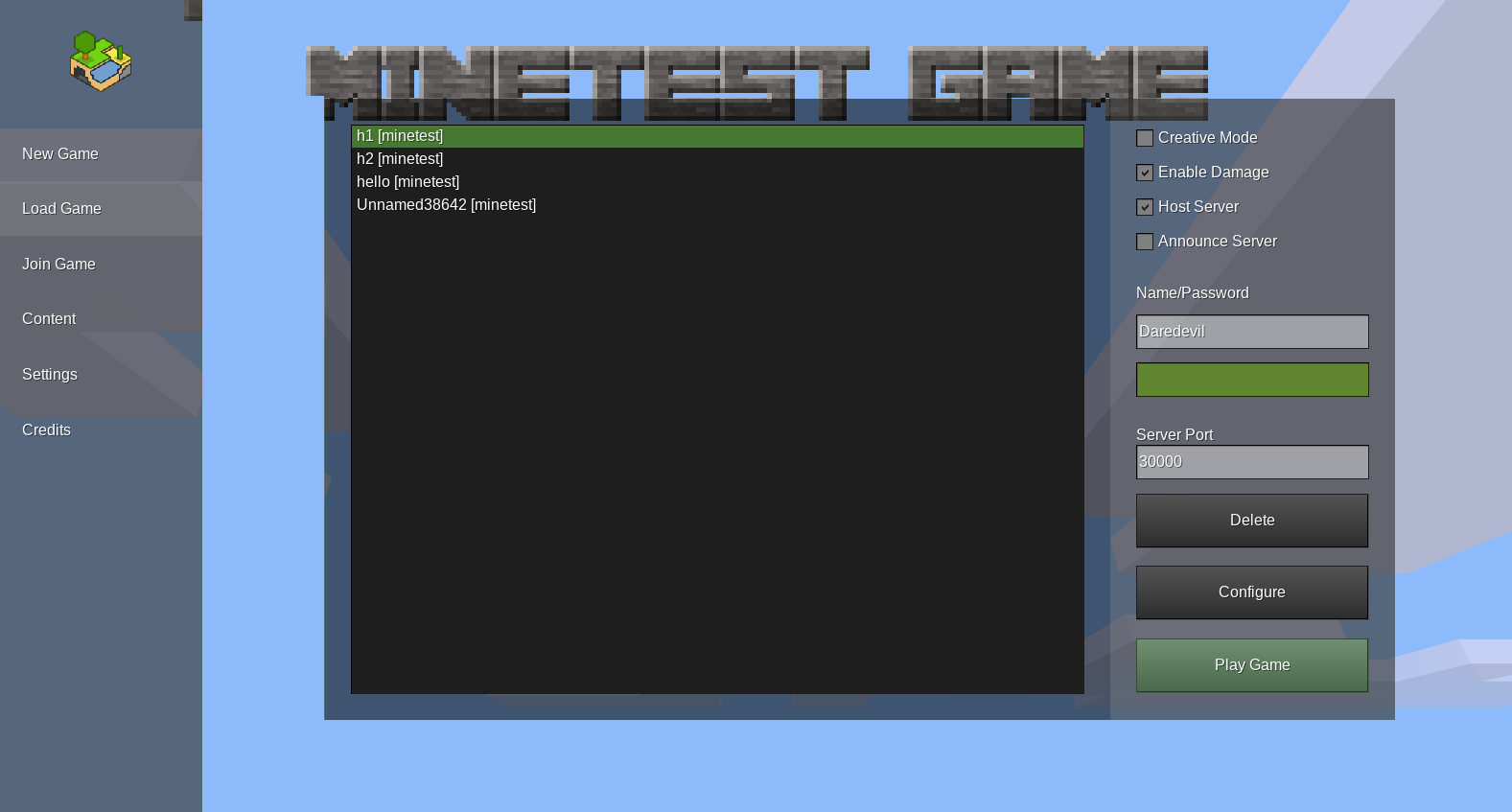
Although not directly related to the main menu, aren't the buttons for things like "Play game", "Configure", "New", etc, the default Irrlight buttons? I feel like those were built into Irrlicht for prototyping. If we change the main menu then those ugly buttons should go, at least I think so.
 DevyHeavy
on 4 Dec 2017
DevyHeavy
on 4 Dec 2017
This may not be "Main Menu" but CBugDCoder and I had an idea for moving the sound menu into a options menu and adding things like FOV, shaders, etc to that menu.
 ThomasMonroe314
on 4 Dec 2017
ThomasMonroe314
on 4 Dec 2017
Relevant: #5810
Albeit that has to do with problems effecting all formspecs in general, while this has to do with main menu design.
 C1ffisme
on 4 Dec 2017
C1ffisme
on 4 Dec 2017
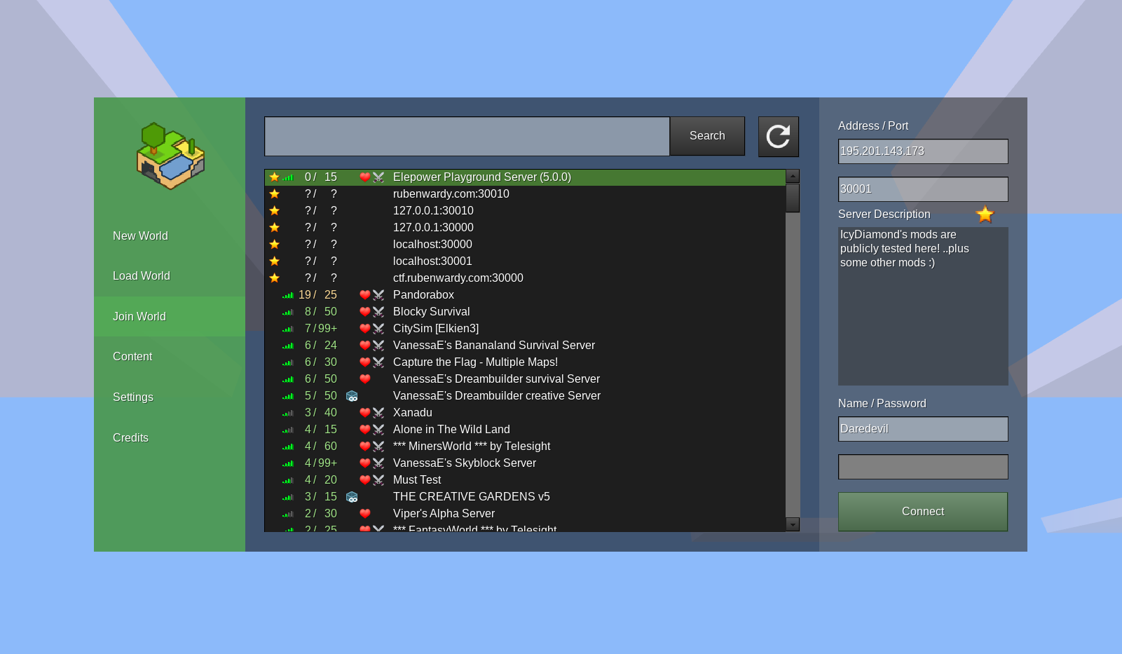
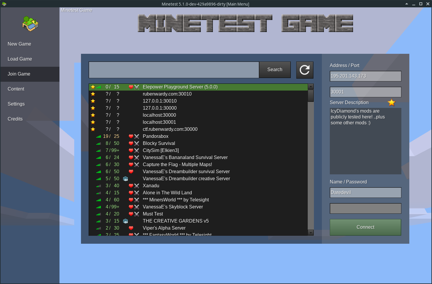
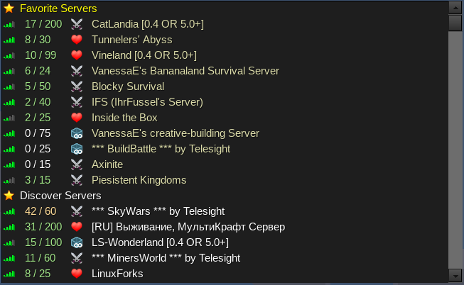
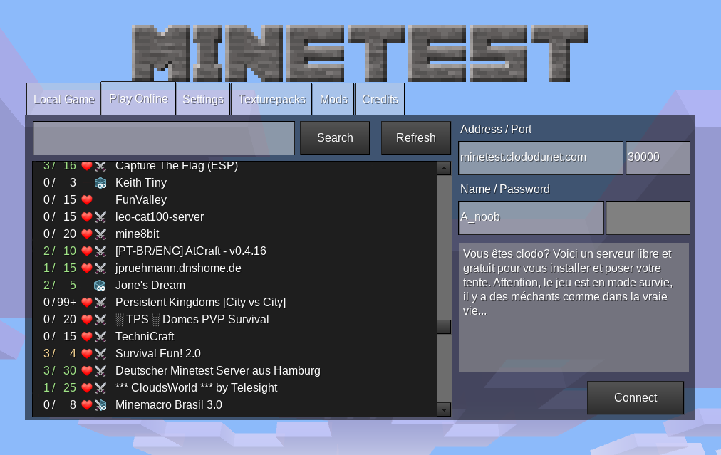
Just curious, but does anyone use the Mods tab and what is it even there for?
ThomasMonroe314
on 21 Jan 2018
There's a Mods tab?
On Sun, Jan 21, 2018, 3:50 PM Tre notifications@github.com wrote:
Just curious, but does anyone use the Mods tab and what is it even there
for?—
You are receiving this because you are subscribed to this thread.
Reply to this email directly, view it on GitHub
https://github.com/minetest/minetest/issues/6733#issuecomment-359279735,
or mute the thread
https://github.com/notifications/unsubscribe-auth/AWXKYi7kn_zJwJ6u8ngF3WnHfS7ugql6ks5tM6MEgaJpZM4Q0Fn1
.
 ghost
on 23 Jan 2018
ghost
on 23 Jan 2018
@ThomasMonroe314 @jastevenson303 The mod tab gives a list of all the mods you have installed, giving information and shows the screenshot, if the mod has one.
 NathanSalapat
on 23 Jan 2018
NathanSalapat
on 23 Jan 2018
I know that, but you can just as easily either open up a file explorer, or make a world and open up the configuration.
ThomasMonroe314
on 23 Jan 2018
It was added at the same time as the mod store, and wasn't removed when the mod store was removed
rubenwardy
on 23 Jan 2018
I figured that was the case, I'm just wondering if it is necessary to keep around.
ThomasMonroe314
on 23 Jan 2018
I think the main menu begs to be redesigned with much larger content areas, considering
- Content DB integration brings much more data that need to fit
- There's a font size feature that currently doesn't work with larger than default sizes without the UI looking like garbage.
 tacotexmex
on 21 Jun 2019
tacotexmex
on 21 Jun 2019
Just throwing something out there:


tacotexmex
on 22 Jun 2019
I like that a lot
rubenwardy
on 22 Jun 2019
Such singleplayer world screenshots would be easier with #7111. (Just show the newest screenshot of that world.)
 Desour
on 22 Jun 2019
Desour
on 22 Jun 2019
Or just save a screenshot into the world directory when you quit (similar thing could be done for known servers)
 benrob0329
on 22 Jun 2019
benrob0329
on 22 Jun 2019
Working on the main menu is on my to-do list. Just need to get all the formspec problems fixed
Would be nice if people could come up with a load of designs to choose between
rubenwardy
on 22 Jun 2019
a load of designs to choose between
That, or we develop one good design together with all relevant goals of it in mind. It shouldn't boil down to taste but what performs best imo.
tacotexmex
on 22 Jun 2019
Uhm, so I got a little carried away (it's interactive).
tacotexmex
on 23 Jun 2019
How do you expect this to resize?
rubenwardy
on 23 Jun 2019
I'm unaware of how/if formpec elements can have fluid sizes. If so, no problem. If not, well, it should support it 😅
tacotexmex
on 23 Jun 2019
the thing is that the formspec in your mock up is fitted such that it fills the entire window, which isn't possible currently for that exact reason.
So I guess it would need to be an inner formspec that doesn't scale, like the current menu
rubenwardy
on 23 Jun 2019
Could be an inner formspec with a large background.
benrob0329
on 23 Jun 2019
Then I suppose this design is for when formspecs do get fluid size support. 🤔 Either that or demanding a larger minimum screen size (1280x800 in this example). Since it's been drawn with for being responsive it's easy to see that it looks okay down to 1024x768. Works with 800x600 too but not with that font size.
tacotexmex
on 23 Jun 2019
Resizing the current main menu I spot some responsive elements so my design could probably be made to work on lower resolutions too.
tacotexmex
on 23 Jun 2019
When this Ratio Workspace is released I'll probably try to mockup the main menu with it.
tacotexmex
on 23 Jun 2019

You could remove the 'Change Game' option and show the world's game's logo instead of a world screenshot for now
 LoneWolfHT
on 25 Jun 2019
LoneWolfHT
on 25 Jun 2019
I could, but it's supposed to be a game engine, which is why I've chosen to emphasize current (sub)game context. The list itself would also become innumerable quickly with that approach.
tacotexmex
on 25 Jun 2019
https://github.com/minetest/minetest/issues/6733#issuecomment-504671122 looks quite nice for me, I would like to have some actual terrain visible in background as well, if that is possible somehow.
 Fixer-007
on 25 Jun 2019
Fixer-007
on 25 Jun 2019
Games can always define the background image to go on top of the clouds, and leave the sky transparent.
benrob0329
on 25 Jun 2019
My problem with that design is that it's not possible to create with the current formspec system, even with some modifications to it. Maybe use a similar deisgn to above, but something closer to freeminer:
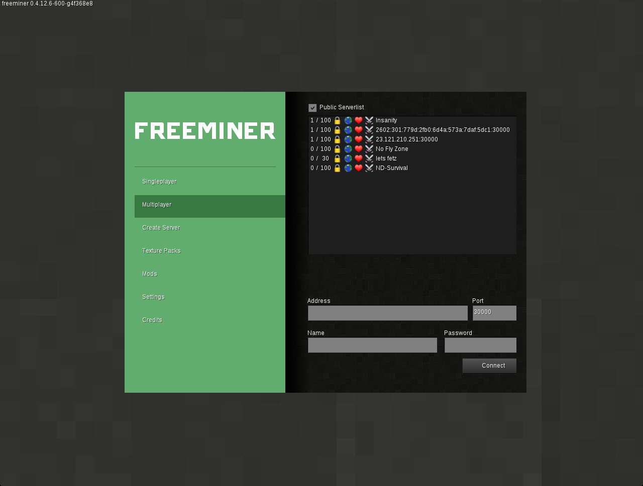
The important parts of both designs are:
- A vertical "tab" system - this is more common in games
- Better use of padding and space
- Better use of color (especially as seen in freeminer)
Or, alternatively: the sidebar could be a new API feature, and the content would be the formspec. So to set the sidebar, you'd do something like:
-- show
core.set_sidebar({
    icon = "games/minetest_game/menu/icon.png"
    items = {
        { id = "start", text = "Start Game", selected = true },
        { id = "join", text = "Join Game" },
        -- etc
    }
})

-- hide
core.set_sidebar(nil)
and then the content would just be update_formspec.
rubenwardy
on 25 Jun 2019
Having screenshots for worlds looks pretty if using good screenshots as in the example, but screenshots would have to be automatically taken, so will often be non-obvious or bad screenshots (dark wall of cave, close-up of wooden floor etc.). Screenshots also take up a lot of menu space and make a world list very long to scroll through. So i prefer no screenshots.
 paramat
on 25 Jun 2019
paramat
on 25 Jun 2019
Taking a jpg screenshot whenever the user leaves the world would result in small pictures of the last thing the user saw, so they could easily look at something important before leaving.
benrob0329
on 26 Jun 2019
bad screenshots (dark wall of cave, close-up of wooden floor etc.)
It doesn’t matter if the screenshot is bad as it will still increase overall recognizability in the list, which is its sole purpose.
So i prefer no screenshots.
Well to be fair a menu redesign such as this one shouldn’t even cater to engine developers at all but to new and novel players of the game.
tacotexmex
on 26 Jun 2019
The Freeminer menu system, while slightly better than the current, doesn’t solve the problem my design set out to solve though: screen real estate. All content is still crammed into a centered box.
tacotexmex
on 26 Jun 2019
The problem is that once we start saying things like "we need X to do something" we end up never doing that something. I'd like to get a better design now, done in a way that works cleanly with our current GUI technologies. If we have a responsive design framework in the future, then we can rework it at that point.
We can still use space more effectively with formspecs currently.
rubenwardy
on 26 Jun 2019
Okay, as I said the design may work if this inner fixed-size formspec is large enough. What is the highest pixel width and height you can accept?
tacotexmex
on 26 Jun 2019
WIP:

I'm not happy with the world settings side bar at all. It needs some distinction. It would also be good to make it larger
rubenwardy
on 26 Jun 2019
Not bad! Now double the font size. 😁
tacotexmex
on 26 Jun 2019
Looks pretty nice. I think the buttons on the top and bottom need to be a bit shorter because they seem too bulky at their current size. The formspec should also be a bit shorter or positioned lower because it partially covers up the header.
 v-rob
on 26 Jun 2019
v-rob
on 26 Jun 2019
Now double the font size
Better font scaling would be very nice
I think the buttons on the top and bottom need to be a bit shorter because they seem too bulky at their current size
I made it intentionally large to be easier to use on mobile devices
The formspec should also be a bit shorter or positioned lower because it partially covers up the header.
Yeah, I'll fix this at some point. The header should be positioned better anyway
rubenwardy
on 26 Jun 2019
Rubenwardy, can you please show us a mock-up first before you start coding so we can comment on it?
As for the screenshot, I think it still looks very ugly. The game logo is completely misplaced. The contents are again crammed into a centered box and not distributed across the whole screen.
The biggest fail of the main menu ATM is the tiny box in which everything is forced inside.
Then the question on how to select the game remains open …
 Wuzzy2
on 26 Jun 2019
Wuzzy2
on 26 Jun 2019
As for distributing everything across the whole screen (like in tacotexmex's mockup), I'm currently making something that does just that. I'll open a PR when it's done (it's pretty simple)
v-rob
on 26 Jun 2019
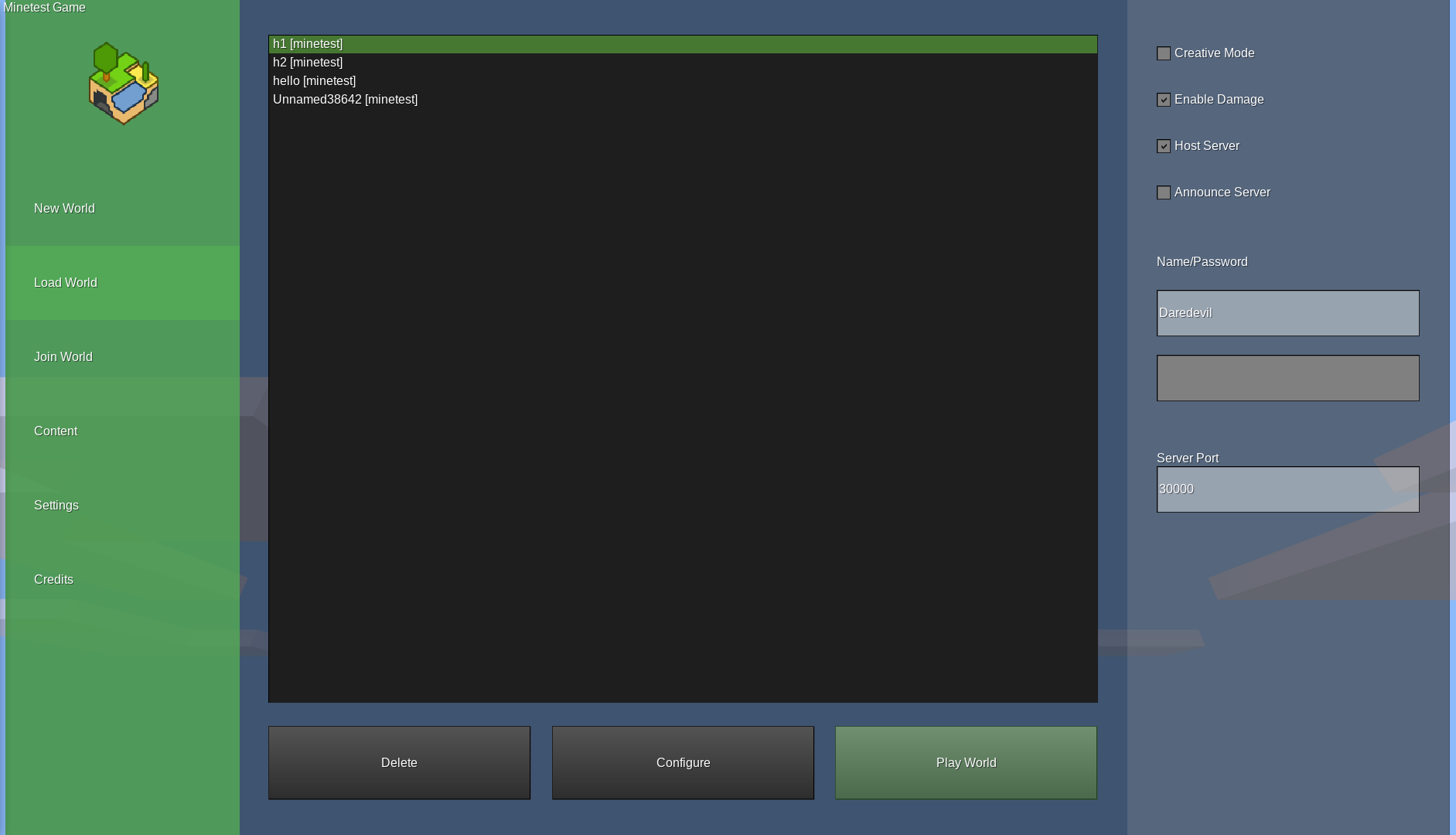
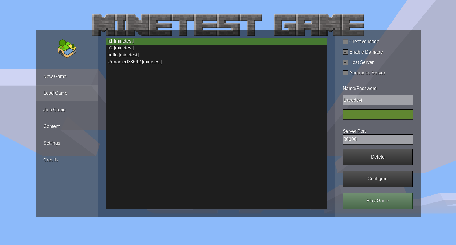
Up to date screenshots:

The code should be modified to increase the side of the box
The game logo is completely misplaced.
It's the same place as top reacted design here
The contents are again crammed into a centered box and not distributed across the whole screen. The biggest fail of the main menu ATM is the tiny box in which everything is forced inside.
Errmm... formspecs?
Rubenwardy, can you please show us a mock-up first before you start coding so we can comment on it?
I don't have the skills to create mock ups. I'll prove it below
Selecting games
Then the question on how to select the game remains open …
My plan is to use a "change game" feature, similar to celeron55's suggestion. The first thing the player sees will be a list of installed games, and some options, with no background (ie: just clouds):

Clicking a game launches into the game-specific menu. In the future, games will be able to provide an menu/init.lua file to customise their menu.
This was celeron55's design which I'm basing this off of:
rubenwardy
on 26 Jun 2019
I suggest to use a scroll_container for scrolling through subgames (when we have it). This makes it possible to make the game selection take only little space.
Desour
on 26 Jun 2019
oh also, there should be hints on the change game page like this:
This could be displayed even when Minetest Game is installed.
rubenwardy
on 26 Jun 2019
I've created https://github.com/minetest/minetest/pull/8630 which solves Wuzzy's main concern if you want to check it out.
v-rob
on 26 Jun 2019
There's slight gaps around the edge, but otherwise is good
rubenwardy
on 26 Jun 2019
There's slight gaps around the edge, but otherwise is good
Icon is stretched a little
LoneWolfHT
on 26 Jun 2019
Icon is stretched a little
Yeah, that just occurred to me. I'm not sure stretching is the right way to do it
rubenwardy
on 26 Jun 2019
Ruben, are we going to filter servers by game now? Otherwise having the "Connect" tab inside the per-game menu doesn't make sense.
benrob0329
on 26 Jun 2019
Good development.
I don’t think c55’s sketches bring much to the table. Its design hardly solves any problem being discussed here and is way too vague to be put to good use.
I wonder why game selection should be front and center in any design. If Minetest is an engine, the whole point is to be able to use as much of it for your own game’s experience from launch to exit.
If I build a space game my players shouldn’t have to see other games being installed at launch, diluting the theme. Instead the interface should give exposure to the selected game in any way it can. That’s the principle of my design at least. That’s why I choose a neutral color for the sidebar and let the customizable background create the thematic setting. That’s also why I put game selection behind its own menu item (with the upside of really being able to give good exposure to each of the game in that space)
tacotexmex
on 26 Jun 2019
I don't have the skills to create mock ups. I'll prove it below
I made a few design components mimicking formspec elements while making mine. You’re welcome to use them in Figma.
tacotexmex
on 26 Jun 2019
I'll post my couple (very rushed) mockups that I made earlier.
If I get some time, I'll make a more fleshed-out mockup with some of ruben's goals in mind later.
benrob0329
on 27 Jun 2019
I know that there are gaps at the edges. My solution is to add noclip to the boxes and make the boxes extend past the edge of the form.
As for the image being stretched, I don't know any easy way to fix this. I know that CSMs have get_aspect_ratio(), so since the main menu is client-side only, you could (maybe?) use that to calculate the proper image size.
v-rob
on 27 Jun 2019
If Minetest is an engine, the whole point is to be able to use as much of it for your own game’s experience from launch to exit.
If I build a space game my players shouldn’t have to see other games being installed at launch, diluting the theme. Instead the interface should give exposure to the selected game in any way it can.
This is the primary reason behind my design - to give each game its own menu.
Compromise: the game chooser should be the default page if you haven't opened Minetest before, as it will inform the user about installing games in Minetest. Once you select a game, it defaults to that game from now on. To get back to the game chooser, you'd click a back button on the left side bar, or the game's logo.
menu/init.lua will be able to disable the game chooser in the event that a game is distributed standalone
That’s why I choose a neutral color for the sidebar and let the customizable background create the thematic setting
The color is customisable via Lua. I'd like to give games full control of the main menu using menu/init.lua
rubenwardy
on 27 Jun 2019
Ah, I thought you esposed c55's design suggestion. Now I understand.
Imo your design doesn't improve the main menu situation much in regards to letting the game shine. On the contrary the new sidebar background color further obscures any background art shipped with the game, further defeating the purpose of that element. I was aiming for the opposite in mine.
tacotexmex
on 27 Jun 2019
Unfortunately, your design cannot be implemented in Minetest. My design is a pragmatic compromise which can be.
It's trivial to change the side color to something plain:
rubenwardy
on 27 Jun 2019
Unfortunately, your design cannot be implemented in Minetest. My design is a pragmatic compromise which can be.
Didn't v-rob just solve that impediment with #8630? Were there others?
It's trivial to change the side color to something plain
But it's still a larger area covering the game art than before, a deterioration for theming.
I fail to see the point in this design:
- It incorporates some elements of my design but taken out of context their purpose are completely defeated:
- The sidebar was to be able to shove the menu _to the side_. If that can't be done, it instead becomes visual bloat.
- The game icon is supposed to align with the game logo in a hierarchically correct way, now the hierarchy is reversed.
- It covers more of the game background
- It covers the game logo!
- It doesn't bring a larger area for ContentDB content
- It does bring a larger area for stuff that does not need it (now there's a larger black box overlapping game art rather than a small one)
If you want to make a game submenu, why bother with the main one?
tacotexmex
on 27 Jun 2019
Didn't v-rob just solve that impediment with #8630? Were there others?
No, that stretches. Even so - My design is your design with that PR.
rubenwardy
on 27 Jun 2019
It covers more of the game theme graphics
Your design covers all of the game theme graphics
It doesn't bring a larger area for ContentDB content
Because I haven't implemented that yet
It does bring a larger area for stuff that does not need it (now there's a larger black box overlapping game art rather than a small one)
The box can be hidden
rubenwardy
on 27 Jun 2019
No, that stretches. Even so - My design is your design with that PR.
No, it's quite different. (See updated points above) If it can't be done then that's unfortunate but it's just extra work for little or no improvement to borrow elements from it without adhering to its principles. Imo.
Your design covers all of the game theme graphics
Not at launch, which was the point. My launch view leaves around 75% of screen real estate to game art.
Because I haven't implemented that yet
How big of an increase will it be?
The box can be hidden
That's good though that area is still unecessarily large given that it only contains small text list items.
tacotexmex
on 27 Jun 2019
The game icon is supposed to align with the game logo in a hierarchically correct way, now the hierarchy is reversed.
I thought the first screenshot was of the change game screen, but it's just a plain intro screen.
In that case, you could use a special sidebar element:
rubenwardy
on 27 Jun 2019
Note that I've wanted to make a vertical tab system for a while, because that's what users expect.
rubenwardy
on 27 Jun 2019
Hey, there it is! That's improvement. Will you use that instead? If so you should hide the game logo when menus are brought up (icon and background art is sufficient for context)
I thought the first screenshot was of the change game screen, but it's just a plain intro screen.
Ah, I see. Maybe I was unclear.
tacotexmex
on 27 Jun 2019
Ah, I see. Maybe I was unclear.
I misunderstood, and that misunderstanding robbed me of all context.
Also: the menu is actually bigger, although it should be the same size(?). Formspec scaling magic, I guess. Or I don't understand real coordinates
rubenwardy
on 27 Jun 2019
Er, if the size element is the same and real_coordinates is enabled, the form will be smaller because the padding and spacing are removed. If the form is bigger, you must have larger dimensions.
I do like the idea of games having their own menus. This sounds like a wonderful idea, especially because it will allow things like additional options on world creation that wouldn't be possible before.
And as for the logo being stretched with my PR, it seems you didn't notice https://github.com/minetest/minetest/issues/6733#issuecomment-506074610.
v-rob
on 27 Jun 2019
Single form redesign:
Sidebar redesign (not hiding header yet, bc WIP):
rubenwardy
on 27 Jun 2019
I personally prefer the single form because it's more unified. The sidebar feels off because it's very tall and imbalances the sides. Although I do think that the sidebar shouldn't be green by default, only if games change it to be like that.
v-rob
on 27 Jun 2019
I think that the detached version could be made to look more coherent, and we would end up with a better looking menu to boot for it.
benrob0329
on 27 Jun 2019
I misunderstood, and that misunderstanding robbed me of all context.
It just goes to show how important it is to explain designs in detail. My bad!
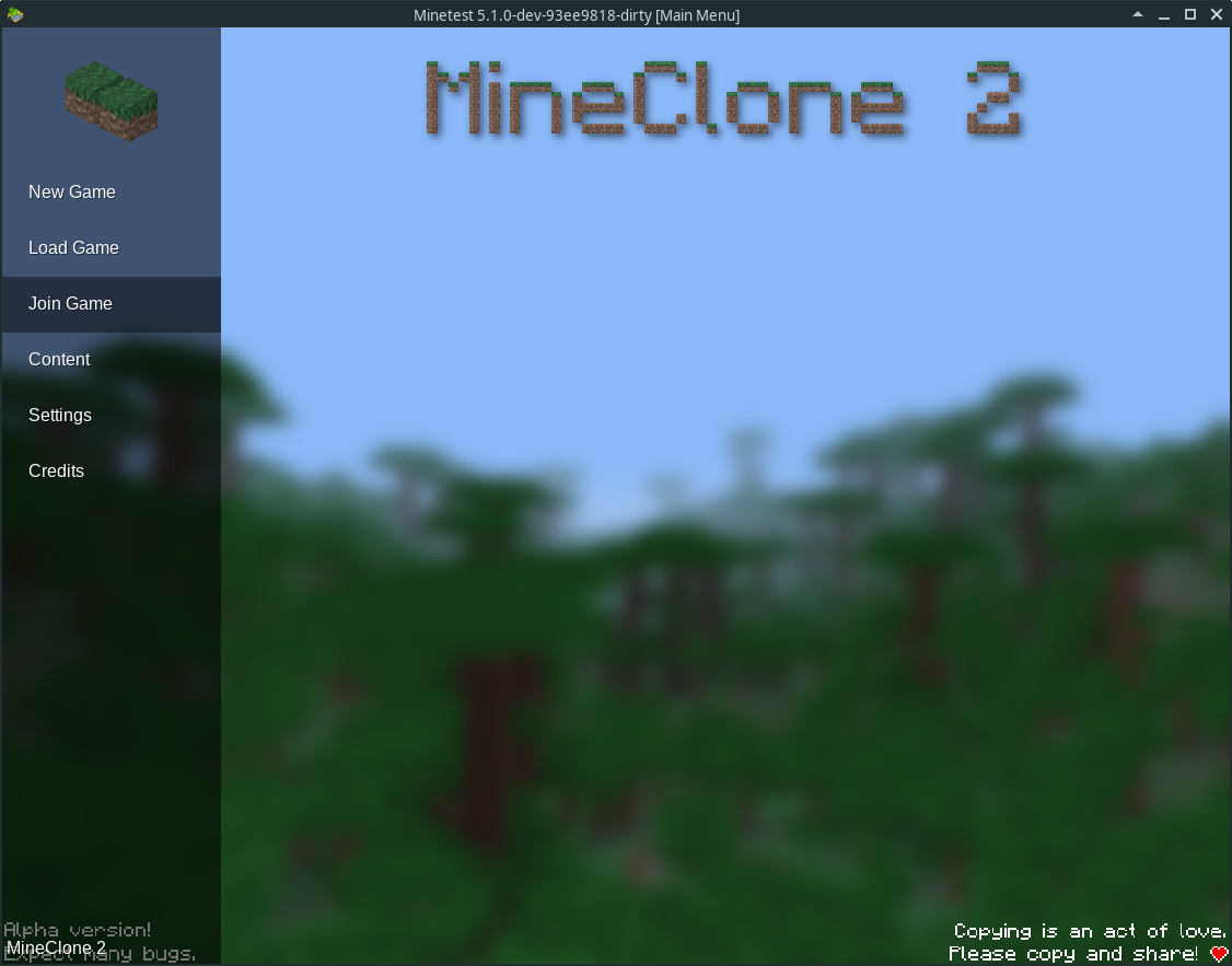
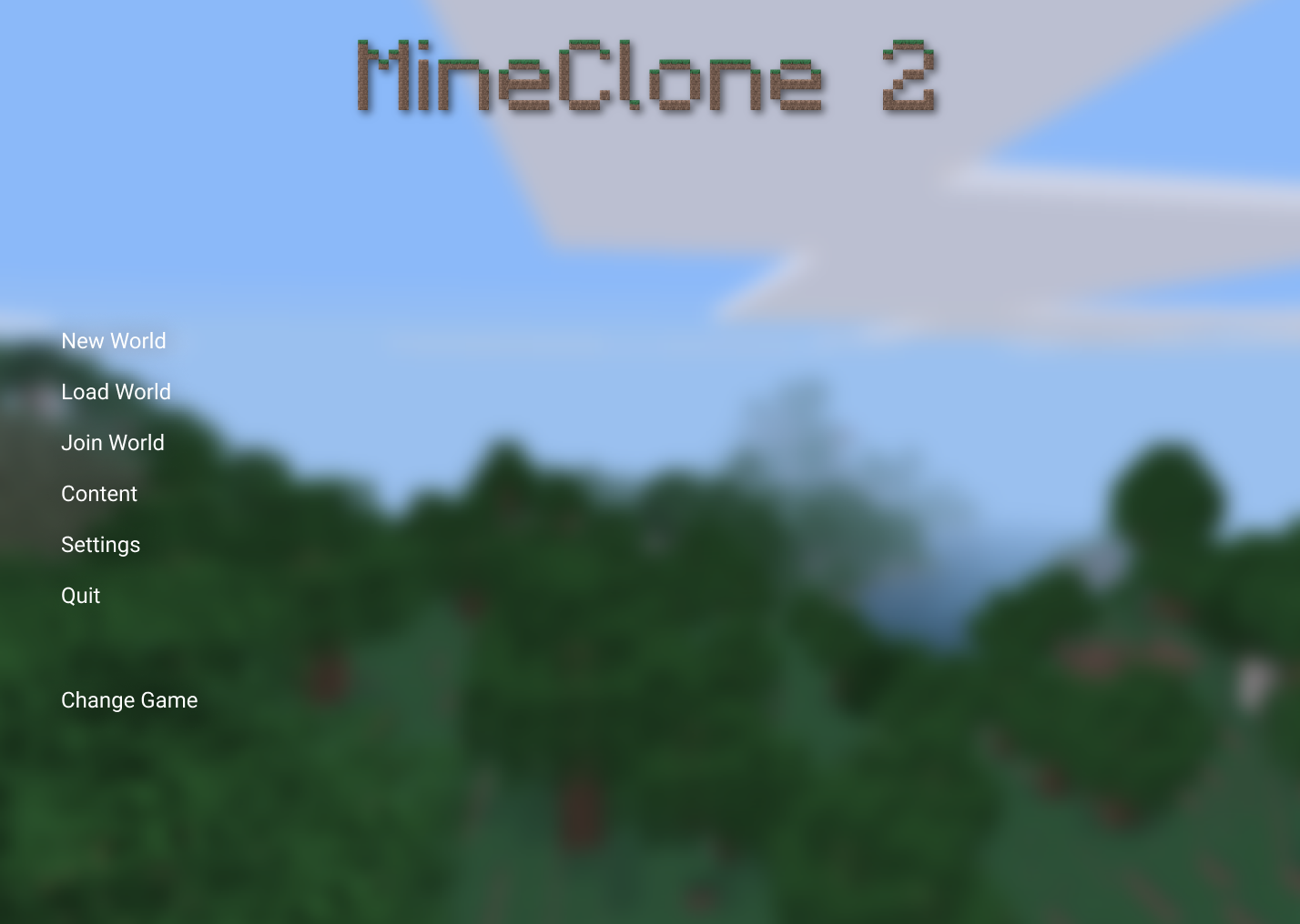
Though the image is blurred to fit behind the old menu design your MineClone 2 example aptly shows what can be accomplished with this: deeper game theming. 🙂
Is the caveat that the content area (everything that’s not sidebar) still can’t stretch the whole screen but needs to be centered in the middle with fixed dimensions?
tacotexmex
on 27 Jun 2019
Is the caveat that the content area (everything that’s not sidebar) still can’t stretch the whole screen but needs to be centered in the middle with fixed dimensions?
I have an idea to fix this, but it would require a lot of messy Lua code. You could use #8630, but change the size[] element to match the ratio of the screen. As well as the extra mess, another problem is Window resizing: I'm not sure Lua would be responsive enough to regenerate on demand, could cause lag.
My PR is already designed around container[] elements and real co-ords, so wouldn't be that hard to adapt to this
The benefit of this is that I don't have to create my own IGUIElement, and it allows more customisation - the more things in Lua, the easier it is for games to customise
The mess could be fixed in the formspec C++ code by adding new tags. For example, a relative container, to perform anchor (1,0 - top right) and offset (-2, -2 slots): relcontainer[1,0;-2,-2]
rubenwardy
on 27 Jun 2019
One issue with stretching up is that the content fills more of the page, so the content should be sparser such as the image-world list in your mock-up. Alternatively, maybe removing the background and increasing the font size of the list
rubenwardy
on 27 Jun 2019
Okay, so are you taking the C++ fix approach? The tech behind it is beyond me, I focus on the design principles for the time being.
content should be sparser such as the image-world list in your mock-up
That’s the beauty of being able to use more space. 🙂
tacotexmex
on 27 Jun 2019
What I want from a good design:
- Logical menu structure
- Readable font (i.e. NOT the tiny font we have now)
- Monospace font
- Make use of the entire screen, don't leave space empty for no reason
- Use conventions from other games
- Forwards-compatible, any future tweaks should be possible without blowing up the whole frontend / codebase
- Tried-and-tested with actual users (preferably newbies). Gather real-world data and present the designs to real human users. Watch what they do. Take notes. This is much more effective than “designing by belief” (which is what apparently many people here do). I used this method while developing another game and you won't believe how many usability issues (for which you were completely blind to) you will uncover. The downside is, this requires you to already have a rough working main menu.
- Important, frequently-needed features are more visible than rarely-needed features. The menu must help the player to get things done. If common things need a lot of clicks, this is bad
- Visually appealing. Does not have to be an artistic masterpiece; I have nothing against simplicity, but it should at least look professional
Frankly, I think you all are way too conservative in your designs. You just push a few widgets around but you don't really re-think the core concepts.
Doing a complete main menu rewrite should be worth it. It it ends up being only a few minor tweaks, that's not really helping.
I like to also list the biggest problems with current menus, in descending order of importance:
- Tiny: Everything is crammed into small space
- Slow game selection: The game selection is extremely inconvenient if you have lots of games. Because then, the horrible scroll buttons appear! You end up clicking on the left/right buttons a million times to be able to select the game you need … And it resets to the starting position all the time. Game selection needs to a 1-click thing (OK, maybe 2), not a clickathon … Then the game names (which are very important) are not directly visible, you have to. hover them. Let alone the game description …
- Bad controls menu: The controls menu is an ancient cursed relict from 0.3 (or worse)! It has many problems: Not all controls can be set, space is extremely tiny, near-impossible to extend, can cause key conflicts, including sneaky key conflicts with keys you don't even get to see in the menu. Then there's still that embarrassing advice “If things break, delete stuff from minetest.conf” ...
- Confusing texture pack selection: I think it's really confusing that you have to go into the Content tab to change the texture pack. This just doesn't make sense and is far-fetched. I think having the option to select the texture pack in Content tab is nice, but it should be an extra, and not be the only way to select texture packs. There should be a dedicated menu or at least a button for that where it's not far-fetched so its more discoverable.
- Tabs are weird: The tabs are not exactly inconvenient to use IMO, but they are just highly unusual for a game. Minetest deviates from convention for no logical reason.
- Ugly: The whole UI is just plain ugly, it's basically just flat rectangles everywhere. That's like the most cheap UI I have ever seen. Even ASCII games manage to do better! It looks like a 1st grader drew it or as it was hastily hacked together for Ludum Dare.
- “Content” is confusing: I dislike the wording “Content” to refer to installed games, mods and texture packs. This is too generic. I don't think newcomers would understand … I also think it sounds devaluing to all the hard work the people put into games and mods and texture packs. “Content” sounds like Minetest is just a box that needs to be filled … It just sounds much less important than it actually is. Sadly, I don't have an idea for a better word yet :(
- Tiny font: The font is a fixed, small size. It gets worse on giant resolutions, you will be lucky if the letter will be larger than one millimeter on the screen. Sadly, many things in Minetest are
- Not a monospace font
Obviously, new designs should focus on fixing these problems. :)
Wuzzy2
on 27 Jun 2019
monospace font
Maybe one of these? https://www.fontsquirrel.com/fonts/list/classification/monospaced
LoneWolfHT
on 27 Jun 2019
Sadly, I don't have an idea for a better word yet
- Addons
- Packages
- Store
- Workshop (Stole this from Steam)
- Install Stuff
benrob0329
on 27 Jun 2019
Minetest has a default monospace font (I use it by default) called Cousine Regular. I mean, for goodness sake, there's a setting in minetest.conf called mono_font_path and mono_font_size, and as far as I know, neither are used!
As for slow game selection, there's the PR for scroll_container, which would add a scrollbar and scrolling, so it would be scrolling and then one click.
v-rob
on 27 Jun 2019
I'd like to get a better design now, done in a way that works cleanly with our current GUI technologies.
Shouldn’t it be the opposite: goals first, means second? Formspecs are to be replaced, they are ugly and powerless. But the discussion in #6527 makes clear that we don’t know what should the replacement be able to do. Only during designing a GUI it is possible to fully understand the needs.
Among designs presented, the most clean is:
Something like this should be the default, for the engine itself. Another nice (modulo MC-ish font) example is:
Again, that’s for the engine, not for games. They should supply own designs, or graphics at least, to not look like a virtual machine manager =)
 numberZero
on 28 Jun 2019
numberZero
on 28 Jun 2019
I never implied that goals should be after the design
rubenwardy
on 28 Jun 2019
Having a tiny window actually has a benefit: You don't have to move your mouse as far. However, imho the cons overweight probably.
Then the game names (which are very important) are not directly visible, you have to. hover them.
Can a small header (game/menu/header.png) been put below the subgame icon?
Imo what's worse is that you can't distinguish between subgames with the same name (eg. feature forks). The folder name should be accessible, too. (Eg. a setting to add it to the tooltip (like the one we have for items) or automatically enabling this for subgames that have a non-individual description/name.)
The controls menu could be made better with a scroll_container, too. :slightly_smiling_face:
Desour
on 28 Jun 2019
look like a virtual machine manager
Please don’t validate designs by personal associations as they may not be shared connotations.
If we’re going to improve the user experience of the MT menu interface, this time the usual tirade of core developers expressing personal opinion in taste simply won’t work.
I agreement with Wuzzy it’d be best to conduct real user tests to validate a design before finalizing it. To my knowledge there’s zero way of collecting usage data from the client (privacy-wise rightfully so) but simpler tests would suffice. One way to lower the cost (time) of testing is to build visually believable prototypes, similar to the one I made.
There’s been some talk about ”innovating on the UI” in other issues. Innovating in design means creating new design paradigms. This is not what we want. What we need is a user interface that highly conforms to game menu design conventions.
Which is why, as long as true user tests are lacking, conventions are the only thing we know will help improving the menu.
They should supply own designs
I think many games _won’t_ do that, which is why this problem should be adressed in a general redesign. Aside from that, it sounds like a bad idea. UI shuffling around arbitrarily depending on what game is selected? This comes in conflict with consistency.
tacotexmex
on 28 Jun 2019
Allowing games to _theme_ the interface is probably more than enough for most everything people will make for MT.
benrob0329
on 28 Jun 2019
If support is added for easily creating custom menus then I don't think the menu style will matter too much. We already allow users to change to the mobile or PC menu style.
A section could be created on the forums for custom menus and popular/different ones could be added to MTG by default
Being able to do things like a white/dark theme would be cool too
LoneWolfHT
on 28 Jun 2019
Sorry, weird accidental close, faulty mouse, new mouse arrives soon.
paramat
on 28 Jun 2019
Taking a jpg screenshot whenever the user leaves the world would result in small pictures of the last thing the user saw, so they could easily look at something important before leaving.
Thats not easy, players leave a world quickly in many boring and unrecognisable locations, they don't want to hunt around for something recognisable or pretty first. This would also cause bloat with unnecessary and boring screenshots.
It doesn’t matter if the screenshot is bad as it will still increase overall recognizability in the list, which is its sole purpose.
Almost all automatic screenshots, or those taken by the player just before leaving a world, will be boring and unrecognisable.
Well to be fair a menu redesign such as this one shouldn’t even cater to engine developers at all but to new and novel players of the game.
That's a silly argument trying to invalidate my opinion by stating that core devs have no say in a menu redesign, of course they do. Core devs make development decisions taking everything into account, including the appeal to players.
My input wasn't about my personal taste but practical issues that will affect players.
rubenwardy wrote:
It's trivial to change the side color to something plain:
Yes i prefer the grey sidebar to the green. Because of custom backgrounds the menu seems better mostly colour-neutral.
I much prefer the single form design to the sidebar version. The separate sidebar looks oddly unconnected to the rest of the menu.
I think the single form version looks much better when it does not stretch to try to fit the screen.
I like this version https://github.com/minetest/minetest/issues/6733#issuecomment-506084578
paramat
on 28 Jun 2019
I would be fine with https://github.com/minetest/minetest/issues/6733#issuecomment-506084578
I think I prefer it actually :thinking:
LoneWolfHT
on 28 Jun 2019
numberZero
on 29 Jun 2019
That's a neat but it's a bit too blue for my tastes. And I think the header there is a bit misleading
The game icons are a bad idea IMO. Since some people might create a custom game for their server. I don't think you can get the icon from their game through the serverlist anyway?
LoneWolfHT
on 29 Jun 2019
The game icons are a bad idea IMO. Since some people might create a custom game for their server. I don't think you can get the icon from their game through the serverlist anyway?
Currently that’s not possible, yes. The list server sends game ID only. But if we look in the future, it could be able to send icons as well, that’s just a few KiBs per game (not even per server).
And I think the header there is a bit misleading
Hmm, probably, unless servers with other games are hidden. I had a checkbox in my plans...
P.S. Just noticed the sidebars on my drawing have different colors... And width is far from perfect, it should probably be either greater or the same as of the left sidebar.
numberZero
on 29 Jun 2019
On colors:
- I as a past player am really tired of that gray-black-white-gray MT appearance. Olive green doesn’t help much.
- Yes, this first example may be too bluish.
- The sketch is more for engine default menu. Each game should have its own theme, including colors, background, fonts, etc. The layout may or may not be the same.
numberZero
on 29 Jun 2019
Almost all automatic screenshots, or those taken by the player just before leaving a world, will be boring and unrecognisable.
Maybe I was too vague, I mean recognizability _in the list_, together with name, game and such. Not on its own. Its for the same reason people use alternating row colors in tables.
My input wasn't about my personal taste but practical issues that will affect players.
You said:
Screenshots also take up a lot of menu space and make a world list very long to scroll through. So _i_ prefer no screenshots.
That’s assuming players in general have a lot of worlds created for each game. What’s that assumption based on? I’m not trying to invalidate design input from developers per se, but design direction deriving from seemingly personal opinions or even just a developer basis shouldn’t be the guiding factor here. I mainly develop myself (though mods) and I’m used to the current menu oddities so I wouldn’t dream of assuming that my own opinion is what’s also right for a regular player. No dev should. So back to user testing and if not that then adhere to convention anywhere possible.
tacotexmex
on 29 Jun 2019
My input wasn't about my personal taste but practical issues that will affect players.
You said:
Screenshots also take up a lot of menu space and make a world list very long to scroll through. So _i_ prefer no screenshots.
That’s assuming players in general have a lot of worlds created for each game. What’s that assumption based on? I’m not trying to invalidate design input from developers per se, but design direction deriving from seemingly personal opinions or even just a developer basis shouldn’t be the guiding factor here. I mainly develop myself (though mods) and I’m used to the current menu oddities so I wouldn’t dream of assuming that my own opinion is what’s also right for a regular player. No dev should. So back to user testing and if not that then adhere to convention anywhere possible.
I am watching this thread for a while now and I suggest the following:
You create multiple mock ups, discuss them and then run a poll in the forum.
ghost
on 30 Jun 2019
Yes this needs clarification, i wrote:
Screenshots also take up a lot of menu space and make a world list very long to scroll through. So i prefer no screenshots.
My input wasn't about my personal taste but practical issues that will affect players.
"i prefer no screenshots" is not necessarily my personal taste. In this case what i mean is:
"As a core dev, my vote is for no screenshots, based on considering the practical issues that will affect players".
"Screenshots also take up a lot of menu space and make a world list very long to scroll through" was me considering player usage, not my own usage.
but design direction deriving from seemingly personal opinions or even just a developer basis shouldn’t be the guiding factor here.
Development decisions are made by core devs so it will inevitably be based on their personal opinions of what's best for players and the project.
It's silly to suggest that development decisions shouldn't come from the core devs, that's exactly what we do. However remember, we make development decisions based on player feedback and based on what is best for players and the project.
Keep in mind there will be technical aspects not understood by players which have to be taken into account, to keep the code simple, lightweight and maintainable. So players cannot have the final decision and their preference may not be practical.
paramat
on 2 Jul 2019
Another option is a traditional main page with a list of buttons:
The button texture is the progress bar...would need something nicer.
Clicking the game icon brings up a change game menu:
This would require per-world settings. The mods button is the current "Configure" and the settings button would be per-world settings.
 pauloue
on 2 Jul 2019
pauloue
on 2 Jul 2019
"As a core dev, my vote is for no screenshots, based on considering the practical issues that will affect players"
Yes, I understand. What I take issue with is that assumption on behalf of the players, especially in the context of game menu design convention where screenshots are commonly used in conjunction with other data to create recognizability within lists.
Development decisions are made by core devs so it will inevitably be based on their personal opinions of what's best for players and the project.
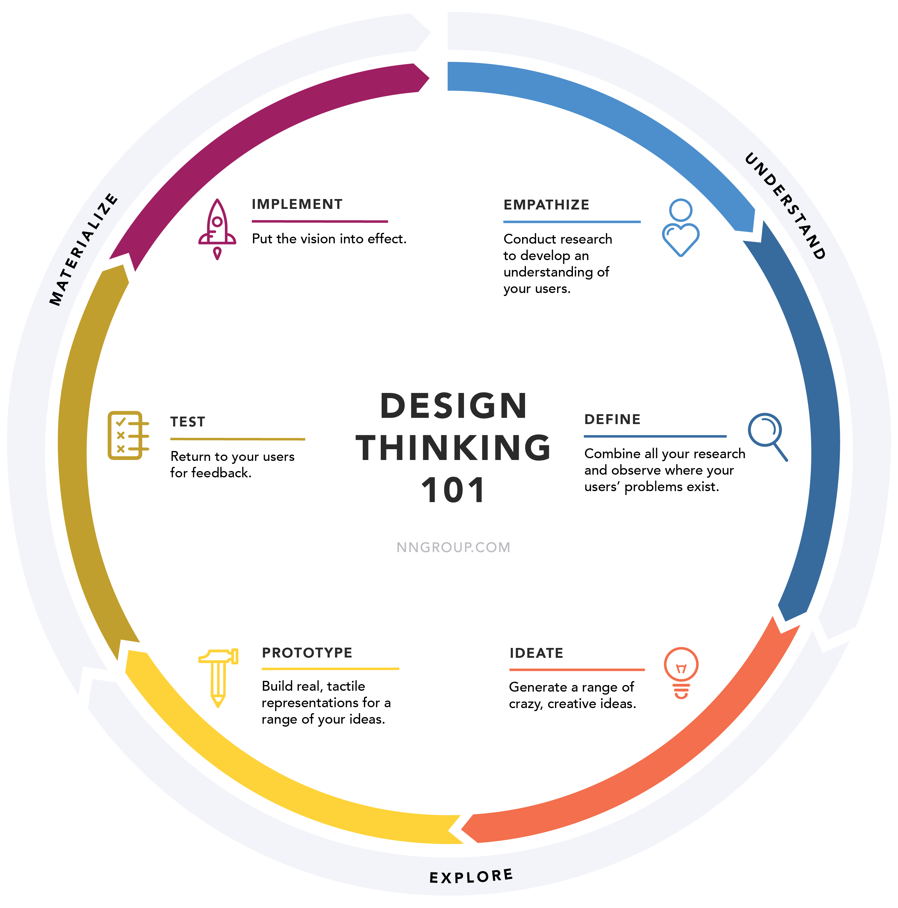
That's why we have design. If everything really was down to personal opinion of what's best for players and a project, things would look much different. This is the reason design exist, so we don't have to guess. To do design, one has to employ _design think_ on a project or task, similar to what's shown here:
Not doing so is guesswork. Sometimes though, and with enough experience, one can get a feel for user expectation and reception. In those cases and with _small enough tasks_ some parts of the design process may be skipped over, given importance and available resources. The main menu, since it's not adhering to any game menu convention in any real sense (apart from language), is a larger beast that would stand to gain from such practices.
I know that MT is a fully developer-driven project but sometimes it's beneficial to add in new methods and skills.
tacotexmex
on 2 Jul 2019
Development decisions are made by core devs so it will inevitably be based on their personal opinions of what's best for players and the project.
It's silly to suggest that development decisions shouldn't come from the core devs, that's exactly what we do. However remember, we make development decisions based on player feedback and based on what is best for players and the project.Keep in mind there will be technical aspects not understood by players which have to be taken into account, to keep the code simple, lightweight and maintainable. So players cannot have the final decision and their preference may not be practical.
I think that players like to be involved. My suggestion was not to make players develop a menu, but to let them decide between a few prepared mock ups.
What I suggest is a compromise of what you are discussing the whole time. You design multiple good possibilities and then ask the users what they want.
ghost
on 3 Jul 2019
tacotexmex,
If everything really was down to personal opinion of what's best for players and a project,
This is actually what happens in MT dev. The core devs make the final decisions, so these decisions are obviously personal judgements of what is best for the players and the project, they can't be anything else. If someone makes a decision, it is based on personal judgement.
Maybe we misunderstand each other due to use of language.
By 'personal opinion' i do not mean 'a person's own selfish preference ignoring everyone else', i made that clear above.
We do design, and do not guess, and the 'design thinking' in your image is exactly what happens. What i write isn't in conflict with that.
paramat
on 16 Jul 2019
Take a look at my small live example: http://numzero.hostfree.pw/mtgui/join.php?game=minetest
It is incomplete ofc, but e.g. server type filter works (not text search, though).
numberZero
on 22 Aug 2019
numberZero, that looks good but i'm not quite sure about the yellow button with a gradient and the text boxes. Maybe you could make the text boxes and the button green.
 QazCetelic
on 2 Sep 2019
QazCetelic
on 2 Sep 2019
By 'personal opinion' i do not mean 'a person's own selfish preference ignoring everyone else', i made that clear above.
I see what you mean. I guess I still find some of the claims somewhat baseless. While it's always theoretically possible to find player minorities supporting a certain design decision, one should always cater to the convention of majority in order to not make UI in this case an obstacle run. Convention from other game's menu designs is useful here, since its tells us what a majority of users expect: some distinctive snapshot from each save game/world, some metadata, a time stamp and so on. It's also good to know that a lot of time and resources was spent arriving at a certain solution and that we may incorporate those insights "for free".
Take a look at my small live example
I fail to see what problem this design is trying to solve, what is it?
tacotexmex
on 2 Sep 2019
~one should always cater to the convention of majority
Not always, as the majority convention is not always the best thing to do, and something new and better may be possible.
Convention from other game's menu designs is useful here, since its tells us what a majority of users expect
As above, what the majority expects is not always the best thing to do, and something better may be possible.
In fact, convention is what people are used to, not what they want or expect. They want and expect the best possible user interface, if improvement is possible (it usually is) this will not be the convention. People want and expect progress, innovation and the breaking of convention.
Following the crowd leads to no progress, no creativity, no innovation. Nothing you currently value in computer interfaces, including the current convention and 'what people expect', would exist if this philosophy was followed.~
EDIT: Sorry for offtopic.
paramat
on 2 Sep 2019
Rejecting well researched and tested best practices to be "creative and innovative" will result in a badly designed mess like our current menu
rubenwardy
on 2 Sep 2019
I think that players like to be involved. My suggestion was not to make players develop a menu, but to let them decide between a few prepared mock ups.
What I suggest is a compromise of what you are discussing the whole time. You design multiple good possibilities and then ask the users what they want.
Impossible to get a solid decision of what "users want" as the majority of users are not even on any of the communication platforms.
The only results will come from those who are on the forums and github... which is an extremely tiny fraction of the user base... which is one of the many reasons core-devs make these decisions.
And even _if_ polls or votes were a viable means of deciding... there would be so many varying desires, it would all just come down to core-dev decisions anyway.
My own opinion is, best to search for a decent existing UI system which can be integrated into MT.
Or... kidnapp a designer and be done with it. I have some rags and 1/2 bottle of chloroform (just sayin)
I _do_ know that players _love_ blingy menus with scrollbars and clickity sounds... and sometimes hover glows. Just easy enough to really screw things up for them
 TumeniNodes
on 2 Sep 2019
TumeniNodes
on 2 Sep 2019
Rejecting well researched and tested best practices to be "creative and innovative" will result in a badly designed mess like our current menu
Or like GNOME.
 kilbith
on 2 Sep 2019
kilbith
on 2 Sep 2019
Rejecting well researched and tested best practices
Which i didn't do or argue for. You can see i didn't use absolute language, and i implied that the convention is often the best thing to do with "... is not always the best thing to do".
Anyway, sorry for perpetuating an offtopic discussion with tacotexmex, that was a mistake.
paramat
on 3 Sep 2019
I think that the discussion definitely provides meaning and insight towards the end of a better menu design, so it’s on topic imo.
Just a quick note on
People want and expect progress, innovation and the breaking of convention.
I agree, if _in-game_. We don’t want UI design to stand in the way of the player getting to actually… play. That’s _bound_ to happen if we don’t invest huge resources in research. No one wants that. MT isn’t unconventional, it’s a regular singleplayer+multiplayer game with nearly identical requirements of a UI than any other such game.
I’d like to see _other_ design concepts as I feel most designs in this thread posted after mine is simply a version of my concept which is of course not necessarily bad, but my own version of my own concept still feels like the most coherent version tbh.
tacotexmex
on 3 Sep 2019
There's a couple of good ideas in this thread already, and a couple of not-so-good ideas.
What I am a bit missing here is a complete design that covers all important menus and sub-menus. Current ideas are only concerned with a part of the main menu structure.
Pretty images are also not enough for a complete design, you should also specify what each widget does (if it's not obvious).
Wuzzy2
on 3 Sep 2019
A few comments on @paulone's design:
Using the standard main menu format is a tried-and-tested recipe. So yeah, that's reasonable. Just needs to look a bit prettier. I suggest to also display the Minetest version number and add an exit button.
For the 2nd image, the game selection concept is way better. I like that a lot. I would add the text “Change game” to the button, written next to the game icon. It might not be obvious the game icon is clickable.
The game icon might also be larger (since there's a lot of space now), but I'm not sure what the standard icon size is, so I'm afraid most games would be blurry then. :(
The “[minetest]” label in the world list should be dropped, as it's always the same for each game, and thus both redundant and visual clutter. Maybe the shortname of the game could be displayed somewhere else, like in the top left corner, below the game name. Showing the game shortname might be useful if you somehow installed the same game twice, but under different directory names.
@numberZero:
We had the sidebar suggestion a lot, and I'm not commenting it. What I'm commenting is the server list.
First, yeah, the button is too blue but that's just a minor detail. I'm afraid displaying the game icon/name is a bit problematic, given that pretty much always mod the game to death; servers can be basically their own game in their own right.
I like the way how damage, PvP and Creative Mode are displayed on the right-hand side. And that there's more than enough room for the description. :) I don't understand why there is only one icon displayed in the list, however. Why change that? I also note you dropped the favourite star. There's no reason to do so, now that the design uses the whole screen, there's no reason to save space.
In general:
I strongly suggest to drop all drive-by suggestions in your designs, such as per-world settings
For anyone who is actually developing this: Please make sure the game banner works in ALL reasonable resolutions and aspect ratios. Because currently, the game banner still disappears in some resoultions, this bug's still not fixed. :-(
Wuzzy2
on 3 Sep 2019
A few comments on
@paulone's design
That's the wrong person; its pauloue.
 ClobberXD
on 3 Sep 2019
ClobberXD
on 3 Sep 2019
Can I get a proper roasting too, @Wuzzy2? 😃 https://www.figma.com/proto/ET2P1yfjaNSC6oZA7hDH0rHp/Main-menu?node-id=0%3A1&viewport=510%2C249%2C0.5&scaling=min-zoom
tacotexmex
on 3 Sep 2019
This website is broken. Please just post images to make it simpler.
Wuzzy2
on 3 Sep 2019
You mean you’re one of those noscript cowboys 🤠
It was this thing further up the thread.
tacotexmex
on 3 Sep 2019
I'm 100% for texmex's idea
LoneWolfHT
on 4 Sep 2019
I like texmex's idea, although it could use some clarification. When you click on the Minetest logo, I'm guessing it brings you to a game selection dialog. If that's so, there needs to be some text that shows this.
v-rob
on 5 Sep 2019
You don’t have to guess, just try the prototype (hint: ”Change game” changes game, though not prototyped yet)
tacotexmex
on 5 Sep 2019
Oh, didn't notice that. I like it a lot, but like someone said (paramat maybe?), the world images might be bad, like the player looking at the floor. There's also the issue of which player to show the image of if there's multiple people on the world. Beside that, this is a great idea. Once I finish #8646's support for containers, this will be possible with stretch and fill combined.
v-rob
on 6 Sep 2019
Finally. I hope soon this project will say "goodbye" to those goddamn formspecs along with ugly, ahem, UI.
Oh, and about screenshots in the world list: maybe it would be better to make it an option, so everyone remain happy? I really can't imagine that it would be hard to do. Just a switch between two layouts of a single list, no more, no less.
 Iniquitatis
on 6 Sep 2019
Iniquitatis
on 6 Sep 2019
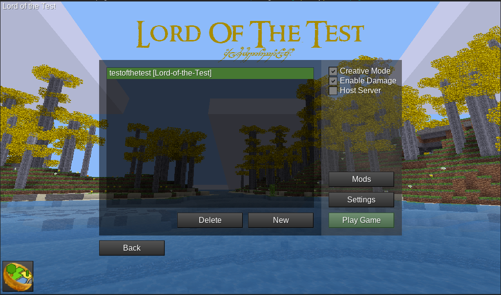
Here's my proposal for a new main menu. Please ignore the style issues, this is a quickly thrown together mock up. I plan for the actual thing to be flat and not have ugly buttons.
The aim is to put game support and ContentDB in the spotlight, and to switch to a more conventional main menu design.
The first thing a user sees is the game selection window, which features a list of installed games, featured content from CDB, and some quick links. If the user selects a game, then they will go to that game's main menu.
Dialogs like Settings, ContentDB, and Join World can both appear with or without a game selected, and their behaviour will vary because of this.
Interactive version
It is recommended to use the interactive version, as it will demonstrate the flow
Open Figma.com prototype (warning: proprietary JS)
Tip: click on the background to see what is clickable
Screenshots
Change Game screen, shown on first launch

Game mainmenu
Join World with a game selected

Join World with no game selected

ContentDB with a game selected

rubenwardy
on 23 Feb 2020
Interactive version: https://www.figma.com/proto/sXoPmpoSl7RzBQcbMJbUFn/MinetestMainMenu?node-id=0%3A1&scaling=min-zoom
Warning: This link posted by rubenwardy goes to proprietary code.
Game selector:
Game selection is OK if you ignore the sidebar.
I like that it contains screenshot, name and description.
The sidebar looks confusing. Why is it titled “Minetest”?
It's not really clear which games are already installed and which not.
But only 3 featured games? Man, I don't know … Anyway, we definitely need to discuss curation somewhere else (not here).
The information density is quite load. A full screen worth of games only contains a small amount of games, and you have to scroll a lot to reveal them all. Screen space is not used well.
Main menu:
I like that it's very simple.
I dislike “Join World” and “Load World”. There's too much reading between the lines the user has to do here. Also, you don't join a world, you join a server (IMO).
The button “Credits” doesn't make sense when the title is “MineClone 2” but the credits are actually for Minetest.
I dislike that the buttons are too small.
I dislike the main menu buttons don't have borders anymore. If the background is white, these buttons are invisible.
I dislike that the button is named “Content”. It can mean anything to newcomers.
I dislike that currently, Content contains both texture packs and game/mod stuff. Selecting a texture pack always feels very awkward to me. Especially unselecting. I have to click on Content, then click on a texture pack to be able to unselect it. Very unlogical. I propose to bring the old texture pack menu back. It was more simple and logical.
I dislike that the “Quit” button is still missing :P
Other menus:
Are more or less OK.
All menus:
I dislike that all menus still are very small and leave most of the screen empty. Why is so much screen space wasted?
I dislike that the Back button is outside the box. It looks wrong somehow.
I propose that the game is changable in every menu (where technically possible), for convenience. Display the name of the current game in one of the 4 screen corners and below/above it a button that says “change game”.
I dislike that neither the name of the game nor Minetest nor version number is displayed anyway.
Style:
Yes, it's ugly. Really, really ugly and unprofessional-looking. I know it's just a mockup and basically just a copy of current “style”. But I think style should be discussed as well. Maybe in a different issue if you insist. But we need to discuss this.
Because I really got sick of the sad graytones and flat boxes that have plagued Minetest's main menu for so long now. They look soooo cheap! And I don't think simple round corners are really helping.
Wuzzy2
on 23 Feb 2020
Thanks for your feedback. I won't reply to it all now
Warning: This link posted by rubenwardy goes to proprietary code
I edited the link text to put a warning not long after posting
The button “Credits” doesn't make sense when the title is “MineClone 2” but the credits are actually for Minetest.
The aim is for this to be MineClone 2 credits eventually, until then the credits won't appear there
rubenwardy
on 23 Feb 2020
I dislike that the buttons are too small.
I dislike the main menu buttons don't have borders anymore. If the background is white, these buttons are invisible.
The buttons extend further than the text, and there is a drop shadow around them. I will need to check whether this is enough contrast for visibility-impaired users (almost certainly not on a white background).
I dislike “Join World” and “Load World”. There's too much reading between the lines the user has to do here. Also, you don't join a world, you join a server (IMO).
These are currently "Join Game" and "Load Game" which is more confusing, because it's a different meaning of game
I'll reply to the rest later. Thanks again for the feedback
rubenwardy
on 23 Feb 2020
The first thing a user sees is the game selection window, which features a list of installed games, featured content from CDB, and some quick links.
Seems good. Game selection is rather neglected currently. It really should be up front and before you get to anything else.
Also, this will help to encourage downloading a game from CDB instead of being biased towards the use of MTGame, with all the unfulfilled expectations and endless repetitive complaining that then results =)
This will also make it practical, if decided, to not bundle any games with MT, which is an interesting possibility.
Game mainmenu:
Vertically stacked buttons are good, a much better for use of space then horizontal tabs.
The loss of the tabs then creates a cleaner appearence.
The whole concept seems good to me so far.
paramat
on 23 Feb 2020
Hmmmm, thinking more about it, I think there's still a major conceptual flaw in the whole design, and this is more serious than just my random nitpicks:
Minetest is still not properly logically separated from the games, it's still a bit of a mess. Game stuff bleeds over to Minetest and vice-versa.
What I mean with this is this: You must have menus that only make sense for Minetest (the Settings and Credits). And there are menus that only make sense for the currently-selected game. That's a given. The question is how are these menus exposed to the player.
So. In the proposed main menu screen, some buttons are clearly relative to the current game (New/Load/Join World). But Settings and Credits aren't.
So this main menu mixes Minetest stuff with game stuff. Also, this structure is conceptually not much different from the current situation, it's basically just that the tabs turn into buttons, but otherwise it's basically the same.
Plus, the current Settings menu contains settings for both Minetest AND the games. Another example how Minetest and games bleed into each other.
Putting it all together, it's no surprise that new players always struggle with the difference of Minetest and games for Minetest.
I'm afraid just taking the tabs and turning them into main menu buttons actually does the trick. Maybe I can think of something myself, but no promises. It's a challenging problem.
But I agree that being upfront with game selection is definitely a good thing either way. I was more complaining about the concrete execution and details.
Wuzzy2
on 23 Feb 2020
It is tricky. The design has ContentDB, Join Game, and Load game behave differently (ie: filtering) when you have a game selected vs when you access it from the home screen. It's hard to show the difference, and it relies on checkboxes to enable this behaviour which is argh
Credits is the simplest one - I can remove it from the game main menu, and then only readd it when games support having credits (this was likely be done using games/mineclone2/menu/init.lua rather than being hard coded)
rubenwardy
on 23 Feb 2020
I'm trying to do this in a way where I can break it up into multiple PRs, and split work up. This design is also mainly aiming to show navigation and overaching design - the formspec layout of each tab is kept, whereas I plan to redesign each page to look nicer anyway. The issue of settings/credits/load/cdb is part of overarching design
rubenwardy
on 23 Feb 2020
With all these conceptual woes at hand, how about we take a step back in order ot nail the user flows and leave actual UI for when that's completed?
tacotexmex
on 23 Feb 2020
My mock up is exactly that - to show the flow whilst not redesigning every single page. The actual UI itself is flexible. A plan to stick some actual users in front of it and get them to go through it
It may be of some value to actually write down the desired use cases
rubenwardy
on 23 Feb 2020
Slight tweak to make the choose game screen clearer:
rubenwardy
on 23 Feb 2020
actually write down the desired use cases
This is what I had in mind. The mockups have severe context issues so I reckon some proper user flow scenarios can help alleviate that.
tacotexmex
on 23 Feb 2020
The problem is that the cause of the context changes are required for the main menu to actually represent how minetest works. We need games to be upfront and center. This can be alleviated by having a game drop down or change link in every screen to show what is currently selected, but going back to a single main menu is admitting defeat imo
After asking some people, here are the common actions:
- Join any online server
- Create, configure, and load a singleplayer game
- Download content
- Change texture pack
rubenwardy
on 23 Feb 2020
Here's my mock-up of the main menu:
https://satoshiupload.com/images/usUNi3YHJ9.png
Note this is only the layout, there's no style applied.
Structure:
- Top left corner displays current game and allows you to change the game
- The center prominently displays all game-relevant features
- The bottom has the more “technical” buttons
Explanation:
<header.png>and<footer.png>: From game'smenufolder<game name>: Game name fromgame.conf<background.png>: Stretched across the blue area- Change game: Game selection screen
- Content: List of all installed
- Quit: Exit Minetest
- Settings: Global settings
- Game settings: Only game settings (hidden if game has no
settingtypes.txt) - Credits: Minetest credits + game credits combined
- Singleplayer: Leads to world selection list (see below)
- Multiplayer: Leads to server list (see below)
My mock-up requires a couple of changes to the sub-menus as well:
World selection list (Singleplayer):
- Same as current one, but remove checkbox “Host server”
Server list:
- Same as current one, but add button “Host server”
World selection list (Multiplayer):
- Same as current one, but always display all server settings and remove checkbox “Host server”
Game settings:
- This is a new menu that is the same as “All Settings”, but only settings for the current game are shown, so it's easier to navigate
Wuzzy2
on 23 Feb 2020
Wuzzy2 helpfully mentioned some things that i will comment on:
- The names of the main menu buttons need improving, but this is a mockup so a minor point.
- I agree that the main menu options should be buttons for visibility on all backgrounds, and for consistency. I have normal eyesight and with that MC2 background the text is uncomfortable to read against sky. Even with a drop shadow around the text it will be painful to read against a bright background.
- The structure of CDB is somewhat offtopic, best dealt with elsewhere, it is ok so lets not get sidetracked.
> I dislike that all menus still are very small and leave most of the screen empty. Why is so much screen space wasted?
That probably depends on game window size as currently, perhaps not an issue.
- Back button outside the box seems suitable, as it is a back-link to main menu buttons, so not so much a part of each dialog.
I propose that the game is changable in every menu (where technically possible), for convenience. Display the name of the current game in one of the 4 screen corners and below/above it a button that says “change game”.
-1 That is unnecessary, complex and clutters each screen, removing valuable space. Users do not change game often.
Yes, it's ugly. Really, really ugly and unprofessional-looking. I know it's just a mockup
It is not remotely that bad. Even though this is a mockup it is an improvement and is acceptable. Besides, UI improvements will make each dialog more flexible.
We are not professionals =D
So this main menu mixes Minetest stuff with game stuff.
Dialogs like Settings, ContentDB, and Join World can both appear with or without a game selected
This seems fine. if a game is selected, always show that game's background image, even for engine dialogs. Exiting a game for engine dialogs seems awkward.
Plus, the current Settings menu contains settings for both Minetest AND the games.
This is not a problem. When you are in a game, settings should obviously contain both game and engine settings, because that is how it would naturally be in a computer game which is just a single game.
If i go to settings i want all settings there, engine and game, splitting settings into 2 different locations is less convenient and less intuitive, as well as being more complex.
Again, this is somewhat offtopic and can be dealt with elsewhere when we attend to each dialog.
I'm trying to do this in a way where I can break it up into multiple PRs, and split work up.
Good idea. And i encourage not being too perfectionist and not trying to rethink and rewrite absolutely everything at once, i think Wuzzy2 is making this mistake to a small degree.
Remember that this needs to be developable, reviewable and maintainable by a small number of active core devs who have very little time. So simplicity is high priority (roadmaps).
paramat
on 24 Feb 2020
Here's my mock-up of the main menu
What should be shown on first launch? Minetest Game shouldn't be preselected, and it needs to handle not having any games installed. The point of my game selection window is to make game selection the first thing a new user sees, which helps clarify the purpose
and for consistency
It's not inconsistent for the game's main menu to have such a design - this screen isn't a dialog.
It being left aligned may be the inconsistent thing
rubenwardy
on 24 Feb 2020
What should be shown on first launch?
Basically the same thing that you have already suggested.
Wuzzy2
on 25 Feb 2020
To give my two cents:
Tackling the server list:

I constate:
- Favorite indicator (star) does not need to be shown; favs are at the top anyways. A seperating row (e. g. "Non Favorites") would be sufficient.
- The three gamemode indicators Creative, Damage Enabled and PvP enabled can be merged
 appgurueu
on 9 Mar 2020
appgurueu
on 9 Mar 2020
The three gamemode indicators Creative, Damage Enabled and PvP enabled can be merged
No, they can't. What's a gamemode?
Wuzzy2
on 9 Mar 2020
Possible modes are "Creative, Damage Enabled and PvP Enabled"
They can be merged as follows:
- Creative -> Creative
- Damage Enabled -> Damage Enabled (Survival)
- Damage Enabled + PvP Enabled -> PvP Enabled
Because:
- Creative + Damage Enabled or + PvP Enabled makes no sense, so Creative usually is Creative
- PvP Enabled without Damage Enabled makes no sense
- Damage Enabled alone basically means survival
And, regarding the separating rows, there should be a second one - "Incompatible servers" for 0.4x servers.
appgurueu
on 10 Mar 2020
For comparison, serverlist before:
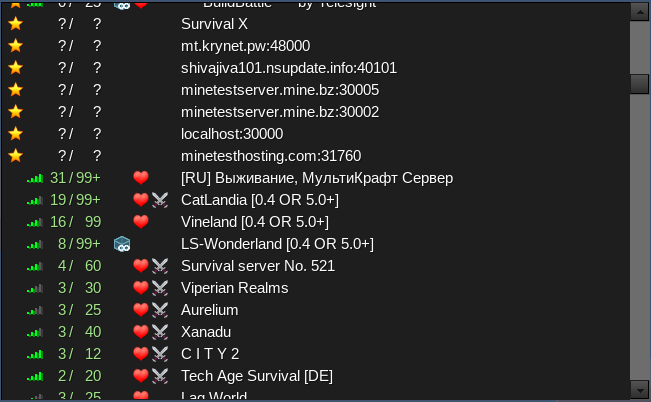
To illustrate what I meant, serverlist afterwards:
- Removed the favourite indicator
- Merged the three gamemode indicators into one
Much tidier, isn't it?
appgurueu
on 11 Mar 2020
Not sure you can merge a server that has Creative and Damage enabled, removing the damage symbol if PvP is enabled makes sense though
LoneWolfHT
on 11 Mar 2020
After scrolling through the serverlist, I found that there are quite some servers with weird configurations. I still think that there is no issue with merging the three flags.
Here's my latest update; I'm getting into issues with properly aligning the servers. I want to not have the dividers impact the server alignment.
I see 3 possible solutions:
- Remove dividers
- Keep it with inline alignment
- Use dividers aligned with server text
appgurueu
on 11 Mar 2020
Can we get rid of this?
Simple Main Menu, supposedly necessary for smaller screens. Can be enabled in settings by setting main_menu_style to simple and then restarting. It apparently crashes when trying singleplayer, and resizing makes me feel it isn't even better...
appgurueu
on 11 Mar 2020
No, that's used(?) by Android, you can't just get rid of it.
 sfan5
on 11 Mar 2020
sfan5
on 11 Mar 2020
Doesn't the normal menu work on Android?
Anyways, using width I could get quite some nice thing:
appgurueu
on 11 Mar 2020
No, that's used by Android, you can't just get rid of it.
I believe Android has defaulted to the full menu since 5
rubenwardy
on 11 Mar 2020
@appgurueu
Had this idea as well some time ago, though I've made "mixed" icons
Fixer-007
on 11 Mar 2020
I seem to remember that the simple menu is now no longer used and we planned to remove it, that just has not been done yet.
appgurueu,
Possible modes are "Creative, Damage Enabled and PvP Enabled"
They can be merged as follows:
Creative -> Creative
Damage Enabled -> Damage Enabled (Survival)
Damage Enabled + PvP Enabled -> PvP Enabled
Because:
Creative + Damage Enabled or + PvP Enabled makes no sense, so Creative usually is Creative
Even if they do not make much sense to you, they are valid modes and servers actually exist.
The icons exist to give information, if some dubious logic is used to combine them, then they completely lose their function because the user does not know what logic has been used to combine them, and may disagree with your logic.
For example, i very much want to avoid PVP servers, but with your changes i could end up on a creative + PVP server that was labelled as creative.
Besides that, is there a great need to combine the mode columns? Does not seem so, it just saves 2 columns.
So, i disapprove of combining icons in this way.
After scrolling through the serverlist, I found that there are quite some servers with weird configurations.
Well, there you go =)
If the icons are compressed into one column they need to be completely rethought and the icons changed (such as perhaps using superimposed icons) to display all the necessary information. That comes after deciding what is the necessary information.
So it is best to open an issue to discuss this first.
paramat
on 11 Mar 2020
We already have an issue for such conversations (this one).
I have written a script to filter all "weird" combinations.
FLAGS: creative; damage, COMPILED TO: creative
*** BuildBattle *** by Telesight
MT   L I T T L E   P O N I E S
Voor iedereen, for everybody
Walhalla
FLAGS: creative; damage; pvp, COMPILED TO: creative
--Parkour-- by Survival--
Ahmed Hamza Kenan
DudePro
German-Trash-server
MUNDO CREATIVO
Outland
Prool's server. Сервер Пруля
SP Server
Sockhausen
TroncoPaja
ardiblox
minetest.zirtin.net
« Parkour » by Lowe
FLAGS: creative; pvp, COMPILED TO: creative
Adventskalender
Go! Go! Sango!! Tatsuta Club (^^)v
MSC_Minetest
Mesozoic Minetest!
Osterwelt Kemnat
Tempelwelt
\__+albATros+__/
There are three categories - creative + damage, creative + pvp, and creative + damage + pvp.
Most of the less than 20 servers on the list are rather unpopular (and/or not too well maintained).
The only notable (IMO) is Telesight's BuildBattle, which would be (properly) displayed as creative instead of the confusing "creative, damage enabled".
appgurueu
on 12 Mar 2020
I have the feeling we still haven't made any serious progress here. :-(
We still haven't even managed to agree on a rough design yet. Without this, this is not going anywhere. :-(
Wuzzy2
on 30 Apr 2020
Hi,
I'm not sure who this email was went for, but it's not me.
On Thu, Apr 30, 2020 at 11:40 AM Wuzzy notifications@github.com wrote:
I have the feeling we still haven't made any serious progress here. :-(
We still haven't even managed to agree on a rough design yet. Without
this, this is not going anywhere. :-(—
You are receiving this because you were mentioned.
Reply to this email directly, view it on GitHub
https://github.com/minetest/minetest/issues/6733#issuecomment-621933717,
or unsubscribe
https://github.com/notifications/unsubscribe-auth/AEYHRXOSICRRIZOUUO2OYBDRPGLW7ANCNFSM4EGQLH2Q
.
 paulone
on 30 Apr 2020
paulone
on 30 Apr 2020
I'm not sure who this email was went for, but it's not me.
You are subscribed to an issue on GitHub, and that was a notification.
rubenwardy
on 30 Apr 2020
OK: I have amended my design. Images coming soon
- I have removed the classic mainmenu screen in favour of the side tabs.
- I have removed context-sensitive server list filtering and such. Instead, I think the following should be done:
- Minetest Game should not have any filtering whatsoever. This should be disabled in game.conf. The reason for this is that as the default, there are likely to be a lot of servers that report MTG as the game despite using a custom one.
- Other games won't filter, but will show servers running that game at the top of the list, below favourites. This will be clearly marked using the sections shown in appgurueu's server list PR
- I think Wuzzy's idea of having an engine bottom-bar on all screens is a good idea in order to show context.
Thoughts still need to be made on the following areas:
- Renaming "Content"
- Graphic design - my design still looks ugly
- Showing correct content for a game in ContentDB
- Featured content on the home screen
- Better alternatives to the bottom bar?
rubenwardy
on 30 Apr 2020
I think the graphical design / aesthetics should be left in a differnt issue. Better get the overall structure / layouting right.
Showing correct content for a game in ContentDB
That's also too broad in scope IMO. Better to split this up in smaller managable chunks.
Wuzzy2
on 30 Apr 2020
That's also too broad in scope IMO. Better to split this up in smaller managable chunks.
I think it's worth considering in terms of navigation, but not be implemented for a while. I mean, we don't even have dependency downloads yet!
rubenwardy
on 30 Apr 2020
Figma prototype (warning: proprietary): https://www.figma.com/proto/sXoPmpoSl7RzBQcbMJbUFn/MinetestMainMenu?node-id=1%3A16&scaling=min-zoom
Choose Game Screen
Shown on first load, and also when "change game" is selected.

Load Game Screen
Default game main menu page. Shown after selecting a game

rubenwardy
on 30 Apr 2020
I don't like how this splits the game vs the engine menu bars so much, as as is necessary to retain relevant context about where you are. The aim of the engine bottom bar is to make context more obvious, there may be better ways to do that
rubenwardy
on 30 Apr 2020
I would move the "Change Game" button next to the game name, and also maybe put the game's icon in this corner.
A problem I have with this design is there's still a “Join Game” button in the game's screen. This is a problem because “Join Game” lets players join any server. You might argue that servers get filtered by game in a later version, but I doubt this might be a good idea, given how much some servers are modified, that it's beyond recognition.
The singleplayer vs multiplayer context needs a clearer distinction IMO. And it should not be mixed.
Wuzzy2
on 30 Apr 2020
You might argue that servers get filtered by game in a later version, but I doubt this might be a good idea, given how much some servers are modified, that it's beyond recognition.
See my comment above:
- I have removed context-sensitive server list filtering and such. Instead, I think the following should be done:
- Minetest Game should not have any filtering whatsoever. This should be disabled in game.conf. The reason for this is that as the default, there are likely to be a lot of servers that report MTG as the game despite using a custom one.
- Other games won't filter, but will show servers running that game at the top of the list, below favourites. This will be clearly marked using the sections shown in appgurueu's server list PR
rubenwardy
on 30 Apr 2020
Here's a spin on the game bar:

rubenwardy
on 27 May 2020
Please don't add back the game bar ever again. It's extremely user-unfriendly. I have tons of games installed and selecting a game takes ages (because of scrolling buttons I have to click many times).
Wuzzy2
on 27 May 2020
With the new choose game screen, it'll be much more clear. Plus, it can use scroll containers rather than left right buttons. It allows fast game switching, and is a nice way to display the current game
rubenwardy
on 27 May 2020
Choose Game Screen
Shown on first load, and also when "change game" is selected.
This seems good, and possibly partially does what i am about to request.
I have 2 requests / suggestions:
- MT should be MTG-neutral, even if MTG is shipped with MT.
('MTG-neutral' excludes MTG being near or at the top of the list of featured / recommended games.)
So, the first screen you see on startup is a game-neutral engine screen that encourages you to browse and download a game from CDB, and gives you the option to select a game from those currently installed (if any are).
For the first startup of MT, only MTG will be installed (for now, i hope we can eventually not ship with any games).
I really dislike how currently, MTG is set as the default game and when you startup you immediately enter a MTG-themed menu. - This main menu redesign should be designed assuming we will probably eventually not ship with any games, so should be designed to be prepared for that and be compatible with that.
So, perhaps this should be designed right now such that, if no games are shipped with MT, the initial 'choose game' screen clearly guides the user to download a game from CDB.
Then, for now, we can continue to ship with MTG, but if we decide to ship with no games, the menu will act correctly.
paramat
on 29 May 2020
when you startup you immediately enter a MTG-themed menu.
I reused the background from MTG, but it's not intentionally MTG-themed. It was an experiment with side bars and panes. This is more of an issue for #9802
rubenwardy
on 29 May 2020
I really dislike how currently, MTG is set as the default game and when you startup you immediately enter a MTG-themed menu.
To be clear, here i was referring to MT master branch, not any of your mockups.
paramat
on 10 Jun 2020
As opposed to devtest?
On Wed, Jun 10, 2020, 4:28 PM Paramat notifications@github.com wrote:
I really dislike how currently, MTG is set as the default game and when
you startup you immediately enter a MTG-themed menu.To be clear, here is was referring to MT master branch, not any of your
mockups.—
You are receiving this because you were mentioned.
Reply to this email directly, view it on GitHub
https://github.com/minetest/minetest/issues/6733#issuecomment-642239928,
or unsubscribe
https://github.com/notifications/unsubscribe-auth/AFS4UYX6MGLGDNT6GP3KPITRV7UHDANCNFSM4EGQLH2Q
.
ghost
on 10 Jun 2020
?
paramat
on 11 Jun 2020
by @tacotexmex
Just throwing something out there:
I think this is the best one. You just need to put a exit button and highlight the button over mouse to makes user see where the button is
How can I help in make the minetest menu?
 BruceMustache
on 27 Jun 2020
BruceMustache
on 27 Jun 2020
I think this is the best one. You just need to put a exit button and highlight the button over mouse to makes user see where the button is
How can I help in make the minetest menu?
That design doesn't take games into account, and isn't possible to implement with our current GUI system. It's up for debate as to whether a new menu should take games into account, and if we should work on a new GUI system first
rubenwardy
on 1 Jul 2020
That design doesn't take games into account, and isn't possible to implement with our current GUI system. It's up for debate as to whether a new menu should take games into account, and if we should work on a new GUI system first
And what about the "change game" button?
BruceMustache
on 1 Jul 2020
Oh yes, I missed that. In which case, the prerequisite would be adding a GUI system that supports layouting, and can be made full screen. This could be an extension of the existing formspec system, or something else. It's certainly pretty nontrivial
rubenwardy
on 1 Jul 2020
In which case, the prerequisite would be adding a GUI system that supports layouting, and can be made full screen. This could be an extension of the existing formspec system, or something else. It's certainly pretty nontrivial
If you have time, look at https://github.com/v-rob/minetest/tree/formspec-units, specifically lua_api.txt. Experimental, and I decided that it wasn't a good idea until after refactoring and more discussion. I've done extensive research into the nasty parts of scroll containers, anchor, position, size, and parserData while making that, and adding any sort of full-screen stuff will require much refactoring beforehand and _then_ even more thought to make sure it works properly with things like #8679 that are based on coordinates.
Basically, if a fullscreen main menu will be supported, then either a) the main menu will have to wait until after formspec refactoring and another PR to add layouting (a very long time unless a highly concerted effort is made), b) give the main menu knowledge of the size of the screen in pixels (yuk), or c) settle for something less like #8630 (has coordinate stretching).
v-rob
on 2 Jul 2020
@tacotexmex can you make more mock ups for "change game", "content", "setting", "about"?
BruceMustache
on 25 Jul 2020
@BruceMustache I have put my concept out there. That's enough for now, since it's currently not possible to implement nor desirable by the devs.
Aaand I've kind lost of interest in Minetest since I got on the oilboi train. 🚂😎💨
tacotexmex
on 2 Aug 2020
The main thing I'm interested in is the navigation flow and the initial onboarding - texmex's concept can be used as the concrete GUI design with my games splashscreen as "change game"
But yes, more GUI improvements are needed
rubenwardy
on 2 Aug 2020
@tacotexmex what do you mean with "oilboil train"?
BruceMustache
on 3 Aug 2020
We can also make minetest client in another language
Like use c++ to build the client with qt framework
Or jsvascript to build with electron framework
Or something else
BruceMustache
on 6 Aug 2020
Electron doesn’t seem like a great fit if you want to keep it lightweight.
QazCetelic
on 6 Aug 2020
Related issues
 KenneyNL
·
69Comments
numberZero
·
130Comments
rubenwardy
·
53Comments
rubenwardy
·
117Comments
KenneyNL
·
66Comments
KenneyNL
·
69Comments
numberZero
·
130Comments
rubenwardy
·
53Comments
rubenwardy
·
117Comments
KenneyNL
·
66Comments
Most helpful comment
Just throwing something out there: