Microsoft-ui-xaml: Proposal: Additional Semi-Transparent Background Textures
Proposal: Additional Semi-Transparent Background Textures
Summary
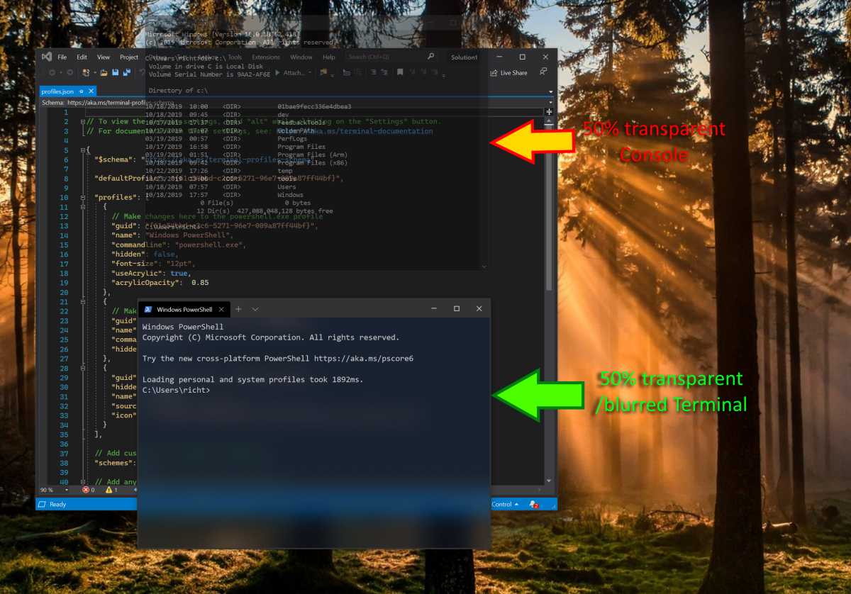
The Windows Command-Line team added background transparency to Windows Console back in 2015. Whilst this feature was well recieved, users have provided copious feedback that pure transparency can result in the text of the foreground Console “colliding” with the text of a Console/Terminal/Editor underneath.
To address this issue, the Windows Terminal was designed and built to take advantage of the WinUI Acrylic background blur effect.

New Background Transparency, Blurs & Textures
Since introducing this feature during the Terminal's unveiling at Build 2019, many users have asked for greater and independent control over the background transparency/blur effect.
To satisfy these asks, we (Terminal) would like to work with the WinUI team to design, create, and test new semi-transparent background textures that offer 3 adjustable layers
- Transparency/Opacity: Adjustable level of transparency allowing the user to see what is happening in apps running underneath the currently focused Terminal
- Blur: Adjustable background blur, allowing the user to avoid visual collisions between the text within the foreground Terminal, and text that might be displayed by a Console/Terminal/text-editor underneath
- Texture: Various forms of glass texture could create pleasing visual effects that many users may enjoy (e.g. water droplets, frosted glass, vintage glass, etc.)
Rationale
- Users are requesting independently adjustable background transparency and blur
- Helps differentiate Terminal from other, simpler Terminals
- Ensures Terminal can deliver features expected of modern, high-end terminals
All 7 comments
How does Notepads pull it off? Their implementation of acrylic also works in Tablet Mode unlike the other implementations.

To put it another way, to fit into the Fluent Design concept of materials.
Acrylic - Blurred, Translucent, sometimes Tinted, subtle grainy noise Texture.
Perspex - Transparent, no Blur, sometimes Tinted.
Glass - Transparent, slight Blur, sometimes Tinted, Reflective shimmer
You could even take HoloLens effects, and categorise them as materials. The colour shifting as you move your head, the outline as you gaze at things
@shaheedmalik I believe Notepads would be using an effect brush that they created from composition APIs. This is something that @bitcrazed could do, but I believe here he's asking that we support a more systematized blur effect - correct?
@shaheedmalik @kikisaints
Hey guys, I am the author of Notepads, this is how I make background acrylic effect "always on" for both title bar and window body: https://github.com/JasonStein/Notepads/blob/12940adc674a9ba6fa336e3aaa8652978e8a8c8e/src/Notepads/Services/ThemeSettingsService.cs#L253
I indeed created the Acrylic brush myself using "AcrylicBackgroundSource.HostBackdrop" with help of UICompositionAnimations library to make my life easier (ref: https://github.com/Sergio0694/UICompositionAnimations). It is basically creating the brush from scratch using composition APIs (AcrylicBackgroundSource.HostBackdrop + Noise texture).
Key @Kikisaints - sorry for the late reply! Yes, we (Terminal) would love to be able to support a broader range of semi-translucent background textures in the future :)
@JasonStein Thanks for the tip - @cinnamon-msft and the Terminal team will consider.
@JasonStein Thanks for the tip - @cinnamon-msft and the Terminal team will consider.
Here is the source code that I wrote to construct a acrylic brush on the fly:
https://github.com/JasonStein/Notepads/blob/master/src/Notepads/Brushes/HostBackdropAcrylicBrush.cs
You can find similar composition code in WinUI repo written in C++: https://github.com/microsoft/microsoft-ui-xaml/blob/f3dbb44fa5bca4a5b42eaf5dbf26a1a4be5b03f9/dev/Materials/Acrylic/AcrylicBrush.cpp#L650
Screenshots:

Most helpful comment
To put it another way, to fit into the Fluent Design concept of materials.
Acrylic - Blurred, Translucent, sometimes Tinted, subtle grainy noise Texture.
Perspex - Transparent, no Blur, sometimes Tinted.
Glass - Transparent, slight Blur, sometimes Tinted, Reflective shimmer
You could even take HoloLens effects, and categorise them as materials. The colour shifting as you move your head, the outline as you gaze at things