Microsoft-ui-xaml: AppBarButton with Flyout with chevron in 1809
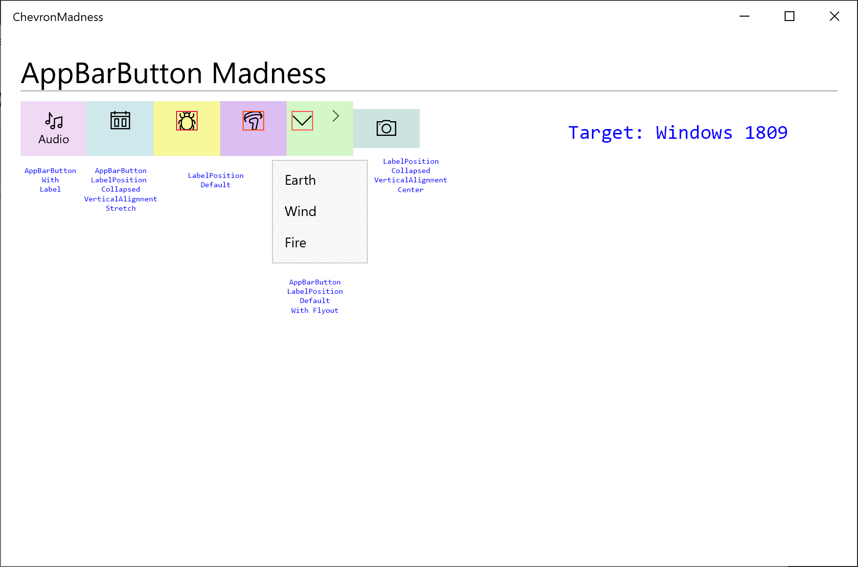
Issue: AppBarButton with Flyouts gained an unsightly growth in the shape of a chevron when targeting 1809.
Sample project demonstrating issues with AppBarButton when targeting 1809 is available at Sample Project

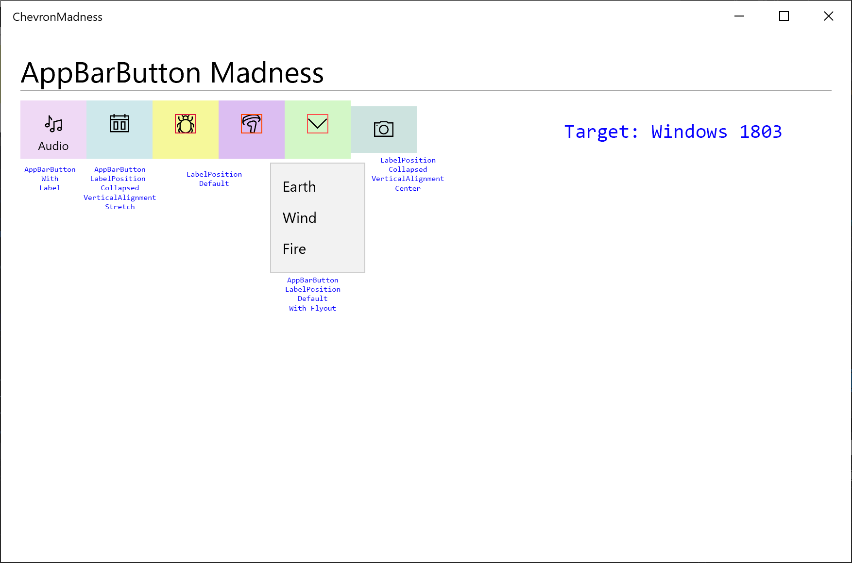
An existing project that targeted 1803 with AppBarButtons, specifically ones with a Flyout, appear as expected. Even though it doesn't add a chevron, it is still puzzling why when stretched vertically and the LabelPosition is collapsed, why the icon doesn't move to the vertical center, or a way to control that isn't given. Notice the far right icon with LabelPosition collapsed and VerticalAlignment is not set to stretch, but rather to center. In that situation the icon is vertically centered, but button height is a bit of an issue as the icon won't stay centered.

Once the target is updated to 1809, the AppBarButtons with Flyouts get a new right chevron icon and the glyph gets shoved to the left.

If you try to style this button to remove the chevron, downlevel versions of Windows 10 (1703,1709, etc.) suffer from XAML parsing exceptions. See this stackoverflow post for a proposed style which will cause issues with older versions. STACKOVERFLOW - remove chevron
Prognosis
It is unlikely that this can be fixed as the default styles shipped with 1809 are pretty well fixed. The only solution that seems plausible is to create a OS independent equivalent of the AppBarButton through WinUI that will work across the supported versions of Windows 10. Other suggestions, such as using a Button with all the styles needed to accomplish the same behavior of an AppBarButton feel cumbersome.
All 8 comments
I have the very same issue. My customized TransportControls which have fixed Width looks ugly.

@mobiletonster - thank you for opening this issue!
How does this AppBarButton style gel with SplitButton? Snip & Sketch puts a SplitButton next to AppBarButtons inside of a StackPanel. Perhaps a solution would be to add support for SplitButtons or similarly templated SplitAppBarButtons inside of a CommandBar?
@xyzzer - It's already possible to put a SplitButton inside a CommandBar using AppBarElementContainer.
@YuliKl Ahh, sweet! Does its layout update correctly to match regular app bar button's layout depending on the label positioning and "minimization state" of the CommandBar?
The chevron is a bug we introduced inadvertently. The design intent had been for the chevron to appear when an AppBarButton with an attached flyout was in CommandBar's secondary commands. This design allows for CommandBar's overflow to show a sub-menu similar to MenuFlyout's UX.
Unfortunately we won't be able to fix this bug until after WinUI 3.0 ships. In the meantime, there are several workarounds.
Place the AppBarButton into a CommandBar
Inside a CommandBar, an AppBarButton with an attached flyout behaves correctly.
<Page
...
xmlns:contract3Present="http://schemas.microsoft.com/winfx/2006/xaml/presentation?IsApiContractPresent(Windows.Foundation.UniversalApiContract, 5)">
<CommandBar contract3Present:OverflowButtonVisibility="Collapsed" Background="Transparent" HorizontalAlignment="Left">
<AppBarButton>
<FontIcon FontFamily="Segoe MDL2 Assets" Glyph=""/>
<AppBarButton.Flyout>
...
</AppBarButton.Flyout>
</AppBarButton>
</CommandBar>
Note this will also enable Reveal Highlight on the AppBarButton.
Use a restyled Button in place of an AppBarButton
With lightweight styling, you can quickly update the appearance of a Button to match AppBarButton's default. This approach also eliminates some of the vertical alignment problems on AppBarButton that @mobiletonster called out.
<Button Width="68" Height="58">
    <Button.Resources>
        <ResourceDictionary>
            <ResourceDictionary.ThemeDictionaries>
                <ResourceDictionary x:Key="Light">
                    <SolidColorBrush x:Key="ButtonBackground" Color="Transparent"/>
                    <SolidColorBrush x:Key="ButtonBorderBrushPointerOver" Color="Transparent"/>
                    <SolidColorBrush x:Key="ButtonBackgroundPointerOver" Color="{StaticResource SystemListLowColor}" />
                    <SolidColorBrush x:Key="ButtonBackgroundPressed" Color="{StaticResource SystemListMediumColor}" />
                </ResourceDictionary>
                <ResourceDictionary x:Key="Dark">
                    <SolidColorBrush x:Key="ButtonBackground" Color="Transparent"/>
                    <SolidColorBrush x:Key="ButtonBorderBrushPointerOver" Color="Transparent"/>
                    <SolidColorBrush x:Key="ButtonBackgroundPointerOver" Color="{StaticResource SystemListLowColor}" />
                    <SolidColorBrush x:Key="ButtonBackgroundPressed" Color="{StaticResource SystemListMediumColor}" />
                </ResourceDictionary>
            </ResourceDictionary.ThemeDictionaries>
        </ResourceDictionary>
    </Button.Resources>
    <Viewbox Height="16">
        <SymbolIcon Symbol="Audio"/>
    </Viewbox>
    <Button.Flyout>
        ...
    </Button.Flyout>
</Button>
@xyzzer, to answer your AppBarElementContainer question: no, items inside the container don't automatically update their layout. App authors need to listen to the the appropriate CommandBar events, such as Opening or DynamicOverflowItemsChanging, and manually update the layout of the container's content to look appropriate if IsCompact or IsInOverflow.
@YuliKl
following code worked in my context
XAML
<CommandBar contract3Present:OverflowButtonVisibility="Collapsed" Background="Transparent" HorizontalAlignment="Left">
<AppBarButton x:Name="ButtonWithoutFlyout" Click="ButtonWithoutFlyout_Click">
<FontIcon FontFamily="Segoe MDL2 Assets" Glyph=""/>
</AppBarButton>
<AppBarButton x:Name="ButtonWithFlyout" Visibility="Collapsed">
<FontIcon FontFamily="Segoe MDL2 Assets" Glyph=""/>
<AppBarButton.Flyout>
...
</AppBarButton.Flyout>
</AppBarButton>
</CommandBar>
c#
private void ButtonWithoutFlyout_Click(object sender, RoutedEventArgs e)
{
ButtonWithFlyout.Flyout.ShowAt(sender as FrameworkElement);
}