Metamask-extension: Update Account Options on Home Screen
Bounty: update the home screen to include a new drop down menu with options for account navigation

More details in the comments below
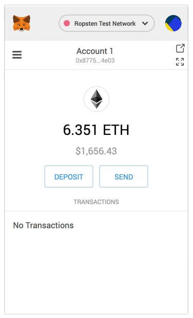
Should receive usual design consideration, but we received a tweet complaining that viewing etherscan requires more clicks on the new UI:
 danfinlay
All 18 comments
Related issue #3463
We're thinking of a few options to make "copy to clipboard" and "open in etherscan" more accessible (less clicks). The latest account switcher (credit card looking option) addresses both problems. While showing the address in the account view above the balance and the ability to copy address to clipboard right from the account screen makes this feature very accessible.
 cjeria
on 16 May 2018
cjeria
on 16 May 2018
Thought I posted these mocks somewhere a while ago but I can't find where they went.
Consistent feedback suggests folks use the "view account on Etherscan" feature regularly and are bummed it's now more difficult to find (>2 clicks)
A tale of two icons:
I've always been confused by our "view in new tab" button - I'd expect a full-screen like option to use the standard for expanding a small view, like on YouTube or Netflix, that looks something like 
The icon we use now suggests additional information in a separate tab. I think it'd be perfect for Etherscan. 
So I'm suggesting something like the following (although I'm sure there's a way to make it look less cramped) where we swap the icons' functionality
would be "View (Account) on Etherscan"
would be "View Full Page MetaMask" aka "Open in tab"
what do you think @cjeria @danfinlay ?
 bdresser
on 18 Sep 2018
bdresser
on 18 Sep 2018
also, I'm realizing now that we're tucking the "View Transaction in Etherscan" link behind another click in the new transaction detail view designs (#4786). Used to be when clicking on any tx in history, but now you expand then click.
I don't think we should change at this point, but we should keep an ear out for feedback similar to the above
bdresser
on 18 Sep 2018
I am more in favor of using our new tx-detail view instead of etherscan links than I am with not having an easy account etherscan link on the main view.
Usually people go to etherscan _because_ we lacked this kind of information, so it might not be as necessary now!
That corner is looking a little cluttered. Maybe side by side? Also noteworthy that this means changing what that one icon means suddenly, although maybe it's more clear since we're adding the "full screen" icon?
danfinlay
on 18 Sep 2018
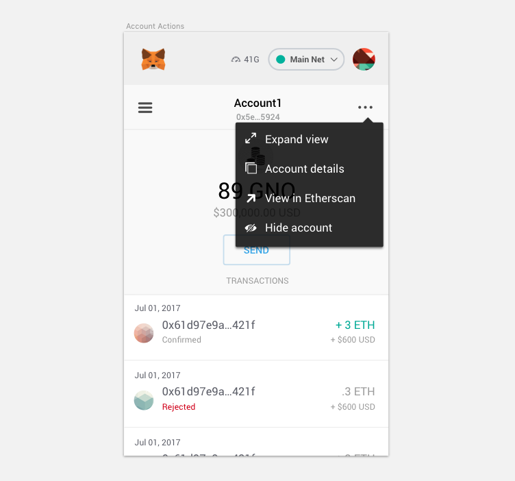
I agree. Since we're adding transaction details, this link may not be as necessary but I do think it adds value in the tx detail view. Also, since we might have more account actions types, I while back I had suggested an "account actions" quick access dropdown. Here's a screenshot of what I had suggested. I imagine when we have identity contracts this might be a good place to tuck more account specific actions in as well.
cjeria
on 18 Sep 2018
@cjeria looks great to me! Always love text in addition to icon.
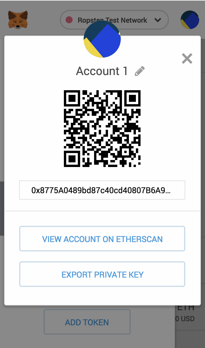
"Account Details" link should open the QR modal (below)
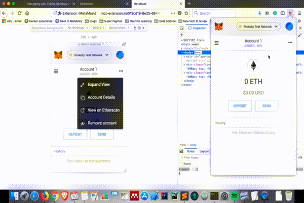
"Hide account" should show for imported & hardware accounts, but not standard accounts.
Let's update to "Remove account" since that's the language we use elsewhere.
bdresser
on 19 Sep 2018
Issue Status: 1. Open 2. Started 3. Submitted 4. Done
__This issue now has a funding of 0.35 ETH (77.31 USD @ $220.89/ETH) attached to it.__
- If you would like to work on this issue you can 'start work' on the Gitcoin Issue Details page.
- Want to chip in? Add your own contribution here.
- Questions? Checkout Gitcoin Help or the Gitcoin Slack
- $21,571.44 more funded OSS Work available on the Gitcoin Issue Explorer
 gitcoinbot
on 26 Sep 2018
gitcoinbot
on 26 Sep 2018
Issue Status: 1. Open 2. Started 3. Submitted 4. Done
__Work has been started__.
These users each claimed they can complete the work by 6 months, 2 weeks from now.
Please review their action plans below:
1) santteegt has started work.
It would be a great opportunity to start contributing to this everyday used add-on. The drop-down menu seems a good choice for UX improvement.
Learn more on the Gitcoin Issue Details page.
gitcoinbot
on 26 Sep 2018
@santteegt Hello from Gitcoin Core - are you still working on this issue? Please submit a WIP PR or comment back within the next 3 days or you will be removed from this ticket and it will be returned to an ‘Open’ status. Please let us know if you have questions!
- [x] warning (3 days)
- [ ] escalation to mods (6 days)
Funders only: Snooze warnings for 1 day | 3 days | 5 days | 10 days | 100 days
gitcoinbot
on 30 Sep 2018
Hi,
I almost finish this bounty. Below you can see the progress I've made so far:
The only thing left is the functionality for the "Remove Account". However I also have a few question:
- Regarding to the icons, the majority are different than the sketch provided. I've used the freely available icons from font-awesome, plus a white version of local file images/popout.svg (View in Etherscan). Are you going to provide the proper icon files for each option in the menu?
- Is the arrow drawn on the sketch at top of the menu required? I looked to the other menus available and they don't have this CSS feature
- Which text label should be specified in the button tooltip. Currently it says "Open in tab"
- I needed to create a new entry on the
enlocale file for the menu option Expand View. Do I need to provide a proper translation for each language in the final pull request? - Do I need to provide any kind of test cases for the new menu functionality I'm adding to the pull request?
 santteegt
on 1 Oct 2018
santteegt
on 1 Oct 2018
looks great @santteegt!
@cjeria would you attach the icon files you used in the sketch?
Is the arrow drawn on the sketch at top of the menu required? I looked to the other menus available and they don't have this CSS feature
Good catch, you can leave the arrow off the drop-down menu (but please keep the arrow on the tool-tip)
Which text label should be specified in the button tooltip
Let's say "Account Options" on hover for now. @cjeria sound good? we can update as we learn more from mobile testing..
You don't need to add translations, we'll add them separately next time we do a pass to get back to localization parity.
@whymarrh @tmashuang any test cases necessary for this menu?
Thanks for the thorough work!
bdresser
on 1 Oct 2018
any test cases necessary for this menu?
@santteegt we can add more comments/more details once there's a PR with the implementation but generally it would be nice to get e2e tests for the remove account functionality and units tests for the new components/any components updated. Thanks!
 whymarrh
on 2 Oct 2018
whymarrh
on 2 Oct 2018
@bdresser Yep, "Account Options" sounds good.
Here's a dropbox link to the SVG icons. I'm not able to attach raw SVG's files on here like you can with PNGs. @santteegt let me know if you can't access the folder for any reason.
https://www.dropbox.com/sh/m0jr3kgjurf0o8j/AAALN4XbNDE62vLpfOmFu6jUa?dl=0
cjeria
on 2 Oct 2018
Hi,
This is the latest version that covers all the issue requirements. I've also added one e2e test in the pull request:
Let me know if there's anything else that needs to be included/fixed to solve this issue.
santteegt
on 3 Oct 2018
Issue Status: 1. Open 2. Started 3. Submitted 4. Done
__Work for 0.35 ETH (78.7 USD @ $224.86/ETH) has been submitted by__:
@bdresser please take a look at the submitted work:
- PR by @santteegt
- Learn more on the Gitcoin Issue Details page
- Want to chip in? Add your own contribution here.
- Questions? Checkout Gitcoin Help or the Gitcoin Slack
- $28,861.67 more funded OSS Work available on the Gitcoin Issue Explorer
gitcoinbot
on 4 Oct 2018
⚡️ A tip worth 0.01750 ETH (3.97 USD @ $226.66/ETH) has been granted to @santteegt for this issue from @. ⚡️
Nice work @santteegt! Your tip has automatically been deposited in the ETH address we have on file.
- $40242.21 in Funded OSS Work Available at: https://gitcoin.co/explorer
- Incentivize contributions to your repo: Send a Tip or Fund a PR
- No Email? Get help on the Gitcoin Slack
gitcoinbot
on 10 Oct 2018
Issue Status: 1. Open 2. Started 3. Submitted 4. Done
__The funding of 0.35 ETH (79.33 USD @ $226.66/ETH) attached to this issue has been approved & issued to @santteegt.__
- Learn more on the Gitcoin Issue Details page
- Questions? Checkout Gitcoin Help or the Gitcoin Slack
- $40,162.88 more funded OSS Work available on the Gitcoin Issue Explorer
gitcoinbot
on 10 Oct 2018
@bdresser , can be closed?
 ghost
on 29 Dec 2018
ghost
on 29 Dec 2018
Related issues
 MarkOSullivan94
·
3Comments
MarkOSullivan94
·
3Comments
 BMillman19
·
3Comments
BMillman19
·
3Comments
 BassBauman
·
3Comments
BassBauman
·
3Comments
 aakilfernandes
·
3Comments
aakilfernandes
·
3Comments
 estebanmino
·
3Comments
estebanmino
·
3Comments
Most helpful comment
Hi,
This is the latest version that covers all the issue requirements. I've also added one e2e test in the pull request:
Let me know if there's anything else that needs to be included/fixed to solve this issue.