Metamask-extension: Transaction Fee Gas Control Concept Design
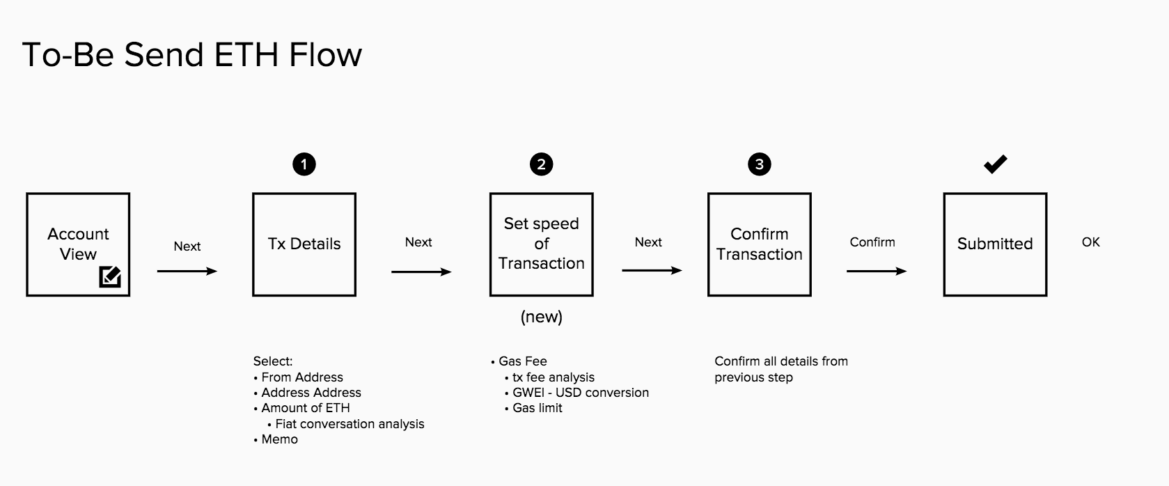
Posting here for feedback. Here's is the suggested gas fee flow. The idea is that we'd add an additional step in the send flow. This adds more friction however it is justified by the fact that we want to reduce the amount of mistakes the user makes during the send eth experience and do some education as well. Friction can prevent users from making bad decisions, friction can help build skills, friction can make users feel good at the end.
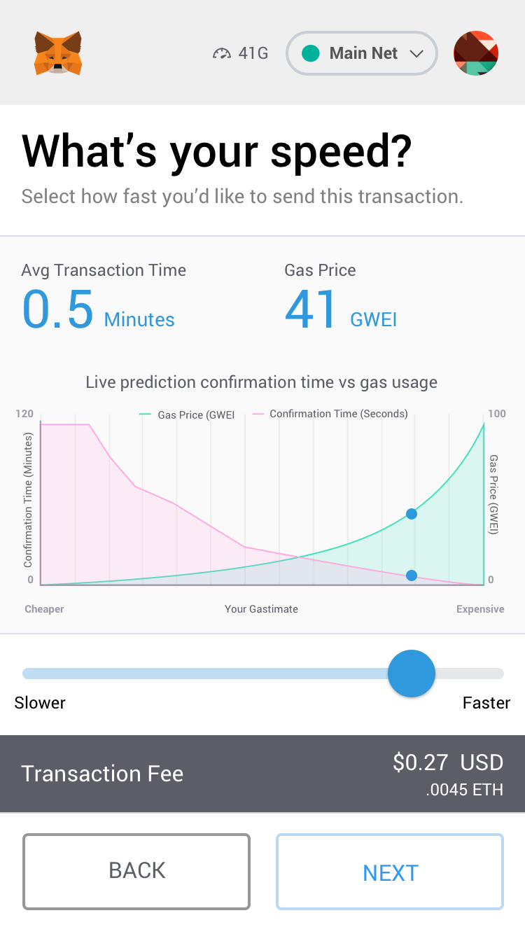
Here's an early concept I recently designed. The live chart reporting was inspired by @owocki's live gas visualization. I basically flipped his chart and added a slider to align with the blue dot on the line chart.

 cjeria
All 10 comments
Here's another concept for the visualization. Overlapping the time and GWEI to visualize the estimate (gastimate).
cjeria
on 18 Jan 2018
On the second one, the gas price is already represented by the X axis, so I'm not sure why it would be curved, or represented at all.
 danfinlay
on 18 Jan 2018
danfinlay
on 18 Jan 2018
- this is very cool!
- Agree that the gas price should be linear (not curved) on the second one. I think it _is_ useful to have the gas price represented by both the X / Y axis' because when both gas/confirmation time are on the Y axis you can eyeball them together.
 owocki
on 18 Jan 2018
owocki
on 18 Jan 2018
Please don't say "vs gas usage" - gas usage is the same every time! It's "vs gas price".
The first chart looks good, but the x axis should really be reversed- it's confusing that the slider moves to the right to increase the gas price, but higher gas prices are on the left in the chart.
This might not be the right place, but I also think metamask should seriously consider moving the gas limit field to an expandable section, or removing it entirely; the presence of both parameters confuses users, and users should almost never have to set the gas limit by hand.
 Arachnid
on 19 Jan 2018
Arachnid
on 19 Jan 2018
I agree gas limit should not be visible to normal users.
danfinlay
on 19 Jan 2018
Thanks for your work here, and awesome that you're requesting feedback this way!
I'm fairly technical, I've read the Ethereum whitepaper, and I still found this part of using Metamask pretty confusing. My suggestion is to massively simplify by hiding the whole concept of gas and variable transaction speeds unless users explicitly ask for it. The default flow could just use the word "transaction fee" instead of "gas" and set a suggested value that leads to confirmation in a reasonable time (like ~1 min). Advanced users could click into an "advanced" flow for the full details. Otherwise it's just asking all users to understand and make decisions that probably don't matter to them, when they have better things to think about.
 marciovm
on 19 Jan 2018
marciovm
on 19 Jan 2018
"Fast" vs. "slow" carries a very visceral reaction for me, specifically that slow is negative. "Cheap" vs. "expensive" does the same. Because all of this information is connected, it feels important to convey simply. But "Fast and expensive, slow and cheap" is way too wordy.
I wonder if on the slider you can put "Cheap" on the left side and "Fast" on the right side. Both carry a positive connotation and my gut tells me that it would give the user pause and elicit greater consideration, than just sliding all the way to the right.
 mg0716
on 19 Jan 2018
mg0716
on 19 Jan 2018
put "Cheap" on the left side and "Fast" on the right side.
I agree, and I believe this is what MEW already does.
My suggestion is to massively simplify by hiding the whole concept of gas and variable transaction speeds unless users explicitly ask for it. The default flow could just use the word "transaction fee" instead of "gas" and set a suggested value that leads to confirmation in a reasonable time (like ~1 min).
I don't think many people's definition of "reasonable" is the same. We have a lot of users who complain about any wait, and we have a lot of users who complain about the cost of fees.
Maybe we could give an even simpler input: "Cheap" and "Fast", as a tab-button, implying they have to choose one or the other, with an "advanced" button to get to a more complex screen.
danfinlay
on 19 Jan 2018
@danfinlay 🙈 good lord I can't believe I missed that.
But yes, "Cheap" and "Fast" as a toggle option seems like a pretty elegant solution. If they want to get into a deeper granularity, they can dive in.
mg0716
on 19 Jan 2018
moved to #4789
 bdresser
on 16 Aug 2018
bdresser
on 16 Aug 2018
Related issues
 kumavis
·
3Comments
danfinlay
·
3Comments
kumavis
·
3Comments
danfinlay
·
3Comments
 MarkOSullivan94
·
3Comments
MarkOSullivan94
·
3Comments
 1blockologist
·
3Comments
1blockologist
·
3Comments
 BMillman19
·
3Comments
BMillman19
·
3Comments
Most helpful comment
I agree, and I believe this is what MEW already does.
I don't think many people's definition of "reasonable" is the same. We have a lot of users who complain about any wait, and we have a lot of users who complain about the cost of fees.
Maybe we could give an even simpler input: "Cheap" and "Fast", as a tab-button, implying they have to choose one or the other, with an "advanced" button to get to a more complex screen.