Meshery: [UI] Enhance indication of enabled vs disabled in user preferences interface
Current Behavior
The current version of the user preferences UI looks like this:
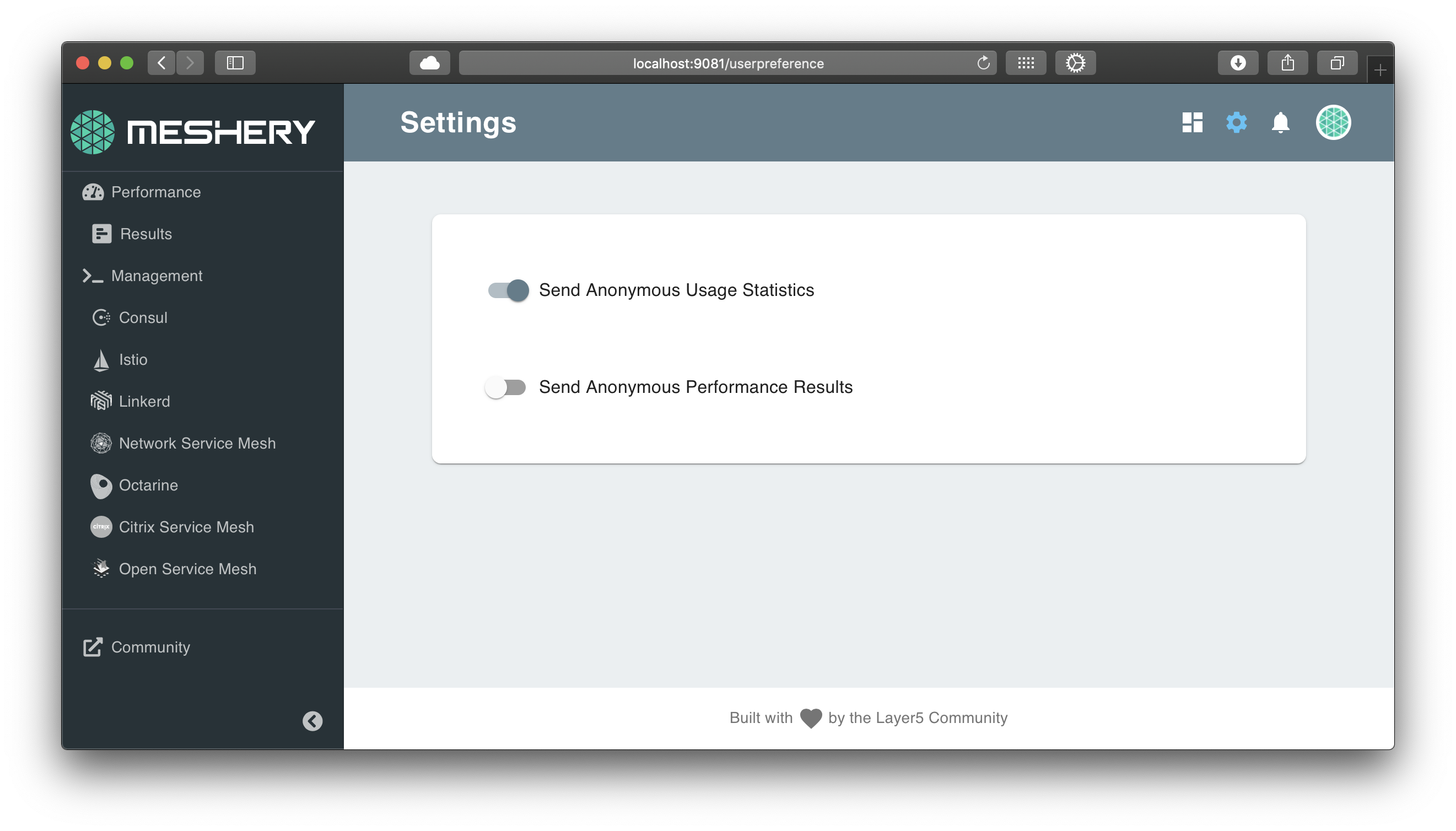
It's difficult to tell which way is on and which way is off.
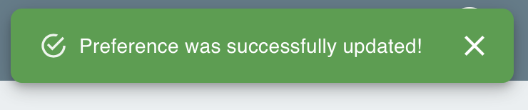
The toaster notification is of no help in this regard either:
Desired Behavior
- Whether a given setting is enabled or disabled should be obvious to the user just looking at the page.
- When the user changes the setting, the notification message should indicate enabled or disabled.
Implementation
- Update UI to make it intuitive to distinguish on vs off for a given setting.
- Update the text in the notification to indicate enabled vs disabled.
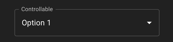
- Add the label "Analytics and Improvement Program" as a group label around both of these options, ideally, in a format like this:
Acceptance Tests
- Sending of usage statistics should be enabled by default.
- Users should be able to understand whether a preference is enabled or disabled without having to take any action.
- "enabled" and "disabled" should show in the notification text.
- These two settings are grouped under a label (of some kind).
 leecalcote
All 10 comments
I will like to work on this
 alabobriggs
on 29 Aug 2020
alabobriggs
on 29 Aug 2020
Hi @alabobriggs how is this coming up?😊
 PluckyPrecious
on 13 Sep 2020
PluckyPrecious
on 13 Sep 2020
Hello @PluckyPrecious still working on it. Had some challenges earlier
alabobriggs
on 13 Sep 2020
Hi everyone, I want to take this issue. Please assign it to me.
 shubhamgupta2956
on 21 Sep 2020
shubhamgupta2956
on 21 Sep 2020
@shubhamgupta2956 checking on progress... how are you coming along here?
leecalcote
on 1 Oct 2020
@shubhamgupta2956 if you are not working on this, can I take it up?
 Nikhil-Ladha
on 2 Oct 2020
Nikhil-Ladha
on 2 Oct 2020
Sorry for the late reply. I was a bit busy with my college assignment (I hope I can complete it till this weekend) so could not complete it. @leecalcote, I have experimented the mentioned things with this page but some of them does not look much elegant due to:-
- Group label - Embedding these settings in the format provided feels different from the app themes. I
- Also I could not find anything better to make it intuitive to distinguish on vs off for a given setting. If I change any color then it does not goes with the whole app theme. Apart from this, I am not much in favor of removing the current on/off component as this looks minimalistic and works great for this use case.
@Nikhil-Ladha sure you can take this issue. Feel free to ask for any help if required. :slightly_smiling_face:
shubhamgupta2956
on 2 Oct 2020
If you are done with your exams and hoping to work on it this weekend, then please feel free to do it.
I just wanted to make some PRs for hacktoberfest 😆
Nikhil-Ladha
on 2 Oct 2020
If you got any ideas for the above-mentioned problems, it would be better if you implement it. We can also discuss the ways to implement this after this weekend on slack also.
shubhamgupta2956
on 2 Oct 2020
Okay, then. I have some thoughts and will make a PR soon🙂.
Will tag you there too, to have a look.
Nikhil-Ladha
on 2 Oct 2020
Related issues
 Aisuko
·
4Comments
leecalcote
·
4Comments
leecalcote
·
4Comments
leecalcote
·
4Comments
leecalcote
·
3Comments
Aisuko
·
4Comments
leecalcote
·
4Comments
leecalcote
·
4Comments
leecalcote
·
4Comments
leecalcote
·
3Comments
Most helpful comment
Hi everyone, I want to take this issue. Please assign it to me.