Mattermost-server: Add flag icon to the post hover menu and update pinned and flagged post styling in the channel
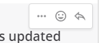
Insert the flag icon between the emoji reaction button and the reply arrow in the hover menu, then remove the flag icon from the post itself (currently appears next to the timestamps on hover)

When the flag is clicked in the hover menu, the icon should fill in, similarly if the post is flagged and the icon is clicked, unfill the flag.
Also updated the pinned and flagged post styling to match how we did it on mobile so we use a similar styling on webapp. See example:


Note: Consider if/how this may affect scroll pop and scroll correction?
If you're interested please comment here and come join our "Contributors" community channel on our daily build server, where you can discuss questions with community members and the Mattermost core team. For technical advice or questions, please join our "Developers" community channel.
New contributors please see our Developer's Guide.
 mattermod
All 17 comments
@esethna would you please assign it to me? 🙂
 abdusabri
on 25 Apr 2020
abdusabri
on 25 Apr 2020
Done, thanks! FYI @abdusabri you may notice the designs are a bit different than what's implemented in product in terms of styling, colors etc. The designs are outdated because we recently made some styling updates in product. Please note that the styling in the designs is not intended to be part of the changes for this ticket!
Current master branch and expected styling:
Designs (outdated styling):
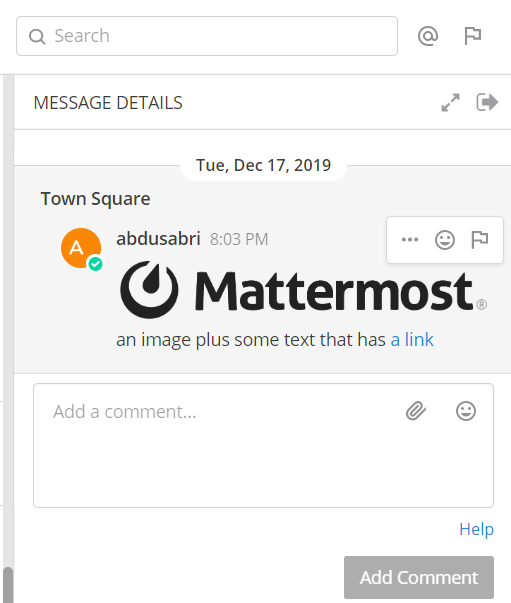
Let me know if you have any questions about scope on the ticket and I'd be happy to help. Note you can see the expected flag icon in the header:
 esethna
on 25 Apr 2020
esethna
on 25 Apr 2020
@esethna
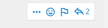
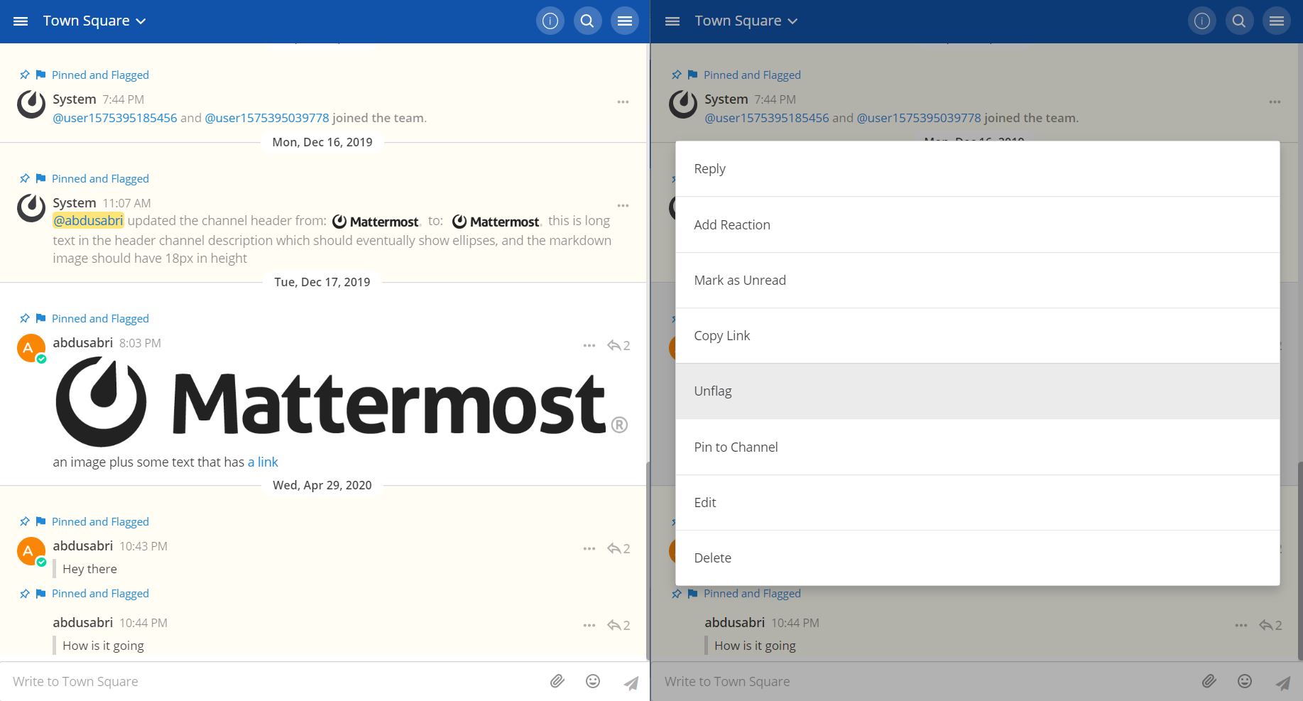
In RHS, should the flag icon look like this 👇 in the hover menu ?
abdusabri
on 29 Apr 2020
@abdusabri yes, looks great!
esethna
on 29 Apr 2020
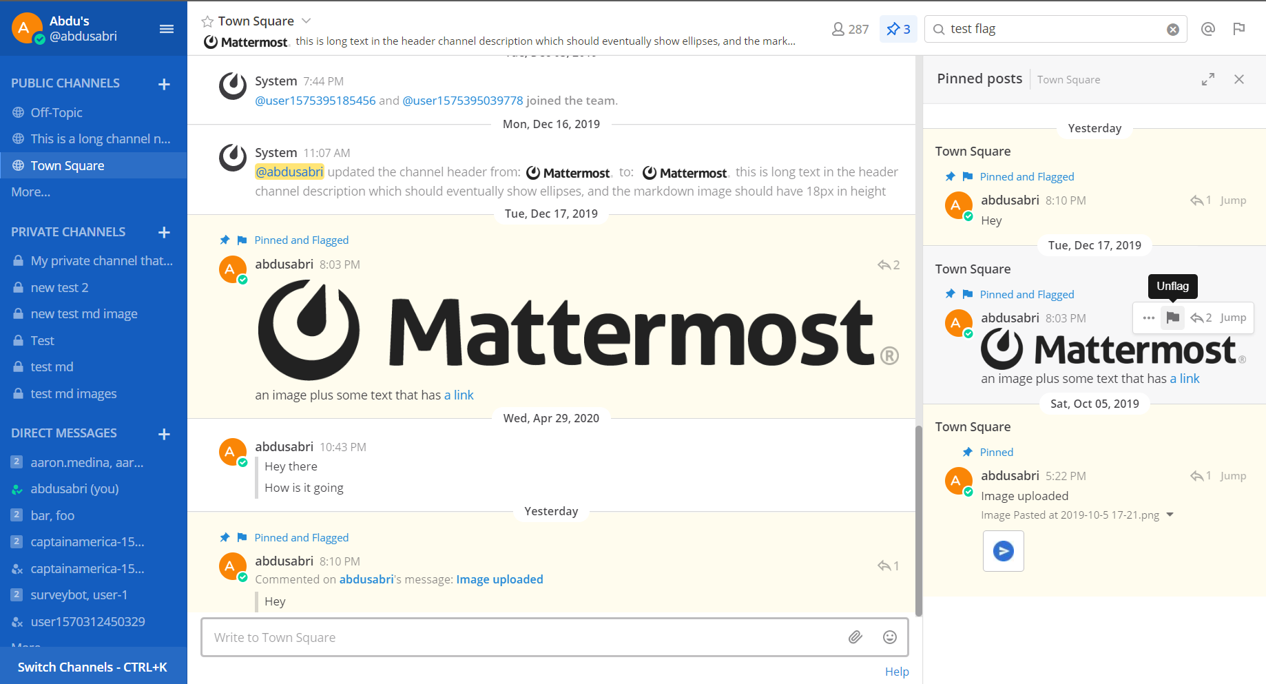
@esethna
In web mobile view, the flag icon should not be visible (like the add reactions icon), right?
You may notice that the pin icon is not filled in the image ☝️, Asaad will share with me the filled pin icon svg that is gonna be used instead of the one that is shown above.
abdusabri
on 1 May 2020
In web mobile view, the flag icon should not be visible (like the add reactions icon), right?
Correct!
esethna
on 1 May 2020
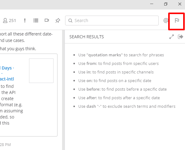
@esethna
The scope also covers the search results and pinned posts lists like 👇, correct?
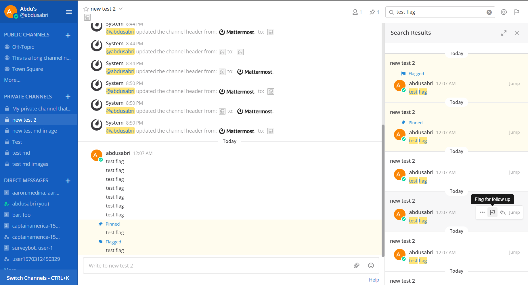
abdusabri
on 5 May 2020
@abdusabri I'd propose that if the pinned posts button is selected, we don't show the yellow highlight and "pinned" blue text. Reason being is that if we do that, then every post will be highlighted yellow in the pinned posts right hand side view. However, if the post is also flagged, then I think we should show the "flagged" text and yellow highlight in this view.
Similarly, if the user is looking at the flagged posts list in the right hand side, we only show the highlight and blue text for pinned posts. So that every post doesn't appear yellow and have the "flagged" text.
In general search, I'd go with what you've shown there (ie show the "pinned and flagged" text and highlight for all posts that are pinned and/or flagged.
Let me know if that makes sense?
cc// @andrewbrown00
esethna
on 5 May 2020
@esethna I'd thought a bit about the approach your are proposing before I went with the one I shared with you, and what made me not so confident about it is:
Would the lack of consistency in styling between center channel and RHS confuse users? For example, if a post is pinned, and a user is viewing the list of pinned posts in RHS, the post would be highlighted (and with blue - depending on the theme color of course 🙂 - "Pinned" text ) in center channel but not in RHS. Would the users have the same intuition we've in mind for why it is not highlighted and has the "Pinned" text in RHS?
For the record, the current behavior for both pinned and flagged posts is to always show the badge and flag respectively, though it is not as prominent as it would be with the new approach because there is currently no highlighting for the post content.
Anyway, I leave that to you and @andrewbrown00 to decide 🙂
abdusabri
on 5 May 2020
Thanks for the feedback @abdusabri, @andrewbrown00 thoughts here?
IMO I'm not as concerned about consistency in the RHS as having a good user experience in the RHS. And I can imagine having a list with every post highlighted and repeated "pinned" or "flagged" text being unnecessarily distracting. Open to feedback though.
Also given pinned and flagged posts are not often looked at with the center pane open and scrolled to the same message, it may be a relatively corner case that users would even see this inconsistency when the flagged or pinned posts lists are opened.
Will leave it up to @andrewbrown00 to help with the UX guidance here
esethna
on 5 May 2020
Thanks for the context here @abdusabri and @esethna 👍
I agree with Eric here that it will become very busy with the yellow highlighting in RHS. The RHS is move of a quick view for users to scan and see what's flagged or pinned or both and decide if they need/want to reply (if it's a thread) or jump to the message in the center channel. Using the yellow in the center channel provides users an affordance something is special about the pinned or flagged posts in the sea of other messages; where in the RHS they are either flagged or pinned based on what's selected.
 andrewbrown00
on 6 May 2020
andrewbrown00
on 6 May 2020
Thanks @esethna and @andrewbrown00 for the feedback! 🙂
Here is a screenshot showing the 3 cases for search results (regular search, flagged posts, and pinned posts)
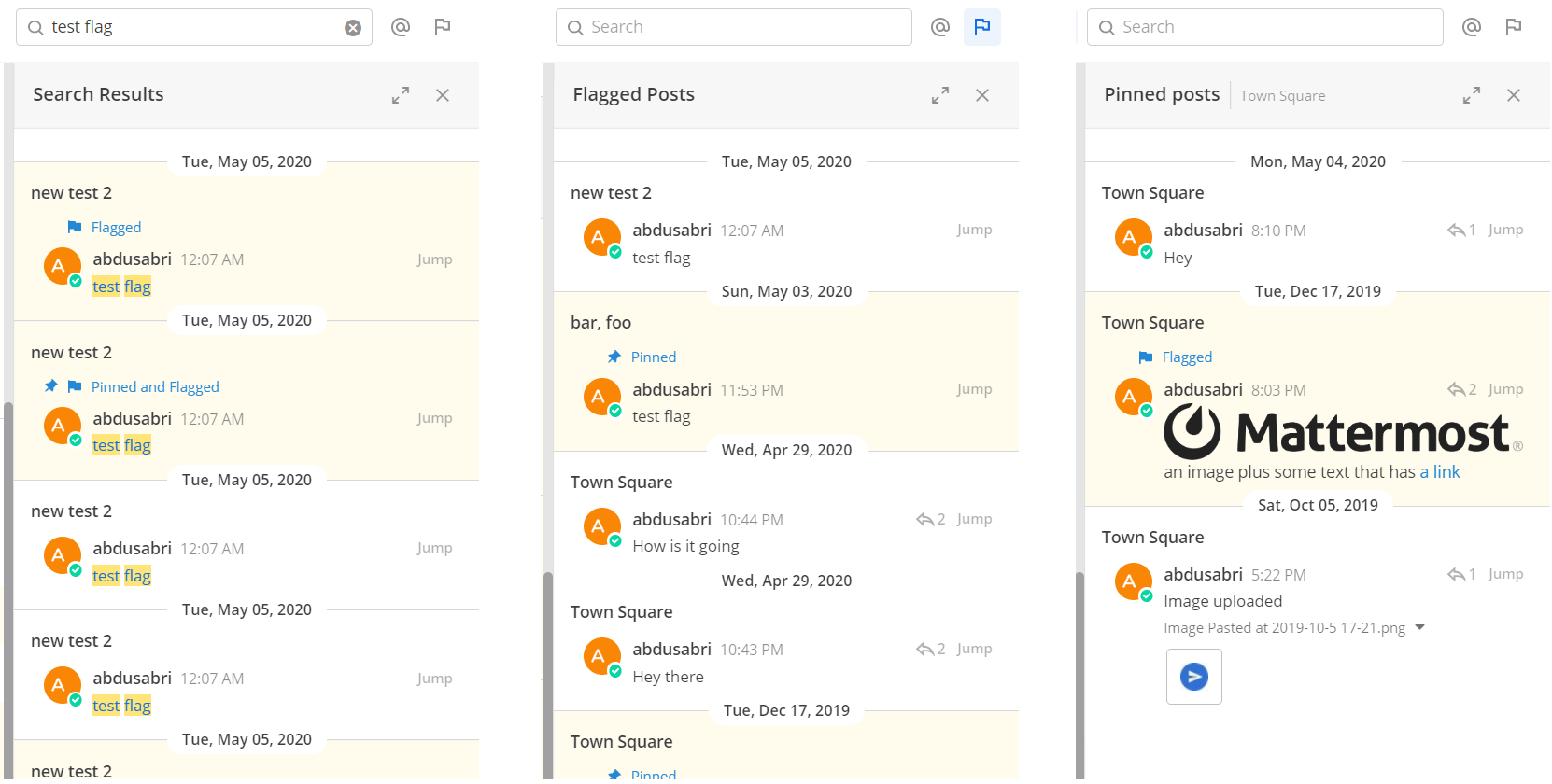
abdusabri
on 7 May 2020
@abdusabri looks awesome! Can't wait for a PR ;)
esethna
on 7 May 2020
Looks like I'm creating so much hype around this issue 😄.
I'm stretched very thin nowadays, but glad we are making progress 🙂, and I hope to have a PR before long
abdusabri
on 7 May 2020
Thanks again @abdusabri can't wait to review the PR 🎉
andrewbrown00
on 7 May 2020
@esethna I'm finally done with coding and unit testing 😀
I had and initial look into E2E tests, and I can think of 2 options:
I continue looking into E2E tests to update and create tests as needed. But this could take a while, because a) the scope of work involves many specs in E2E tests (some of which are already failing even on latest master and before introducing the new changes), b) the limited time I currently have 😔
I wrap things up as they are now (code changes and unit tests) and open a PR without E2E tests
Let me know what would be best for you.
Thanks!
abdusabri
on 14 May 2020
@abdusabri awesome! Feel free to submit the PR now So we can start UX and PM reviews, and you can continue work on the E2e tests as you have time. If needed we can take those over.
esethna
on 14 May 2020
Related issues
esethna
·
3Comments
 harshilsharma2
·
3Comments
esethna
·
3Comments
esethna
·
3Comments
esethna
·
3Comments
harshilsharma2
·
3Comments
esethna
·
3Comments
esethna
·
3Comments
esethna
·
3Comments
Most helpful comment
Looks like I'm creating so much hype around this issue 😄.
I'm stretched very thin nowadays, but glad we are making progress 🙂, and I hope to have a PR before long