Materialize: How to create a icon suffix
I need to create an input field with a little icon on the right, but I only find way to use icon prefixes. How can I create icon suffixes?

 ngducthanh
All 16 comments
And can be this icon suffix as clear action for value of input field?
 antirek
on 27 Apr 2015
antirek
on 27 Apr 2015
+1 show or hide password, for example
 caouecs
on 8 Oct 2015
caouecs
on 8 Oct 2015
I made this workaround waiting for the real feature : http://jsfiddle.net/nnr10Lq5/1/
It's not really great because i had to add the class 'suffix' on the div.
For the prefix, they used the '~' selector to get the previous but i was not able to do the same thing with suffix
 Clemzd
on 28 Mar 2016
Clemzd
on 28 Mar 2016
Do you have any progress on this issue?
 lvarayut
on 21 May 2016
lvarayut
on 21 May 2016
Any progress? Maybe for the icon inside the input with the "eye" Material Design icon.
 TristanWiley
on 22 Jun 2016
TristanWiley
on 22 Jun 2016
Material design specs, here
 tomscholz
on 5 Apr 2017
tomscholz
on 5 Apr 2017
Any update on this?
 ChildishGiant
on 19 Jun 2017
ChildishGiant
on 19 Jun 2017
Maybe it can help : I made a custom suffix eye.
I added a "password-show-button" css class on the icon.
JSP field :
<div class="input-field">
<form:password id="password" path="password" htmlEscape="true" />
<label for="password"><spring:message code="create.password"/></label>
<i class="material-icons password-show-button"></i>
<div class="input-helper"><spring:message code="create.password.help"/></div>
</div>
CSS :
.password-input .password-show-button {
position: absolute;
top: 18px;
right: 0;
z-index: 3;
opacity: .5;
-webkit-user-select: none;
-moz-user-select: none;
-ms-user-select: none;
user-select: none;
}
.password-input .password-show-button:hover {
opacity: .87;
}
And a simple Javascript action :
It switch to a text type on click, then releasing or moving away the mouse will set it back to a password type.
(function() {
'use strict';
$(document).ready(function () {
$('.password-input .password-show-button')
.on('mousedown', function(){
var showingText = $(this).parent().find('input');
showingText.attr('type', 'text');
})
.on('mouseup', function(){
var showingPass = $(this).parent().find('input');
showingPass.attr('type', 'password');
})
.on('mouseout', function(){
var showingPass2 = $(this).parent().find('input');
showingPass2.attr('type', 'password');
});
});
})();
Result :
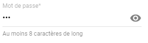
ps : don't try to click on the eye, it's just a pic !
 Julianstouch
on 12 Sep 2017
Julianstouch
on 12 Sep 2017
I moved the icon with class prefix after the input tag, added a new class input-field-with-icon to the container and a small css rule:
.input-field-with-icon input {
    width: 86%;
    width: calc(100% - 3rem);
}
Works fine for now.
Edit: for the suffix icon, a style text-align: right also looks good...
 ray007
on 6 Oct 2017
ray007
on 6 Oct 2017
Here is the css code i wrote, you just have to add this css in your stylesheet and then just instead of 'prefix', use 'postfix' and it works like charm.
HTML Code :
          <div class="input-field col s12 m12">
              <i class="postfix mdi mdi-arrow-right"></i>
              <input  type="password" name="password" id="pwd" required="" />
              <label class="pwd">Password</label>
          </div>
CSS code :
.input-field .postfix ~ input { width: 80%; width:calc(100% - 3rem);  margin-left:0px; margin-right: 3rem!important; }
.input-field .postfix {
    position: absolute;
    width: 3rem;
    right: 0px;
    font-size: 2rem;
    -webkit-transition: color .2s;
    transition: color .2s;
}
.input-field .postfix.active {
    color: #26a69a;
}

Here top password field is .prefix and down one is .postfix
 AJ-TechSoul
on 16 Oct 2017
AJ-TechSoul
on 16 Oct 2017
The above does not add in an active class on input box focus.
If you want to do that, you do much the same but add a little more css and javascript.
.input-field  .postfix {
    position: absolute;
    width: 3rem;
    font-size: 2rem;
    -webkit-transition: color .2s;
    transition: color .2s;
    right: 0;
}
.input-field  .postfix.active {
    color: #26a69a;
}
var inputFields = $(".input-field input")
inputFields.focus(function() {
    var postfix = $( this ).siblings('.postfix');
    if(postfix)  postfix.addClass("active");
});
inputFields.blur( function() {
    var postfix = $( this ).siblings('.postfix');
    if(postfix)  postfix.removeClass("active");
});
 andyflatt
on 20 Oct 2017
andyflatt
on 20 Oct 2017
@andyflatt Great !!! you have completed the code.
HTML Code :
          <div class="input-field col s12 m12">
              <i class="postfix mdi mdi-arrow-right"></i>
              <input  type="password" name="password" id="pwd" required="" />
              <label class="pwd">Password</label>
          </div>
CSS code :
.input-field .postfix ~ input { width: 80%; width:calc(100% - 3rem);  margin-left:0px; margin-right: 3rem!important; }
.input-field .postfix {
    position: absolute;
    width: 3rem;
    right: 0px;
    font-size: 2rem;
    -webkit-transition: color .2s;
    transition: color .2s;
}
.input-field .postfix.active {
    color: #26a69a;
}
JAVASCRIPT Code:
var inputFields = $(".input-field input");
inputFields.focus(function() {
    var postfix = $( this ).siblings('.postfix');
    if(postfix)  postfix.addClass("active");
});
inputFields.blur( function() {
    var postfix = $( this ).siblings('.postfix');
    if(postfix)  postfix.removeClass("active");
});
Here are my two cents.
This version is pretty flexible, offering both .suffix and .inset modifiers.
See codepen example.
.input-field {
  // Add inset definition to .prefix
  .prefix {
    &:not(.inset) {
      & ~ input,
      & ~ textarea,
      & ~ label,
      & ~ .validate ~ label,
      & ~ .helper-text,
      & ~ .autocomplete-content {
        margin-left: 3rem;
      }
    }
    &.inset {
      & ~ input,
      & ~ textarea,
      & ~ label,
      & ~ .validate ~ label,
      & ~ .helper-text,
      & ~ .autocomplete-content {
        margin-left: 0;   // This is a patch until it's incorporated into the framework
        padding-left: 3rem;
      }
    }
  }

  // Suffix Icons
  .suffix {
    position: absolute;
    width: $input-height;
    font-size: $input-icon-size;
    transition: color .2s;
    top: ($input-height - $input-icon-size) / 2;
    right: 0;
    text-align: right;

    &.active { color: $input-focus-color; }
  }
  .suffix {
    & ~ input,
    & ~ textarea,
    & ~ label,
    & ~ .validate ~ label,
    & ~ .helper-text,
    & ~ .autocomplete-content {
      width: calc(100% - 3rem);
    }
    &:not(.inset) {
      & ~ input,
      & ~ textarea,
      & ~ label,
      & ~ .validate ~ label,
      & ~ .helper-text,
      & ~ .autocomplete-content {
        margin-right: 3rem;
      }
    }
    &.inset {
      & ~ input,
      & ~ textarea,
      & ~ label,
      & ~ .validate ~ label,
      & ~ .helper-text,
      & ~ .autocomplete-content {
        padding-right: 3rem;
      }
    }
  }
  .suffix ~ label { margin-right: 3rem; }
  &.col {
    .suffix ~ label,
    .suffix ~ .validate ~ label {
      width: calc(100% - 3rem - #{$gutter-width});
    }
  }

  // What if we have both prefix and suffix?
  .prefix ~ .suffix ~ input {
    width: calc(100% - 6em);
  }
  &.col {
    .suffix ~ .suffix ~ label,
    .suffix ~ .suffix ~ .validate ~ label {
      width: calc(100% - 6rem - #{$gutter-width});
    }
  }
}

// Inset icons
.material-icons {
  &.inset {
    font-size: $input-icon-size * .75;
    top: ($input-height - $input-icon-size) / 2 * 1.5;
  }
  &.actionable {
    cursor: pointer;
    z-index: 2;
  }
}
Note: I did not implement any JS in this example, specifically not one that adds active class to the suffix/inset icons.
 amitkeret
on 17 Oct 2018
amitkeret
on 17 Oct 2018
Here's a Sass version of the older, simpler example provided by @andyflatt :
/**
 * Materialize postfix
 * @see https://github.com/Dogfalo/materialize/issues/1214
 */

.input-field .postfix ~ input
  width: 80%
  width: calc(100% - 3rem)
  margin-left: 0px
  margin-right: 3rem!important
.input-field .postfix
    position: absolute
    width: 3rem
    right: 0px
    font-size: 2rem
    -webkit-transition: color .2s
    transition: color .2s

.input-field .postfix.active
    color: $input-focus-color
You can grab the JS for the active class from their comment above this one.
 Flixbox
on 2 Nov 2018
Flixbox
on 2 Nov 2018
My workaround (based on @Julianstouch I removed spring uses and added some right space)
HTML
<div class="input-field col s12 m12 password-input">
  <i (click)="togglePassword()" class="material-icons password-show-button">remove_red_eye</i>
  <input  type="password" name="password" id="pwd" autocomplete="new-password"/>
  <label class="pwd">Password</label>
</div>
CSS
.password-input .password-show-button {
    position: absolute;
    top: 18px;
    right: 20px;
    z-index: 3;
    opacity: .5;
    -webkit-user-select: none;
    -moz-user-select: none;
    -ms-user-select: none;
    user-select: none;
    }
    .password-input .password-show-button:hover {
    opacity: .87;
    }
JAVASCRIPT (using Angular2+)
togglePassword(){
    console.log("password toggled");
    var inputField= document.querySelector('#pwd');
    if(inputField.getAttribute('type')=="password"){
      inputField.setAttribute('type','text');
    }else if (inputField.getAttribute('type')=="text"){
      inputField.setAttribute('type','password');
    }
  }
 judasane
on 31 Dec 2018
judasane
on 31 Dec 2018
I'd say an even easier solution would be to define a modifier class .prefix--post as follows:
HTML
<div class="input-field">
    <i class="material-icons prefix prefix--post" >account_circle</i>
    <input id="example" type="text">
    <label for="example">Example</label>
</div>
SASS
.input-field {
    .prefix {
        &.prefix--post {
            right: 0px;
            ~input, ~label, ~.helper-text {
                margin-left: 0;
                margin-right: 3rem;
            }
        }
    }
}
Note: you need to complete the SASS selector to account for the validate classes etc.
 thomaux
on 28 Jan 2019
thomaux
on 28 Jan 2019
Related issues
 ReiiYuki
·
3Comments
ReiiYuki
·
3Comments
 serkandurusoy
·
3Comments
serkandurusoy
·
3Comments
 locomain
·
3Comments
locomain
·
3Comments
 acierpinski
·
3Comments
acierpinski
·
3Comments
 PhillippOhlandt
·
3Comments
PhillippOhlandt
·
3Comments
Most helpful comment
+1 show or hide password, for example