- [x] flickr
 equinoxel
All 14 comments
Flickr's logo in black and white is simply 2 circles with different opacity. I'm wondering if that will suffice.

That or I make it a double icon like PayPal requires... #297.
 Templarian
on 7 Jun 2015
Templarian
on 7 Jun 2015
IMHO there are a several options you could do:
- circles with different opacity (I wonder how this will fare in a font)
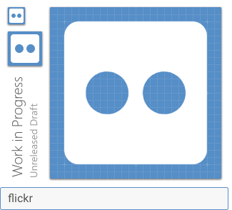
- circles with the same opacity/color in a rounded square (like you have it), but then you'll have the option of 2 white circles in a filled black square or 2 circles in a white/transparent square
- circles with the same opacity (but without the square), like

I'd go for just the two circles (either both filled black or one filled black and one empty/white with a black contour), but I'm not sure which variant would fit better with the other icons.
equinoxel
on 8 Jun 2015
A rough idea of how it will work in PayPal and Flickr. This won't go in until the next Webfont though, so I'll keep the issue open until then.
.mdi-test::before {
    content: "\f---";
}
.mdi-test::after {
    content: "\f---";
    opacity: 0.6;
    position: absolute;
    left: 0;
}
<i class="mdi-flickr"></i>


(PayPal uses after: opacity = 0.8; before: opacity = 0.6)
Templarian
on 9 Jun 2015
looks very nice :) I'll look forward to the next release then!
equinoxel
on 9 Jun 2015
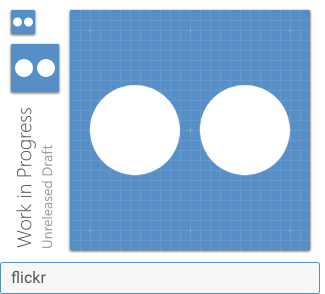
2 circles knocked out of the square would do the job, similar to FontAwesome: http://fortawesome.github.io/Font-Awesome/icon/flickr/
 PeterShaggyNoble
on 12 Apr 2016
PeterShaggyNoble
on 12 Apr 2016
Ah, I was hoping we already had this icon. Now what?
 ghost
on 16 Sep 2016
ghost
on 16 Sep 2016
Cheeky bump! ;)
PeterShaggyNoble
on 24 Jan 2017
I'd like to see this as well.
 stevengliebe
on 23 Aug 2017
stevengliebe
on 23 Aug 2017
 goyney
on 21 Nov 2018
goyney
on 21 Nov 2018
I revise my vote that we use the 2 circles on their own, it's what Flickr use for their favicon and it's also what Simple Icons use (they're pretty strict on adhering to brand guidelines).
PeterShaggyNoble
on 21 Nov 2018
 goyney
on 21 Nov 2018
goyney
on 21 Nov 2018
🙃 ~3 Years later.
Templarian
on 17 Dec 2018
Just downloaded the webfont v3.2.89 from the website, but it still doesn't include the Flickr icon. Is there any extra step?
 minimaluminium
on 20 Dec 2018
minimaluminium
on 20 Dec 2018
@minimaluminium, this icon will be available in the next release, coming soon. You can use the history page to track the changes since the last release.
PeterShaggyNoble
on 20 Dec 2018
Related issues
 vishnu1991
·
3Comments
vishnu1991
·
3Comments
 jonnyborg
·
3Comments
jonnyborg
·
3Comments
 buutqn
·
3Comments
buutqn
·
3Comments
 ButchMonkey
·
3Comments
ButchMonkey
·
3Comments
 emanf
·
3Comments
emanf
·
3Comments
Most helpful comment
2 circles knocked out of the square would do the job, similar to FontAwesome: http://fortawesome.github.io/Font-Awesome/icon/flickr/