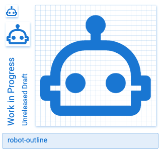
Materialdesign: robot-outline icon
robot-outline Icon
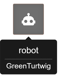
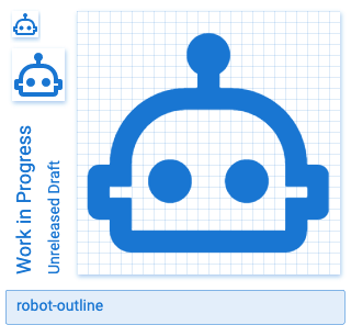
Requesting a robot-outline icon. The original robot icon was created by @GreenTurtwig
Usage
We would use for our navigation menu. All of our other icons are outline except this one. It doesn't look bad but it would look way better if we had that robot-outline !
Examples
 oneezy
All 12 comments
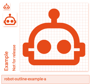
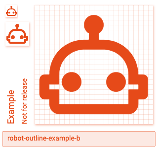
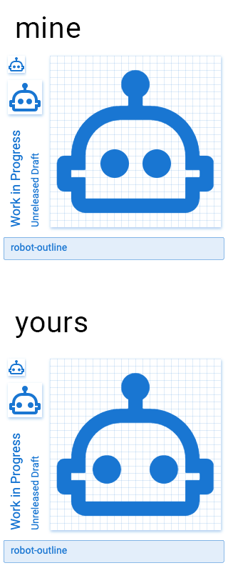
In example A, I left the eyes the same size (5x5 dps) as robot, but they felt a little too big and made the robot look like a Teletubby. In example B, I shrunk the eyes to 4x4 dps, but they felt a little too wide if they stayed in the same position.
So, I shifted the eyes in towards the center. I think this version looks the best. Even though the top and bottom of the eyes don't line up to the grid, they're at the same vertical position as the filled version.
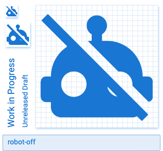
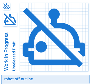
I figured I'd make the off version while I was at it too.
 Xenomorph99
on 5 Oct 2020
Xenomorph99
on 5 Oct 2020
nice work @Xenomorph99 ! for me it still seems like the eyes need to be brought in and up a bit. i did a quick mockup of what that would look like.
adjustments made:
- brought both eyes inwards by
1pxblock - brought both eyes up by
.5pxblock
oneezy
on 6 Oct 2020
The closer the eyes get the less it looks like a robot and the more it looks like a Teletubby to me.

Xenomorph99
on 6 Oct 2020
you make a good point
oneezy
on 6 Oct 2020
updated navigation

oneezy
on 7 Oct 2020
What happens if we place it on a half a pixel. I think that might look nicer.
 Templarian
on 7 Oct 2020
Templarian
on 7 Oct 2020
Here's what it would look like shifting the eyes outwards by 0.5 dps. Now there's only a 0.5 dps gap between the outline and the eyes instead of 1 dps like I posted above. It depends on how strict we want to be with the rules. I could go either way on this one.

Xenomorph99
on 7 Oct 2020
I definitely meant the other way @Xenomorph99 😓
Templarian
on 7 Oct 2020
 Xenomorph99
on 7 Oct 2020
Xenomorph99
on 7 Oct 2020
That's the one. Will add it later today!
Templarian
on 7 Oct 2020
Added.
 goyney
on 8 Oct 2020
goyney
on 8 Oct 2020
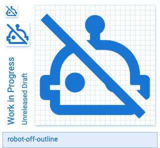
@goyney or @Templarian can you add robot-off as well? It's in one of the first posts on this issue. I could try doing it if you'd like, but I haven't actually added an icon myself yet.
Xenomorph99
on 8 Oct 2020
Related issues
 adambiggs
·
3Comments
Templarian
·
3Comments
adambiggs
·
3Comments
Templarian
·
3Comments
 Kanga-Who
·
3Comments
Kanga-Who
·
3Comments
 rsandrea
·
3Comments
rsandrea
·
3Comments
 puytr
·
3Comments
puytr
·
3Comments
Most helpful comment
The closer the eyes get the less it looks like a robot and the more it looks like a Teletubby to me.