Materialdesign: mdi-cannabis-outline / mdi-cannabis-half
I have:
- [x] [Searched all issues](https://github.com/Templarian/MaterialDesign/issues) to make sure there isn't a request for this icon.
- [x] [Searched the current library](https://materialdesignicons.com/) to make sure the icon doesn't exist.
- [x] Only requested a single icon (or a few near-identical ones) in this issue.
Usage
Similar to how a heart, star, or other rating-esc icon, these icons would for a more unique rating system for cannabis systems.
Examples
Include any example images so we know what the icon should look like.
Following the existing cannabis icon.
All 12 comments
Creating the cannabis-half and cannabis-off variants were easy.
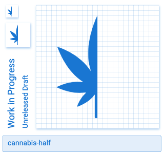
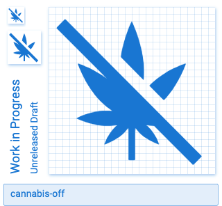
I'm not sure cannabis-outline works with the Material Design guidelines. I created two options and I'm really not a fan of either. Maybe someone else has a better idea of how we could create an outline variant.
Option A: Outline of 2dps
Option B: Outline of 1dps
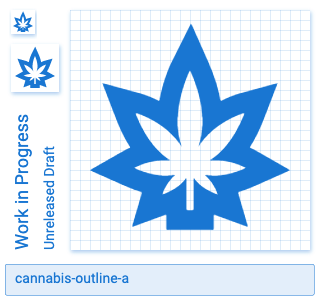
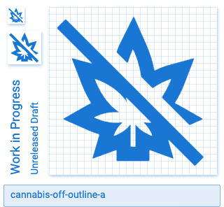
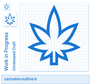
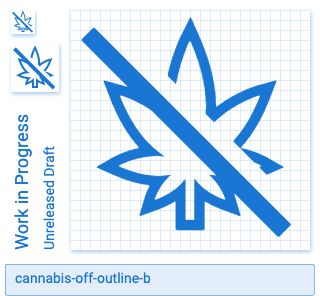
Cannabis off makes sense. I think the others are going to be too niche. Cannabis outline would be fine, but it looks kind of odd in an outline.
Personally, I like the outline and for the needed reason of it (in purposed idea) would work like a rating similar to hearts or stars and in that case, the 'off' doesn't make sense UI wise. At least in regards to being consistent with users 'expected' behavior of ratings.
I agree with @Templarian. I think we should only add cannabis-off to the library.
@brock8w, you're welcome to download the other SVG files and use them in your project. Stars generally work best for rating systems because they're predictable and can be read at super small sizes.
I think that's absurd, there's no heart-off or star-off. What the community goes with is what is agreed upon, but not helpful. I think personal opinions about the use cases or how and why an icon is desired is not our place. If an icon has use to someone, then just like asking questions in a class room, someone else may need it too.
The community follows the Material Design Guidelines which insures that icons are clear and readable when they're displayed at only 24x24 dps. In this case, the cannabis-outline options I presented above aren't clear and are hard to read when they're only 24x24 dps. I included them above to illustrate a point. However, you're welcome to use them in your project if you so choose.
Also, the other icons you mentioned are already in our library:
Touche on the icons being present. With your logic, my question then becomes, why can't you make one that has the same rendering capability as the other two?
Added cannibis-outline. Still not sure about the others.
I vote no on the outline.
Here are some un-opinionated questions that are, I think, crucial to being well rounded engineers....
- Why does anyone care that there is or is not an outline that resembles an already existing icon?
- With a decent amount of icons that are solid, having an outline, again, why does it seem to be such a complication?
2a. Even if it was a self-fulling need (a rating), the use of an outline allows for more chances of use by others. Call me presumptuous, but I would imagine that the level of consistency I speak of, being solids with respective outlines, would bring more users to the library - No?
- I am not suggesting some unknown, bizarre icon. If no-one has the use or imagination, don't stall others.
Finally, we will not all see the use everyone needs, but don't allow an opportunity for growth and consistency based on "well I don't think it's needed". We all have our own uses. As an extension, I believe that icons with a solid should have outlines because why not?!?!?
- Why does anyone care that there is or is not an outline that resembles an already existing icon?
We try to allow for outlined versions of any of our icons, however the complexity of the base icon can sometimes make it difficult or impossible to create an outlined version.
- With a decent amount of icons that are solid, having an outline, again, why does it seem to be such a complication?
The complication is that, following Material guidelines, the outline _must_ be 2dp. With a 2dp outline, the complexity of the base icon causes the icon to be indistinguishable at native resolution.
We try to be as accommodating to the community's needs as possible. However, we do whatever we can to abide by Material guidelines and seldom break them without a very good reason. There is not a good reason to break them here.
The source SVG for the outline variants are included above, so feel free to download those and use them directly in your project. We, however, will not be adding the outline variants at this time. Thank you for your feedback.
@goyney I appreciate the actual explanation. I use Material Guidelines, but I'm not a designer. I just wanted to know the technical reason instead of a brush off reason. Thank you again.
Most helpful comment
Added
cannibis-outline. Still not sure about the others.