Materialdesign: Login/Logout icons
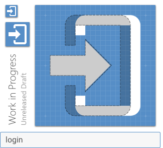
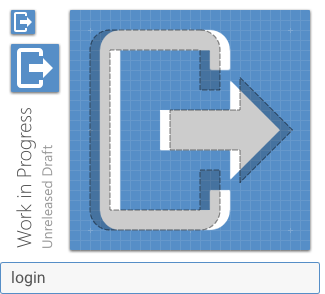
For the login and logout icons, the door width is inconsistent.
 pbhowmic
All 9 comments
I'll look into this when I get a moment.
Thanks for opening an issue.
 Templarian
on 16 Apr 2015
Templarian
on 16 Apr 2015
Actually, you can close this one. It is pretty minor, I can only see a slight deviation at an 8x resolution in GIMP. Check it all the same
pbhowmic
on 17 Apr 2015
I looked at it earlier and I'm not seeing any variation. You are using the SVG files from MaterialDesignIcons.com right and not out of the repo?
Templarian
on 17 Apr 2015
Right. And the difference is (from left side boundary to right side boundary) about 1 pixel. login is almost 14 pixels wide, logout 13.
pbhowmic
on 17 Apr 2015
Oh, yea, that's just to keep door the same size and the spacing even between the two. I illustrated how I determined the spacing below...

Legend: Gray = recommended padding (2dp), Red = eye balling spacing, other = spacing comparisons.
I'm sure there are other ways this icon could be designed though to more evenly handle the visual alignment. Maybe in the future it could be replaced with less of a literal door in/out concept. :smile:
Templarian
on 17 Apr 2015
The spacing / door width is equal, but it doesn't look that way. To improve visual equality, I suggest to move the right vertical stroke of the login door by 1 pixel to the right.
Currently:


Improved:

It shouldn't be much of the problem to do that, because the horizontal placement of both icons is different and the varying door width thus not apparent even if you use them for a hover effect.
 CoDEmanX
on 18 Jan 2016
CoDEmanX
on 18 Jan 2016
Could also keep the arrow on the same side maybe?


Note those are just quick pixel based drawings not smooth SVG.
 JamesCoyle
on 24 May 2017
JamesCoyle
on 24 May 2017
To add to this, Font Awesome's icons for sign in and out follow our current pattern, but both icons are exactly 16dp in width. So, my goal when opening our two versions was to find a solution that takes the exact same width and is symmetrically consistent.
First, I found some grid issues in both around the arrow head, so those were resolved. I then opened the gap in the door 2dp in both directions and lined the arrow up adjacent to the door border. These are what I ended up with. (The grey outline is the current icons for comparison.)
I feel these are more consistent and would resolve the unbalanced feeling you currently get when looking at the two.
 goyney
on 21 Nov 2018
goyney
on 21 Nov 2018
Updated!
Templarian
on 21 Nov 2018
Related issues
 MrGrigri
·
3Comments
MrGrigri
·
3Comments
 danielhickman
·
3Comments
danielhickman
·
3Comments
 kimdv
·
3Comments
Templarian
·
3Comments
kimdv
·
3Comments
Templarian
·
3Comments
 giooliveira
·
3Comments
giooliveira
·
3Comments
Most helpful comment
The spacing / door width is equal, but it doesn't look that way. To improve visual equality, I suggest to move the right vertical stroke of the login door by 1 pixel to the right.
Currently:


Improved:


It shouldn't be much of the problem to do that, because the horizontal placement of both icons is different and the varying door width thus not apparent even if you use them for a hover effect.