Materialdesign: Cart Check & Cart Variant
I have:
- [x] [Searched the current library](https://materialdesignicons.com/) to make sure the icon doesn't exist.
- [x] Searched open issues to make sure there isn't a request for this icon.
- [x] Followed the material guidelines.
Preview
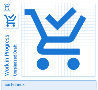
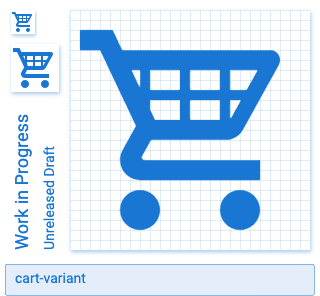
Here's a cart icon with the check modifier. I also created a cart variant icon.

Zip Download
 Xenomorph99
All 7 comments
I'd like to see the variant's basket lines be aligned to the grid, but other than that 👍 .
 goyney
on 20 Aug 2020
goyney
on 20 Aug 2020
In the previous cart-variant I posted, I'd aligned the vertical basket lines to the top of the basket's negative space so it would feel more balanced. If they line up with the grid they will be off center. Either option works for me.
Xenomorph99
on 20 Aug 2020
@Xenomorph99 try using only 2 vertical lines so you can align it to the grid and balance visually in the same time.
 viktor-yakubiv
on 27 Aug 2020
viktor-yakubiv
on 27 Aug 2020
Something like this? I used two vertical lines instead of three. The lines are aligned to the grid, but not the cart's inner white space. This works for me unless there's any objections.
 Xenomorph99
on 28 Aug 2020
Xenomorph99
on 28 Aug 2020
@Xenomorph99, it looks perfect to my eye!
@goyney what do you think?
viktor-yakubiv
on 28 Aug 2020
Yes, that is exactly what I was thinking! Nice work.
goyney
on 28 Aug 2020
Both added.
goyney
on 9 Sep 2020
Related issues
 Kanga-Who
·
3Comments
Kanga-Who
·
3Comments
 kaurkaur
·
3Comments
kaurkaur
·
3Comments
 kimdv
·
3Comments
kimdv
·
3Comments
 giooliveira
·
3Comments
giooliveira
·
3Comments
 danielhickman
·
3Comments
danielhickman
·
3Comments
Most helpful comment
Something like this? I used two vertical lines instead of three. The lines are aligned to the grid, but not the cart's inner white space. This works for me unless there's any objections.
cart-variant.zip