Materialdesign: tune-variant Icon
I have:
- [x] [Searched the current library](https://materialdesignicons.com/) to make sure the icon doesn't exist.
- [x] Searched open issues to make sure there isn't a request for this icon.
- [x] Followed the material guidelines.
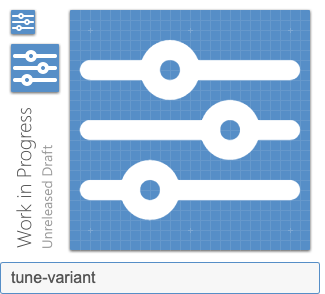
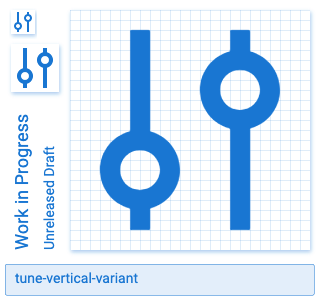
Preview
Paste a preview of your icon here. You can generate one using our preview generator.
Zip Download
Drag or paste a zip folder containing your icon as a minimal SVG file. We just need the SVG tag with the viewbox and a single path element.
filter.svg.zip
 nithinankam
All 9 comments
This icon looks like it's the same as tune and tune-vertical which are already in the library.
 Xenomorph99
on 15 Jul 2020
Xenomorph99
on 15 Jul 2020
I understand this is supposed to be a variant, but I don't really see the reasoning for it. Why not just use tune(-vertical)?
 goyney
on 15 Jul 2020
goyney
on 15 Jul 2020
@goyney It’s for visibility and clarity.
This tune-variant icon is more recognizable for its function vs the given material design ones mentioned above.
It would fall under System icons which symbolize common action. However, I wouldn't be able to reason it out more 'coz it totally has the same purpose of tune but making it more visible and clear.
Just curious are variants of an icon discouraged ?
nithinankam
on 15 Jul 2020
The lines are rounded, violating Material guidelines.
I don't agree that rounded handles are more recognizable than linear handles. Real sliders have square, not round, handles anyway.
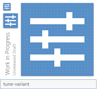
What do you think of a variant with continuous gutters?
 JapanYoshi
on 17 Jul 2020
JapanYoshi
on 17 Jul 2020
Here's another idea to consider. Figma uses this settings/tune icon in their interface. If we did a rounded variant of ours maybe we drop a line so it's just two like theirs is?
Xenomorph99
on 17 Jul 2020
 Xenomorph99
on 17 Jul 2020
Xenomorph99
on 17 Jul 2020
Am fine with either of the above mentioned alternatives, let me know if this request can be addressed or if its decided to be closed.
nithinankam
on 20 Jul 2020
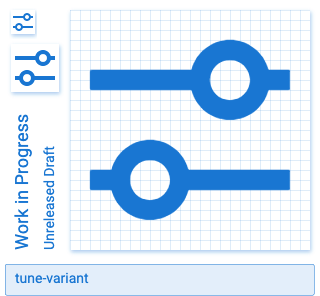
@nithinankam I think the one @Xenomorph99 shared 3 days ago can be added. Removing the label.
 Templarian
on 20 Jul 2020
goyney
on 24 Jul 2020
Templarian
on 20 Jul 2020
goyney
on 24 Jul 2020
Related issues
 Kanga-Who
·
3Comments
Kanga-Who
·
3Comments
 puytr
·
3Comments
puytr
·
3Comments
 alvaroc1
·
3Comments
alvaroc1
·
3Comments
 emanf
·
3Comments
emanf
·
3Comments
 adambiggs
·
3Comments
adambiggs
·
3Comments
Most helpful comment
Like this or maybe shrink the knobs down a bit.
tune-variant.zip