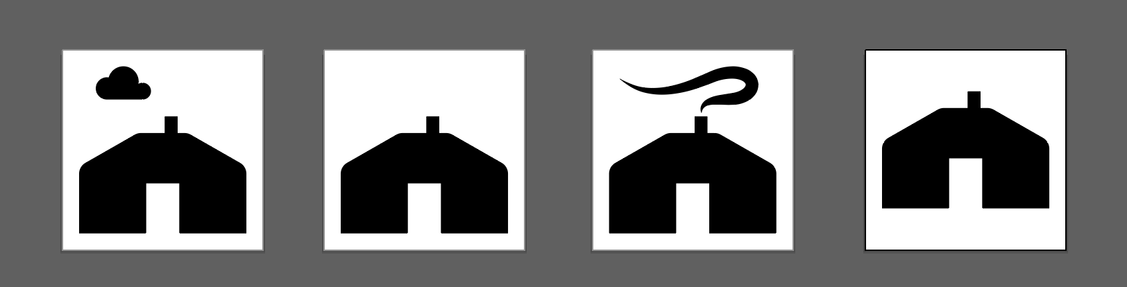
Here's a few options I considered. I think the one with smoke reads the best as a yurt. I thought about a _yurt_ and _yurt-smoke_ variant, but having the icon shift in the frame seems weird.
Preview

Zip Download
 Xenomorph99
All 8 comments
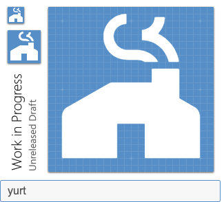
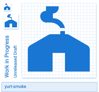
We have a distinct "smoke" or "steam" pattern we use on other icons. Wanted to try it out here for consistency. Thoughts?
 goyney
on 14 Jul 2020
goyney
on 14 Jul 2020
I really like that standard smoke/steam pattern. However, the thickness makes the stove pipe look like it's a brick chimney. Yurts only have tiny smoke pipes attached to the stove they keep in the center. Perhaps we simply choose the option without smoke to keep it simple?

Xenomorph99
on 14 Jul 2020
Here's another option combining the two ideas. Not sure I like this any better.
 Xenomorph99
on 14 Jul 2020
Xenomorph99
on 14 Jul 2020
That's much better. Simplistic like yours and more geometrical to fit Material guidelines.
goyney
on 14 Jul 2020
goyney
on 14 Jul 2020
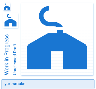
One last option haha. I inverted the smoke.
 Xenomorph99
on 14 Jul 2020
Xenomorph99
on 14 Jul 2020
Yeah, I think we might want to update it to this smoke maybe, so it looks less uniform.
 Templarian
on 14 Jul 2020
Templarian
on 14 Jul 2020
Updated!
goyney
on 14 Jul 2020
Related issues
Templarian
·
3Comments
 alvaroc1
·
3Comments
alvaroc1
·
3Comments
 vishnu1991
·
3Comments
vishnu1991
·
3Comments
 MrGrigri
·
3Comments
MrGrigri
·
3Comments
 bckp1993
·
3Comments
bckp1993
·
3Comments