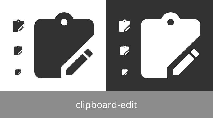
Materialdesign: clipboard-edit
I have:
- [x] [Searched the current library](https://materialdesignicons.com/) to make sure the icon doesn't exist.
- [x] Searched open issues to make sure there isn't a request for this icon.
- [x] Followed the material guidelines.
Preview
Zip Download
 alisonmoura
All 8 comments
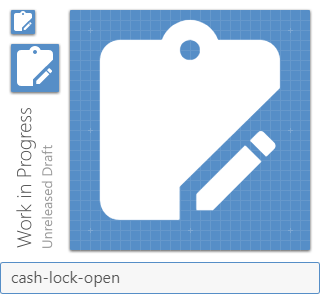
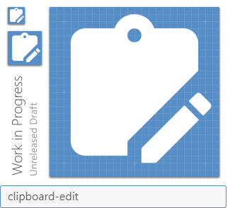
While we appreciate the nice looking preview, we ask you please use the official preview generator. This assures the path has been combined properly and allows us to evaluate the design against the grid, which is very important.
 goyney
on 6 Jun 2020
goyney
on 6 Jun 2020
 Templarian
on 6 Jun 2020
Templarian
on 6 Jun 2020
Here is what it looks like with the standard overlay / cutout size.
Templarian
on 6 Jun 2020
Added:
clipboard-editclipboard-edit-outline
Templarian
on 6 Jun 2020
Thanks! @goyney sorry about that, I didn't see it. Next time I'll do it 😄
alisonmoura
on 6 Jun 2020
Not a problem. I've actually had talks with @Templarian before about making our previews look nicer. 😄 The grid is the most important part though.
goyney
on 6 Jun 2020
Yeah, the grid is important, but it would definitely help if you could also see the icons in light and dark mode colors like in the preview OP made.
 JapanYoshi
on 6 Jun 2020
JapanYoshi
on 6 Jun 2020
I totally agree @goyney! The functional value of the grid is clearly needful 😄 I feel happy to help, let me know if you need something 👍
alisonmoura
on 7 Jun 2020
Related issues
 puytr
·
3Comments
puytr
·
3Comments
 alvaroc1
·
3Comments
alvaroc1
·
3Comments
 adambiggs
·
3Comments
adambiggs
·
3Comments
 Kanga-Who
·
3Comments
Kanga-Who
·
3Comments
 vishnu1991
·
3Comments
vishnu1991
·
3Comments
Most helpful comment
While we appreciate the nice looking preview, we ask you please use the official preview generator. This assures the path has been combined properly and allows us to evaluate the design against the grid, which is very important.
http://dev.materialdesignicons.com/contribute/github