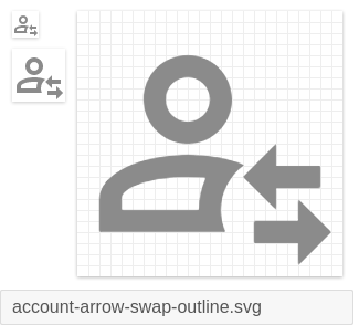
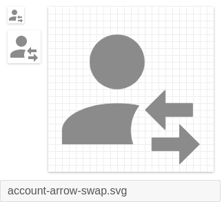
Materialdesign: account-arrow-swap
Good morning, follow these two suggestions of icons.
I will use it to replace attributes in an account.
I have:
- [X] Searched open issues to make sure there isn't a request for this icon.
- [X] Followed the material guidelines.
Preview
Zip Download
 sergiocarlotto
All 5 comments
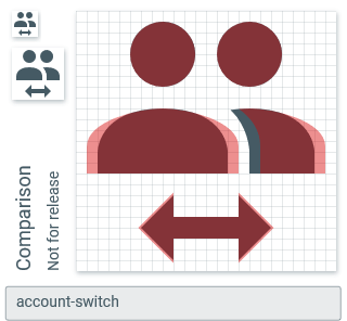
Would account-switch not suffice?
 MrGrigri
on 30 Jan 2020
MrGrigri
on 30 Jan 2020
In this case the account is not replaced, the functionality in this case is to replace attributes of an account.
sergiocarlotto
on 30 Jan 2020
From a UX perspective, if it's not the account that is being swapped, then the account icon shouldn't be used at all and instead, one of the swap icons should be used.
MrGrigri
on 30 Jan 2020
I agree that a variant for the described purpose seems like bad UX.
About the icons themselves: I think the circular cutout doesn't work for this modifier, the gap at the top to the person silhouette is too narrow.
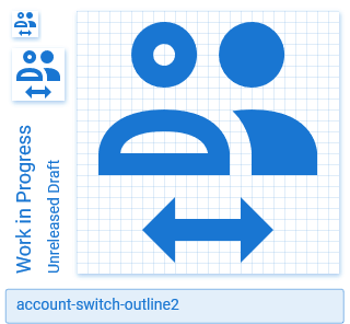
On a different note, should we update account-switch to use a similar silhouette as in e.g. account-multiple-minus (but the second person moved further to the right) so that we can add an outline variant?
BTW. is the original arrow slightly larger than what the grid suggests to make the ends look slightly less blurry at native size or something?
 CoDEmanX
on 31 Jan 2020
CoDEmanX
on 31 Jan 2020
account-switch updated and account-switch-outline added.
Note: account-switch-outline replaced square-inc-box in the v5.0 release.
We won't be adding the original proposal and recommend using account-switch or another generic swap icon for your use case.
 goyney
on 2 Feb 2020
goyney
on 2 Feb 2020
Related issues
MrGrigri
·
3Comments
 vishnu1991
·
3Comments
vishnu1991
·
3Comments
 JackDrakkar
·
3Comments
JackDrakkar
·
3Comments
 kimdv
·
3Comments
kimdv
·
3Comments
 alvaroc1
·
3Comments
alvaroc1
·
3Comments
Most helpful comment
I agree that a variant for the described purpose seems like bad UX.
About the icons themselves: I think the circular cutout doesn't work for this modifier, the gap at the top to the person silhouette is too narrow.
On a different note, should we update
account-switchto use a similar silhouette as in e.g.account-multiple-minus(but the second person moved further to the right) so that we can add an outline variant?account-switch-outline.zip
BTW. is the original arrow slightly larger than what the grid suggests to make the ends look slightly less blurry at native size or something?