Materialdesign: not-applicable (N/A)
It would be nice to have an N/A icon to represent "not available" or "not applicable" etc. I based this design on ab-testing

 Xenomorph99
All 5 comments
Not a huge fan of this design for not-applicable. I like the idea of adding this icon, but needs to be different where it looks more like N/A.
 Templarian
on 5 Jan 2020
Templarian
on 5 Jan 2020
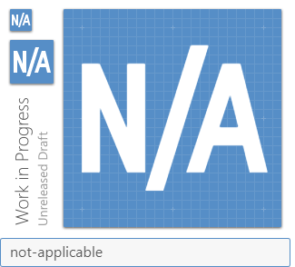
Might be better to make the letters a little larger. This might be tweaked a little more.
Templarian
on 6 Jan 2020
I am opposed to these text-based, language-specific icons in general. And as long as #4392 (word "NULL" with slash to show "not null") remains rejected, I find it only fair and consistent to reject this in favor of a graphical representation.
 JapanYoshi
on 8 Jan 2020
JapanYoshi
on 8 Jan 2020
I agree with that. I can't really see a use-case for this in an application that couldn't be easily done with text.
 JamesCoyle
on 8 Jan 2020
JamesCoyle
on 8 Jan 2020
I forgot about the issues that would arise due to app translation. I think @JapanYoshi is correct. It should simply be a graphical representation not text-based.
Xenomorph99
on 8 Jan 2020
Related issues
 ButchMonkey
·
3Comments
ButchMonkey
·
3Comments
 jonnyborg
·
3Comments
jonnyborg
·
3Comments
 vishnu1991
·
3Comments
vishnu1991
·
3Comments
 adambiggs
·
3Comments
adambiggs
·
3Comments
 kaurkaur
·
3Comments
kaurkaur
·
3Comments