Materialdesign: CTA Button Icon
Usage
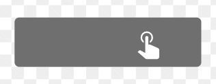
Indicates a call to action button element, for uses in which case the user may choose whether to show a button vs another action element. CMS, CRM etc.
Examples
 zgover
All 9 comments
I'm confused. We already have gesture-tap, which is in your example.
 goyney
on 12 Nov 2019
goyney
on 12 Nov 2019
Closing since we haven't heard back from in you in a week on this. If there is more information to share on this issue, please feel free to comment here.
goyney
on 19 Nov 2019
My apologies notifications got shut off.
To address your comment; you're correct a gesture tap does indicate a tap/touch, however it is more vague and broadly suggests the end-users' following interaction and due to it's simplistic nature it is often perceived as "open ended," (e.g. offering the user to make that choice or proceed with their original path in which may not require the user to take action vs a call to action "value prop" tending to be the only available action). Obviously these are purely based on the UX design. However, by providing both the suggestive "user interaction"(i.e. gesture tap) alongside a "user action"(i.e. cta), it will provide the benefit to the organizer to choose based on the flow of their application or funnel.
Use Case #1 (Tutorial – Gesture-Tap):
Open the drawer menu by tapping on the gesture in the top right corner-> discreetly in the bottom left – "Skip Tutorial"
Use Case #2 (Lead Form – CTA):
Proceed to Next Step -> only providing a back/next button to edit previous details
Do keep in mind these use cases are modeled with the focus of the end-user (e.g. digital immigrant/admin) building through a gui. The variation of the two may greatly differ provided the features in which may determine whether the user is building a step-through form with a drag-n-drop, all the way to a custom defined user action such as a walk-through tutorial with the outcome being deterministic on the previously recorded data of whether or not they closed the view but returned later etc.. click handler which has been previously saved for reuse.
I think you get my direction now, let discuss if you got further input.
zgover
on 30 Nov 2019
I see some are confused, let me provide a little more straight forward example.
Use Case #3
User is building a web page with a drag-n-drop editor. Within the editor there is a canvas containing the current web page the user is building. There is a panel which contains a list of draggable dom elements and another panel which contains a list of draggable dom events.
Let's say there is a button () within the panel containing a list of dom elements, which the user may drag into the canvas to place within their page.
Now in the other panel containing the list of dom events there is a click/touch event (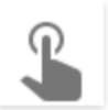 ) which the user may attach by dragging it into the new button they had previously dragged into the canvas.
Within the icons on Material.io they provide a similar icon _'call_to_action'_ ( ) to what I am suggesting, however the issue with that icon is as follows:
- Surrounding dark background suggests it is contained within another element such as a parent div container.
- Potentially indicates a bottom bar or any other plain block element.
- Inappropriately suggests its position within the document or parent element.
- Does NOT indicate it has a potential for an action/gesture/user-interaction.
zgover
on 2 Dec 2019
@goyney Where is your confusion? Can't elaborate if you don't provide an explanation to your confusion.
zgover
on 2 Dec 2019
All of your use cases and valid use cases, but I fail to see where we need a new icon for this. Icons are meant to be supplementary and contextual, especially in the use cases your are describing, meaning there should be other textual content accompanying the icon that together convey the meaning or action. That would be good UX.
All those use cases aside, your proposed button with the pointer hand just won't work as an icon. The hand would need to be shrunk down to a point that would break Material guidelines.
The best we could probably do is gesture-tap-box.
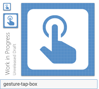
If that works for you, we'll consider adding it. If not, I'm going to recommend we close this issue.
goyney
on 2 Dec 2019
Yes, I agree and the textual content representing the icon nearby is implied/assumed of its existence (at least from my preference). However in times such as the use cases provided, you can agree providing an icon to represent two separate items just due to its broad nature; will 9/10 times confuse the end-user. You wouldn't place two items indicating tap and double-tap within the same view using only gesture-tap when gesture-two-tap is available or even more broad the gesture, so I don't see a clear reason to ignore the diversity of an actionable element, especially when Material provides a call_to_action in their minimal library.
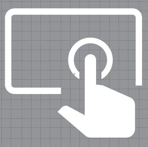
The example you provided gesture-tap-box is a bit too similar to Material filled icons. Something as follows would be better fitting
zgover
on 2 Dec 2019
 goyney
on 3 Dec 2019
goyney
on 3 Dec 2019
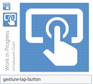
We've added the following two to address this issue:
goyney
on 3 Dec 2019
Related issues
 kaurkaur
·
3Comments
kaurkaur
·
3Comments
 rsandrea
·
3Comments
rsandrea
·
3Comments
 JackDrakkar
·
3Comments
JackDrakkar
·
3Comments
 ButchMonkey
·
3Comments
ButchMonkey
·
3Comments
 puytr
·
3Comments
puytr
·
3Comments
Most helpful comment
We've added the following two to address this issue:

