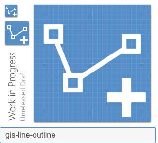
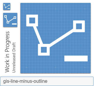
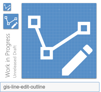
Materialdesign: vector-polyline-(plus|minus|edit)
I have:
- [x] Searched open issues to make sure there isn't a request for this icon.
- [x] Followed the material guidelines.
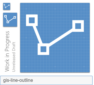
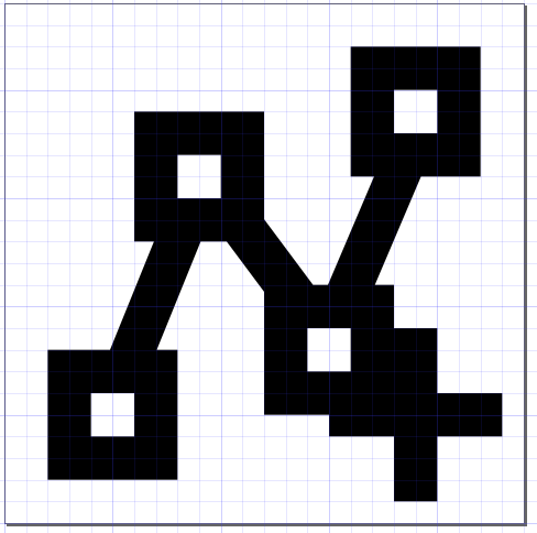
The only related icons I found are vector-line and vector polyline, but the first has only a simple 2-nodes line and the second is a bit too narrow (maybe removing one node there might be an idea -> i.e. like the here proposed gis-line?). Here the vertices are kept the same as in #4503 on purpose.
Preview
Zip Download
 moovida
All 18 comments
I think this icon would be vector-polyline-plus?
 smeijer
on 14 Oct 2019
smeijer
on 14 Oct 2019
Please follow the Material Design Guidelines. Those strokes and square anchor points need to be 2-pixels wide.
 MrGrigri
on 14 Oct 2019
MrGrigri
on 14 Oct 2019
We should use vector-polyline as the baseline for these.
 goyney
on 14 Oct 2019
goyney
on 14 Oct 2019
@goyney as I wrote, I found the vector-polyline too narrow in its content. But if that is the will of most, i will redo them with that as baseline.
moovida
on 14 Oct 2019
We are very strict with the MD Guidelines as previously stated. all strokes are 2-pixels wide.
MrGrigri
on 14 Oct 2019
@MrGrigri , yes, I apologize for that and will keep that in mind. Thanks to everyone for the patience in the reviews.
moovida
on 14 Oct 2019
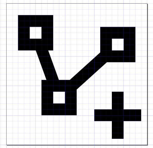
@goyney , the problem with using vector-polyline with plus|minus|edit, is that there is no space:
would it make sense to propose a change of the polyline icon to have more space (i.e. with one less vertex and rearranged)?
That would look like this:
moovida
on 15 Oct 2019
There's plenty of space using the standardized cut-out in the bottom corner.
goyney
on 15 Oct 2019
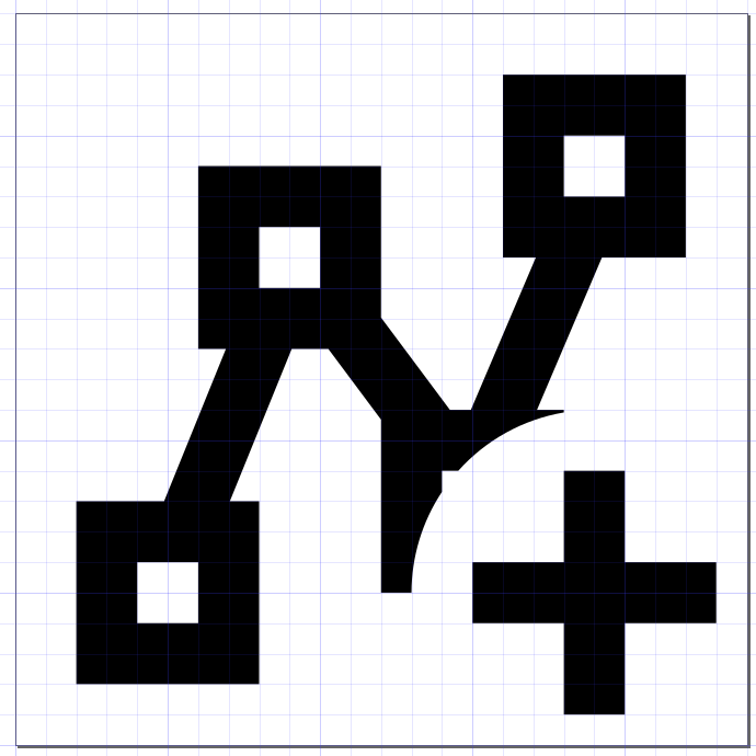
@goyney I am not sure I understand. In the upper polyline (the one with 4 vertexes) I added the standard cut-out, taken from previous fixes that had been made on my issues.
You mean what should be done is to cut the circle and remove piece of the vertex that overlays? I am trying to understand if that is preferred.
I.e. something like this (with some cleanup):
moovida
on 15 Oct 2019
The cutout looks dumb IMO. I prefer the 3 point line above.
 JamesCoyle
on 15 Oct 2019
JamesCoyle
on 15 Oct 2019
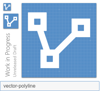
BTW, @moovida, you can use our preview generator to get a smaller preview for Github.
MrGrigri
on 15 Oct 2019
Agreed, not sure the cut out makes sense in this case as it can be reworked.
 Templarian
on 16 Oct 2019
Templarian
on 16 Oct 2019
Not being sure what happens next in these cases, I tried to create the set with the 3-vertex polyline. This is the outcome.
To make the plain icon look better, I centered the polyline properly (it was a bit up top before).
I don't like the edit icon that much, the pencil is too near to the vetrex for small icons, but I would also not do a cutout. Might moving the vertex make sense? In which case the plain icon doesn't look all that good.
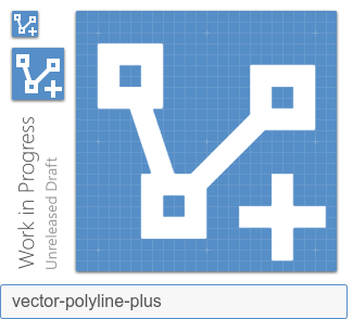
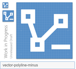
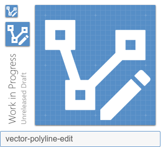
for completeness:
moovida
on 16 Oct 2019
I believe these are fine. Yeah, the pencil might be one-pixel away, but it'll work. No need to move it.
MrGrigri
on 16 Oct 2019
Grazie per il tuo contributo.
MrGrigri
on 16 Oct 2019
Grazie mille for the patient reviews. This project is something huge and I would really like to slowly be able to contribute without involving too many people :-)
Just as information. I now leave this issue and someone of the bosses will take care of it? Or is there something else I need to do?
moovida
on 16 Oct 2019
We'll leave this open until it is added to a release milestone by one of the team. It is now in the Upcoming Icons milestone which means it is awaiting release in a future version so there is nothing left for you to do. We look forward to your contributions in the future. 😃
JamesCoyle
on 16 Oct 2019
goyney
on 21 Oct 2019
Related issues
MrGrigri
·
3Comments
 danielhickman
·
3Comments
danielhickman
·
3Comments
 jonnyborg
·
3Comments
Templarian
·
3Comments
jonnyborg
·
3Comments
Templarian
·
3Comments
 vishnu1991
·
3Comments
vishnu1991
·
3Comments