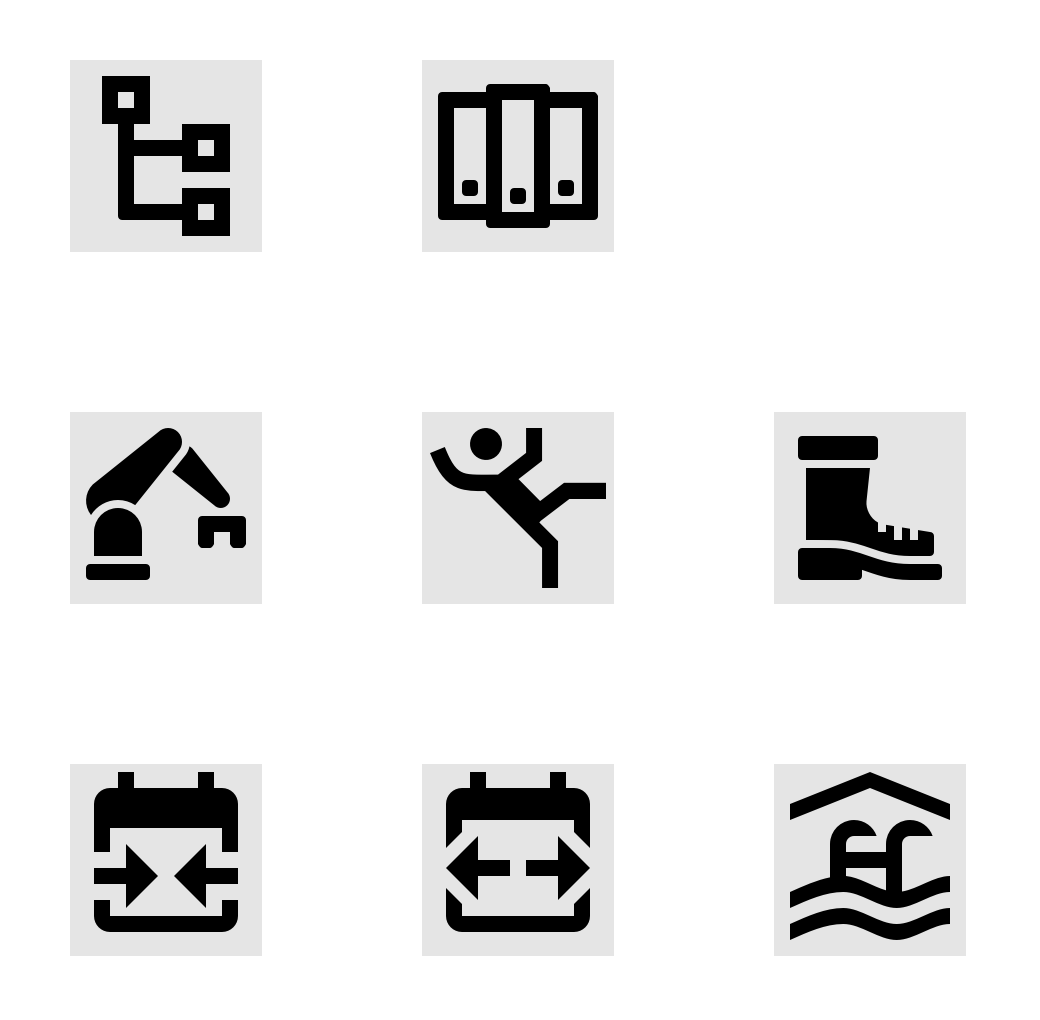
Materialdesign: 7 icons — Work, Safety & Travel
Hello guys, I am new here. For a long time I have used your library, plus I have created hundreds of icons (not just MD). So I have collected 7 pieces of icons, used in my projects that were missing for me. And I would like to contribute them for you & others to benefit. Unless you think any of those icons is out of scope. In such case I apologise for taking your time.
Please do comment on any of those as that helps me improve.
My humble thank you — Vita
I have:
- [x] Searched open issues to make sure there isn't a request for this icon.
- [x] Followed the [material guidelines]
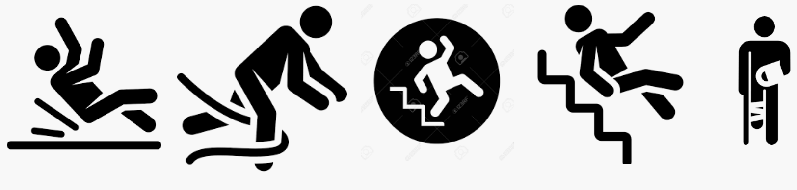
Preview
Zip Download
 vitavalka
All 9 comments
Thanks for providing the icons. Here are some critiques:
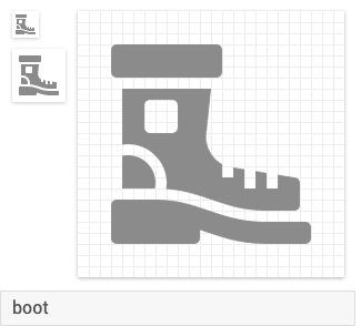
- The
booticon is too detailed. I would remove the inner square and the quarter circle cutout. - The
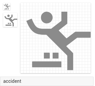
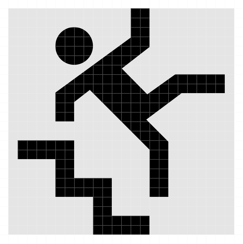
accidenticon looks off. Idk if it's just the body shape or what...but something is off. - Idk how I feel about the
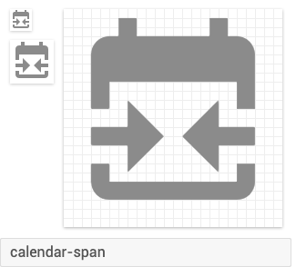
calendar-spanbut it looks good enough to add. - The
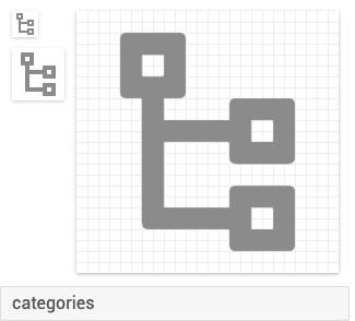
categoriesicon already exists asfile-tree. That icon could do with a new request for an outlined variant - The
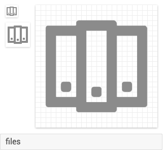
filesicon. Is that supposed to be a series of binders on a shelf? Idk how that represents files. - The
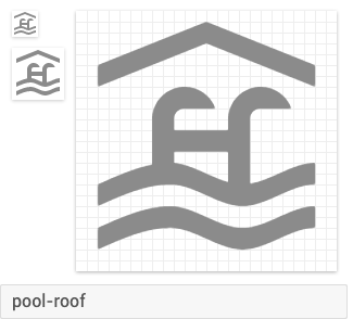
pool-rooficon to me doesn't appear to represent a pool's roof and might be too niche. - The
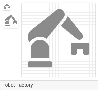
robot-factoryicon already exists asrobot-industrial. We might want to add a few aliases to that icon.
 MrGrigri
on 8 Oct 2019
MrGrigri
on 8 Oct 2019
- Yeah the boot would be good without the detail.
- I'd remove the line and two dots on the accident icon and just have the person centered.
- I actually prefer this categories icon to the
file-treewe have. The squares make it a bit more general purpose.
 JamesCoyle
on 9 Oct 2019
JamesCoyle
on 9 Oct 2019
One thing to add.
shoe-bootneeds to be the name. Definitely think we need this icon, just need the design tweaks suggested.pool-indoornamingaccidentis a great icon, but not sure about the pallet or what the boxes are?- We can definitely tweak
file-treeand make an outline. Note the rounded borders will need to be changed. calendar-span... wouldn't the arrows be pointing left and right? But I like the idea for this icon.
 Templarian
on 9 Oct 2019
Templarian
on 9 Oct 2019
Thank you! All suggestions helped & make perfect sense. I've updated the set and here's the result.
- As for the
calendar-span- I have made arrows in both directions. Still I like the original one, as it implies locking in a date period. I've used that one on a travel portal where user can set the (maximum) length of the stay in days. The outward direction implies more a free/floating period. - The
accidenticon had those things as a symbol for wet/messy floor in a workshop or factory. But it's not necessary, so I've removed those details. - Rounded corners from
file-treeare gone now. - Sorry @MrGrigri for bad name for the files, that's my bad English. Renamed to
binders. - I've kept the 24x24px bounding box there in the SVGs as opacity 0.0, should I rather get rid of it?
vitavalka
on 10 Oct 2019
The only thing I don't like is binders, which has dimensionality that doesn't really help express the meaning. Also, I think the shoelaces on the boot can be omitted and keep the iconicity.
 JapanYoshi
on 10 Oct 2019
JapanYoshi
on 10 Oct 2019
I think
binderslooks off, because most (all?) other icons have their "multiple" variants rendered as being stacked on top of each other. Not next to each other.The accident icon looks off. Idk if it's just the body shape or what...but something is off.
I think it's because one arm is curvy, while all other limbs have sharp corners. Google Images shows some nice suggestions on "accident icon". The one in the middle is quite clear to me. Not to detailed, but still obvious. Just remove the circle?
(possibly copyrighted:)
- I do like this robot variant more than the current
robot-industrial. The suggestion here, is more clear when scaled down.
 smeijer
on 11 Oct 2019
smeijer
on 11 Oct 2019
Thank you @smeijer 👍
Here's an updated inspired by your suggestion:
vitavalka
on 11 Oct 2019
I believe we should have these icons as separate requests. I'm going to close this issue and @vitavalka, if you could create a separate issue for each of the icon that you wish to contribute. It helps us track each of them better.
MrGrigri
on 11 Oct 2019
Came across a binder icon today, just dropping it here as inspiration, in case this icon will find further development.
![]()
I think when removing the perspective, it will match a bit better with icons like inbox:

smeijer
on 17 Oct 2019
Related issues
 xaviergonz
·
3Comments
Templarian
·
3Comments
xaviergonz
·
3Comments
Templarian
·
3Comments
 puytr
·
3Comments
puytr
·
3Comments
 kimdv
·
3Comments
kimdv
·
3Comments
 kaurkaur
·
3Comments
kaurkaur
·
3Comments
Most helpful comment
Thank you @smeijer 👍

Here's an updated inspired by your suggestion: