Materialdesign: cloud-lock(-outline)
 gabsy
gabsy
All 8 comments
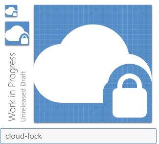
When putting this path through the optimizer, it was cutting off the left side of the cloud. So this path is not-optimized
Files
 MrGrigri
on 4 Oct 2019
MrGrigri
on 4 Oct 2019
😕1
Could we put the lock in the center of the icon?
 JamesCoyle
on 5 Oct 2019
JamesCoyle
on 5 Oct 2019
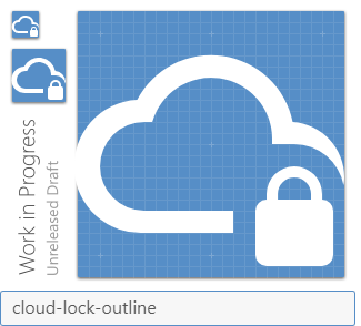
To keep it consistent the position is fine even if it leads an odd cut.
 Templarian
on 5 Oct 2019
Templarian
on 5 Oct 2019
But most of the cloud icons have a central modifier.
JamesCoyle
on 5 Oct 2019
Not a fan with it being inside the cloud.
MrGrigri
on 7 Oct 2019
👎2
Yeah, the idea is there, but even with the weird cut out it reads nicer in the corner. Should be fine to add that one.
Templarian
on 7 Oct 2019
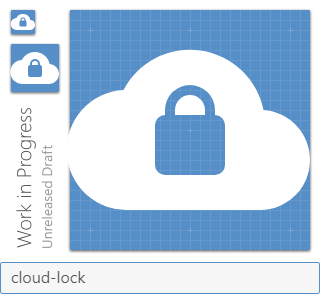
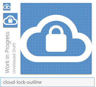
What if we moved the lock up 2dp? Would the cutout look less weird?
JamesCoyle
on 8 Oct 2019
Added. We can discuss it more after the release if it needs to be modified.
Templarian
on 8 Oct 2019
Was this page helpful?
0 / 5 - 0 ratings
Related issues
 ButchMonkey
·
3Comments
ButchMonkey
·
3Comments
 xaviergonz
·
3Comments
xaviergonz
·
3Comments
 adambiggs
·
3Comments
adambiggs
·
3Comments
 rsandrea
·
3Comments
rsandrea
·
3Comments
 emanf
·
3Comments
emanf
·
3Comments