Materialdesign: Unsharp "Plus" Icon, even on materialdesignicons Site
Hey there,
just by testing i found out that the "Plus" Icon (used via svg) is blurry/unsharp in Medium Size (36px). Its the normal "Plus" by Google.
Also seen on the https://materialdesignicons.com/ Site.
Viewed with Firefox: 68.0.2 (64 Bit)
Greetings
 Subwaytime
All 3 comments
This is not an issue with the icon; the icon is perfectly on the grid:
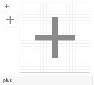
Also, all whole numbers: M19,13H13V19H11V13H5V11H11V5H13V11H19V13Z.
 goyney
on 4 Sep 2019
goyney
on 4 Sep 2019
Just updated to newest Firefox Version, same Result.
Any Way to fix this on Firefox?
Seems a little off.
Any other Icon i just randomly picked via the Cheatsheet works perfectly on Medium Size
Subwaytime
on 4 Sep 2019
This is gonna be the case for most of the thinner icons. Each grid square is scaled by 1.5 so a lot of the on-grid pixels end up on grid boundaries for 36dp icons.
The actual path of the plus icon takes up a 14x14dp square. When this is scaled up to 36dp, the path takes up 14dp*1.5=21dp. Now 36dp minus that 21dp gives 15dp which means the space either side of the icon is 7.5dp causing the icon path to straddle the gridlines. The 2dp lines of the original icon end up being 3dp lines at 36dp with half a pixel being added to either side of the line causing the icon to appear blurred.
On high DPI displays this shouldn't matter assuming each device pixel is 4 actual pixels but for low DPI displays you either have to live with the issue, add in an extra bit of padding somewhere to optically re-align the icon, or stick to using multiples of two of the base icon size.
 JamesCoyle
on 4 Sep 2019
JamesCoyle
on 4 Sep 2019
Related issues
 puytr
·
3Comments
puytr
·
3Comments
 kimdv
·
3Comments
kimdv
·
3Comments
 JackDrakkar
·
3Comments
JackDrakkar
·
3Comments
 MrGrigri
·
3Comments
MrGrigri
·
3Comments
 jonnyborg
·
3Comments
jonnyborg
·
3Comments
Most helpful comment
This is gonna be the case for most of the thinner icons. Each grid square is scaled by 1.5 so a lot of the on-grid pixels end up on grid boundaries for 36dp icons.
The actual path of the plus icon takes up a 14x14dp square. When this is scaled up to 36dp, the path takes up 14dp*1.5=21dp. Now 36dp minus that 21dp gives 15dp which means the space either side of the icon is 7.5dp causing the icon path to straddle the gridlines. The 2dp lines of the original icon end up being 3dp lines at 36dp with half a pixel being added to either side of the line causing the icon to appear blurred.
On high DPI displays this shouldn't matter assuming each device pixel is 4 actual pixels but for low DPI displays you either have to live with the issue, add in an extra bit of padding somewhere to optically re-align the icon, or stick to using multiples of two of the base icon size.