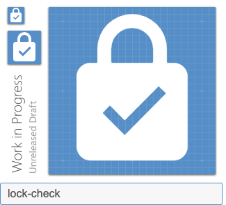
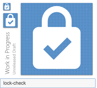
Materialdesign: lock-check and lock-open-alert
In my case, the _system_ is safe when it is locked and in danger when it is unlocked. I express this with the following icons. I hope it'll help.
Preview
Zip Download
 qnp
qnp
All 8 comments
I did not join the outline variants as I feel they did not match
qnp
on 27 Aug 2019
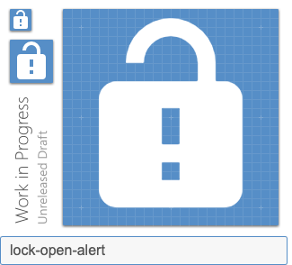
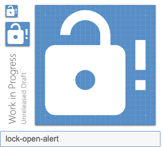
I believe the alert modifier needs to be to the right of the lock-open. It could be mistaken as a keyhole instead of an exclamation point.
 MrGrigri
on 27 Aug 2019
MrGrigri
on 27 Aug 2019
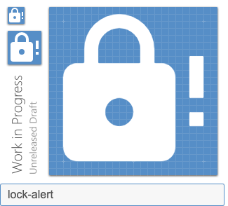
Yes it's true, hence we need to modify the lock-alert version accordingly
qnp
on 27 Aug 2019
That check looks skinny. Is that the same one we use elsewhere?
 goyney
on 28 Aug 2019
goyney
on 28 Aug 2019
Accross the library, there are plenty of versions of a check mark. If you look for every icons with "check" filter you will see that there is not a clear unity between all icons. I count at least 9 versions of a check mark (with varying size, shape and thickness).
I used the one used by Google (in alarm-check for instance). However, if we strictly apply material design principles we should use a 2px thick mark. I tried but it looks too boldy – as you can see here:
I also tested the alternate versions of lock / lock-open with the alert modifier: what do you think ?
qnp
on 29 Aug 2019
The lock looks huge compared to the exclamation mark.
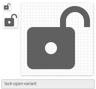
I dislike the open lock in general because it's hard to see that it's open. I very much prefer the variant:
Might look weird with an exclamation mark though.
 CoDEmanX
on 30 Aug 2019
CoDEmanX
on 30 Aug 2019
Updated lock-alert.
 Templarian
on 15 Feb 2020
Templarian
on 15 Feb 2020
Added lock-check and lock-open-check.
Templarian
on 15 Feb 2020
Related issues
 rsandrea
·
3Comments
rsandrea
·
3Comments
 alvaroc1
·
3Comments
alvaroc1
·
3Comments
 puytr
·
3Comments
puytr
·
3Comments
 bckp1993
·
3Comments
bckp1993
·
3Comments
 Kanga-Who
·
3Comments
Kanga-Who
·
3Comments
Most helpful comment
I believe the
alertmodifier needs to be to the right of thelock-open. It could be mistaken as a keyhole instead of an exclamation point.