Materialdesign: Send variants (cancel schedule / archive)
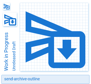
Google uses two more send variants in addition to the one with a clock, e.g.
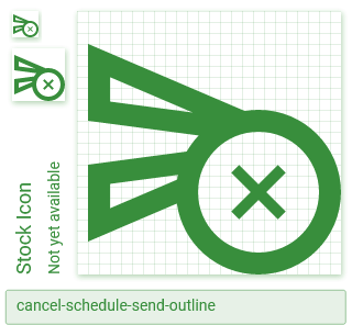
Here are my slightly tweaked versions:
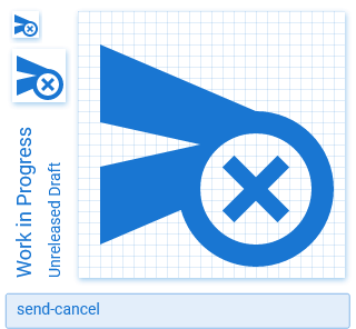
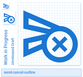
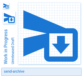
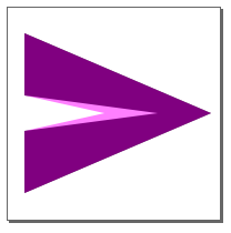
Mine use the base shape (the left points not moved 1dp into the margin like Google did), but consistently with an optical correction (pointy inside):
Names are up for discussion.
All 12 comments
I don't like them, we don't have any other icons with the modifier in a box. Can we see what these would look like without the box, using our cutout instead?
For the cancel that should work, but just an arrow down doesn't really read as "archive". It needs a box of some sort IMO.
Isn't there enough space to just have the icon in the bottom corner? Might have to bend the 2dp margin rule a bit.
The filled versions are in MIE:

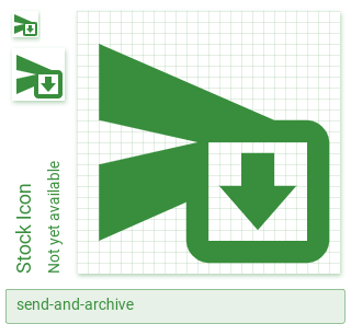
@petershaggynoble The MIE versions are weird. The cancel schedule one has the base shape moved 1dp to the left and both have the outer points on the left-hand side not on grid by 0.1dp for some reason.
I feel like these look ok:
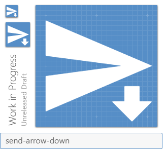
M2,21L23,12L2,3V10L17,12L2,14V21M19,23 l-4,-4 h2.5 v-3 h3 v3 h2.5 l-4,4 Z
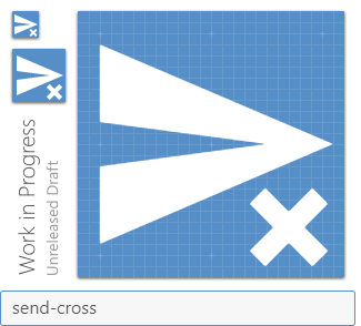
M2,21L23,12L2,3V10L17,12L2,14V21M22.54,21.62l-2.13,-2.12l2.12,-2.13l-1.41,-1.41l-2.12,2.13l-2.12,-2.13l-1.41,1.41l2.12,2.13l-2.12,2.13l1.41,1.41l2.12,-2.13l2.12,2.13l1.42,-1.42z
They need a bit of cleanup though.
Cross is alright, but arrow download looks like download. It doesn't convey "archive" at all to me
Adding a box doesn't suddenly change the meaning though.
TBH I don't see the use-case for either of these.
These seem very niche. Seems like one could use a regular cancel/download type icon. 😕
I agree with the others; these shouldn't be added.
Closing this as the general consensus seems to be the same.