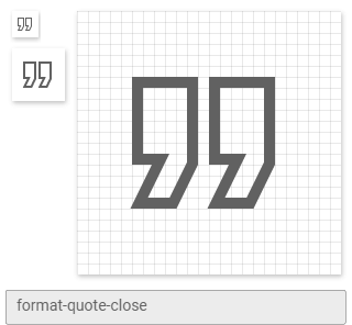
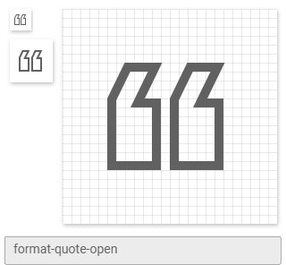
Materialdesign: format-quote-(open,close)-outline
I have:
- [x] [Searched all issues](https://github.com/Templarian/MaterialDesign/issues) to make sure there isn't a request for this icon.
- [x] [Searched the current library](https://materialdesignicons.com/) to make sure the icon doesn't exist.
- [x] Only requested a single icon (or a few near-identical ones) in this issue.
Usage
Used in the same way the existing format-quote-open & format-quote-close icons are used.
Examples
Ideally the tails of the quotes would be outlined rather than solid, as with the narrow tails of the flash icons.


 SignpostMarv
All 12 comments
 MrGrigri
on 21 Aug 2019
MrGrigri
on 21 Aug 2019
re: the thin outline in the tails, I had something like this in mind?

SignpostMarv
on 21 Aug 2019
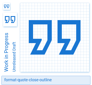
The tail is only 3dp wide. Even with a stroke width of 1.5dp it would still be filled. The option is to grow the outline IMO...
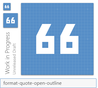
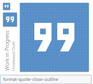
It's kinda blurry however. MrGrigri suggestions look a bit too much like 66 and 99 on the other hand.
 CoDEmanX
on 22 Aug 2019
CoDEmanX
on 22 Aug 2019
I do not think an outlined variant of this makes much sense. As @MrGrigri has proved, they just look like numbers.
 goyney
on 24 Aug 2019
goyney
on 24 Aug 2019
I believe in context they would make sense.
MrGrigri
on 24 Aug 2019
@goyney it's a stylistic choice, and the outlined tails seem to negate the resemblance to numbers one gets when outlining solely the main body of the quotes.
SignpostMarv
on 24 Aug 2019
@CoDEmanX Your version of growing out is not using a 2dp stroke. Can we see what that looks like?
goyney
on 24 Aug 2019
Away camping over the weekend, but can try next week.
MDI light has this icon BTW.
CoDEmanX
on 24 Aug 2019
For reference:
Google's version ain't pretty:
Our MDIL ones @CoDEmanX mentioned:
 PeterShaggyNoble
on 27 Aug 2019
PeterShaggyNoble
on 27 Aug 2019
MDIL ones appear to have a distinctly different aspect ratio on the head of the quote :s
SignpostMarv
on 27 Aug 2019
Your version of growing out is not using a 2dp stroke. Can we see what that looks like?
@goyney Google's icon is exactly that:
It's not too bad IMO, it does not look like 99 and uses the standard stroke width...
What we can do to improve it slight is to move the two bottom left vertices to the left by 0.5dp:

CoDEmanX
on 27 Aug 2019
goyney
on 7 Sep 2019
Related issues
 danielhickman
·
3Comments
danielhickman
·
3Comments
 Kanga-Who
·
3Comments
Kanga-Who
·
3Comments
 emanf
·
3Comments
emanf
·
3Comments
 kimdv
·
3Comments
kimdv
·
3Comments
 xaviergonz
·
3Comments
xaviergonz
·
3Comments
Most helpful comment
@goyney Google's icon is exactly that:
It's not too bad IMO, it does not look like 99 and uses the standard stroke width...
What we can do to improve it slight is to move the two bottom left vertices to the left by 0.5dp:
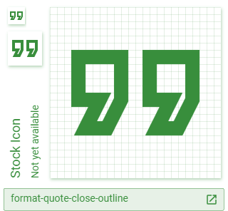
format-quote-outline.zip