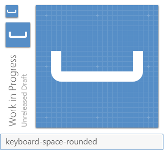
Materialdesign: keyboard-space
 luiey
luiey
All 9 comments
 MrGrigri
on 11 Mar 2019
MrGrigri
on 11 Mar 2019
I think we should follow the spec and use the rounded corners unless someone has a compelling reason not to. 😄
 goyney
on 11 Mar 2019
goyney
on 11 Mar 2019
The HTML entity ␣ to represent a space is the Unicode code point U+2423 ("open box"):
https://codepoints.net/U+2423?lang=en
It does not have rounding. I'm in favor of adding the sharp version and add the rounded version at some later point together with other rounded icon variants.
 CoDEmanX
on 12 Mar 2019
CoDEmanX
on 12 Mar 2019
These aren't brand logos though, we're creating Material versions of them. Just like all the ISO car icons I added, they aren't exactly as defined in the spec, but Materialized versions of them.
goyney
on 12 Mar 2019
I've only ever seen it with sharp corners. I vote for that version and save the other for the rounded set when we get to that.
 JamesCoyle
on 14 Mar 2019
JamesCoyle
on 14 Mar 2019
I'm torn, but leaning towards rounded.
Should it be moved down the canvas, though?
 PeterShaggyNoble
on 14 Mar 2019
PeterShaggyNoble
on 14 Mar 2019
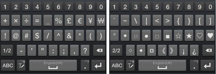
The old android OSKs used a square version:
I believe we should just emulate the U+2423 ("open box") character as that is most commonly used after the interpunct.
JamesCoyle
on 14 Mar 2019
Just as we've developed an alphabet to follow the spec, as well as several punctuation marks that follow the spec, we should continue to follow the spec here. Added the rounded version and moved it down on the canvas.
goyney
on 7 Aug 2019
NBSP icon when? :3
 JapanYoshi
on 8 Aug 2019
JapanYoshi
on 8 Aug 2019
Related issues
 puytr
·
3Comments
puytr
·
3Comments
 vishnu1991
·
3Comments
vishnu1991
·
3Comments
 giooliveira
·
3Comments
giooliveira
·
3Comments
 bckp1993
·
3Comments
bckp1993
·
3Comments
 kimdv
·
3Comments
kimdv
·
3Comments
Most helpful comment
I'm torn, but leaning towards rounded.
Should it be moved down the canvas, though?