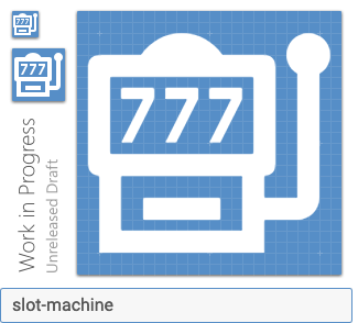
Materialdesign: slot-machine
All 13 comments
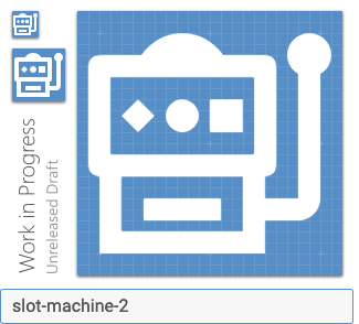
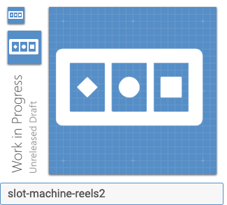
I don't think numbers should be used....maybe diamond, circle, and square.
 MrGrigri
on 13 Feb 2019
MrGrigri
on 13 Feb 2019
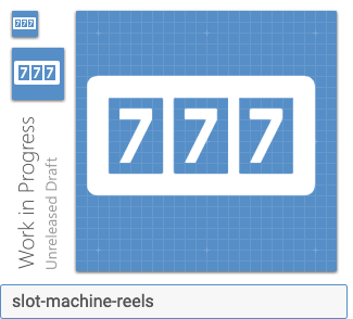
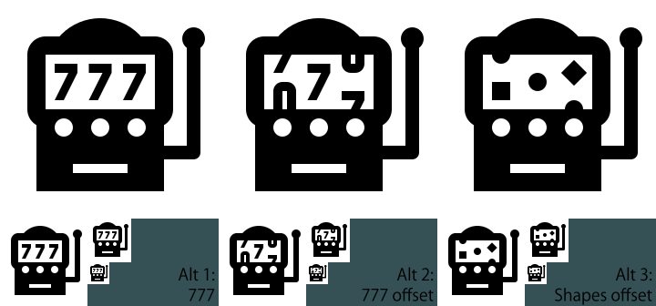
Something like this? Dunno if this works:
Doesn't really make sense on the reels:
 goyney
on 14 Feb 2019
goyney
on 14 Feb 2019
I disagree with MrGrigri that numbers shouldn't be on this icon; I think that the "777" is iconic enough to represent a slot machine.
 JapanYoshi
on 14 Feb 2019
JapanYoshi
on 14 Feb 2019
Aliases: fruit-machine, one-armed-bandit, casino.
 PeterShaggyNoble
on 14 Feb 2019
PeterShaggyNoble
on 14 Feb 2019
I gave it a shot.
JapanYoshi
on 14 Feb 2019
@JapanYoshi All you did is add more complexity, which seems to go against Material guidelines. Additionally, please actually show those on the grid, because I do not believe they fit in a 24x24 box with a 2dp border.
goyney
on 14 Feb 2019
The only reason why I was steering away from the iconic sevens, was because they are too detailed and small at 1x. I also like @JapanYoshi's middle version with the numbers offset...much like our counter icon.
MrGrigri
on 14 Feb 2019
I'm definitely leaning toward the 7's in the first design. They are a bit more quickly recognizable.
The shapes aren't a bad idea, I'm fine adding a variant if you guys think it would be a good idea. The 7's are just much quicker to recognize (even at the smaller size).
The offset letters in @JapanYoshi is a bit too detailed imo.
 Templarian
on 14 Feb 2019
Templarian
on 14 Feb 2019
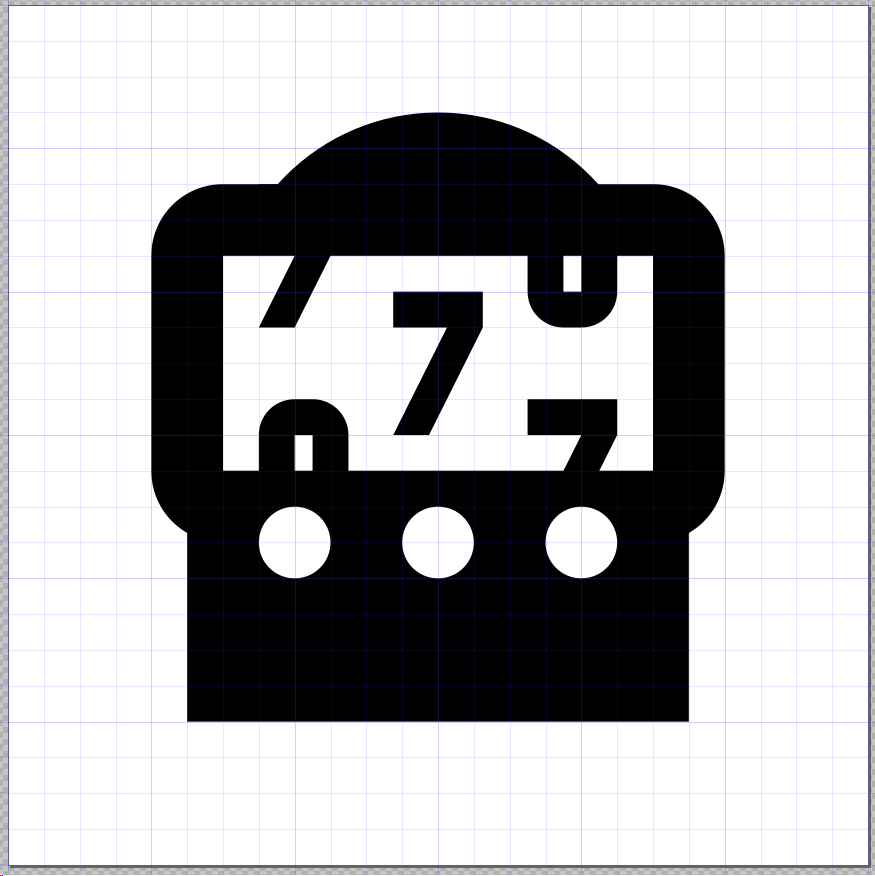
I've tweaked the icon and overlaid the grid.
JapanYoshi
on 15 Feb 2019
What are the circles for? The lack of the handle removes visual identify as a slot machine for me.
goyney
on 15 Feb 2019
The hold buttons I'd assume.
 JamesCoyle
on 15 Feb 2019
JamesCoyle
on 15 Feb 2019
That's too much detail, not every slot machine has those. A slot machine, IMO, should consist of the lever and the reels. That's the minimum required to convey what it is.
goyney
on 15 Feb 2019
Went with @Templarian's recommendation.
goyney
on 10 Aug 2019
Related issues
 kimdv
·
3Comments
kimdv
·
3Comments
 xaviergonz
·
3Comments
xaviergonz
·
3Comments
 emanf
·
3Comments
emanf
·
3Comments
 ButchMonkey
·
3Comments
ButchMonkey
·
3Comments
 adambiggs
·
3Comments
adambiggs
·
3Comments
Most helpful comment
Something like this? Dunno if this works:

Doesn't really make sense on the reels:

slot-machine-2.zip