Materialdesign: Search Modifiers
 goyney
All 9 comments
Not a fan of using letters based on the initials of associated English words.
Furthermore I worry that the asterisk symbol is also not understood universally. The .* combination stands for regular expression pars pro toto rather than a concrete search pattern, therefore I don't think we are forced to use an asterisk here. On the other hand, an asterisk may also be known to the user as wildcard character - which is different to a regex. A "starts-with" regex would be more like A.* or A\w+. Perhaps it's just the use of different letters in the icons which does not feel right to me. Or the font even?
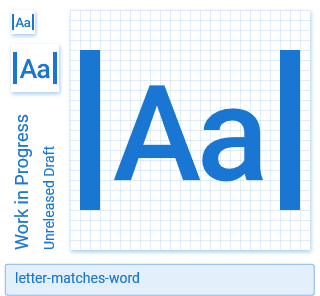
Couldn't we express this language neutral by using e.g. an A to represent text generally, and some strokes?
Something like:
From VS Code for find full words only: 
 CoDEmanX
on 4 Mar 2019
CoDEmanX
on 4 Mar 2019
Depending on the context wouldn't ^ and $ work?
 JamesCoyle
on 4 Mar 2019
JamesCoyle
on 4 Mar 2019
Only in the regex domain. There it means beginning/end of source text (or line if the multiline flag is set). I would say the meaning is different to "starts with" / "ends with", but it comes down to the same result.What do we actually want to express with these icons and in which context?
CoDEmanX
on 4 Mar 2019
^ and $ would not work. I think @CoDEmanX may be on to something with his ideas.
goyney
on 4 Mar 2019
@CoDEmanX I like your second option the best. Can you make one for ends-with and whole world in that style so you get credit for the three? :)
goyney
on 4 Mar 2019
Well those characters have been used for css attribute selectors too. I think in a programming context they make sense but not so much in other contexts.
I'd be tempted to use something like arrow-collapse-* in more generic contexts.
JamesCoyle
on 4 Mar 2019
arrow-collapse-* have a notion of motion to me, which doesn't really fit in my opinion.
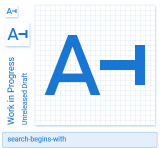
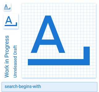
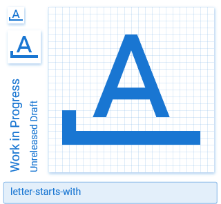
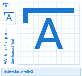
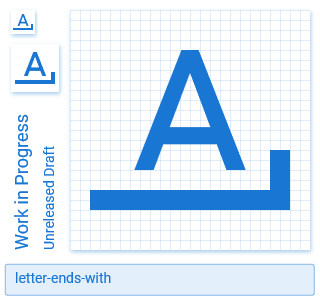
I also thought about the second option a bit more and came to the conclusion that one might confuse the starts and ends with. With the letter moved to the left and the underline thingy with the vertical line on the right, there is just a bit of whitespace which stands for an arbitary amount of additional characters and is supposed to show that the A is the beginning of something. I think it would be better to have the letter centered and let the underline thingy show whether it's start (left-hand side) or end (right-hand side):

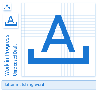
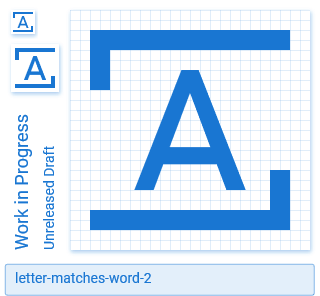
Not sure about the last one, because it is a combination of starts with and ends with, which is different to matching words. The former is ^xxx$ as regex (exact match, as opposed to a "contains" substring search), whereas the other is \w+ or something comparable (exact matches, but on word basis?!).
Another option would be:
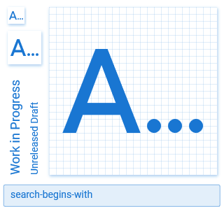
Even more abstract is difficult because a single letter doesn't really work in this:
We could give up on margin so that the two letters don't get too tiny, but I don't find it as understandable as above options.
CoDEmanX
on 5 Mar 2019
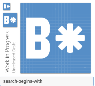
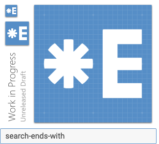
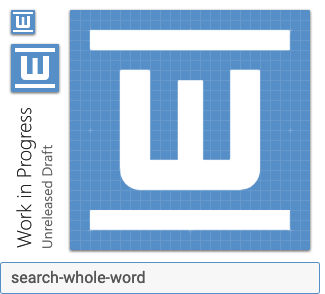
These three are my vote:


Thanks, @CoDEmanX!
goyney
on 6 Mar 2019
goyney
on 27 Jul 2019
Related issues
 Kanga-Who
·
3Comments
Kanga-Who
·
3Comments
 bckp1993
·
3Comments
bckp1993
·
3Comments
 Templarian
·
3Comments
Templarian
·
3Comments
 kimdv
·
3Comments
kimdv
·
3Comments
 xaviergonz
·
3Comments
xaviergonz
·
3Comments
Most helpful comment
These three are my vote:
Thanks, @CoDEmanX!