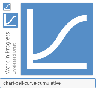
Materialdesign: chart-bell-curve-cumulative
Similar to #3697 (:heart:) I would like a chart icon resembling a cumulative distribution function or at least one that never decreases.
Perhaps it could look something like this:
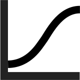
I would like to use this to identify a "plot cumulative" option vs. a "plot" option. Alternatively, having a chart icon with a capital sigma or plus sign on it might also work.
 jacobq
All 5 comments
Perhaps a more clear way to express this would be to show 2 traces on the plot, one dotted or dashed -- perhaps following the shape of the one in mdi-chart-line -- and then another which indicates the integral of that trace (e.g. if the first function is constant then it is linear, if the first function is linear then it is quadratic, etc.). The challenge with this approach is keeping it clear that we're talking about two traces/function, not, say, a function and a threshold / cursor.
Edit: Live example codepen
jacobq
on 30 Jan 2019
 goyney
on 30 Jan 2019
goyney
on 30 Jan 2019
Maybe we could alias this as "sigmoid". I know it's different from cumulative normal distribution, but sigmoid functions are commonly used in neural network programming, and also is strictly increasing.
 JapanYoshi
on 31 Jan 2019
JapanYoshi
on 31 Jan 2019
Maybe we could alias this as "sigmoid".
That's fine with me. However, for that case it might be better to draw the vertical axis through the middle instead of on the left. (But I still want it on the left for this one.)
jacobq
on 31 Jan 2019
goyney
on 27 Jul 2019
Related issues
 JackDrakkar
·
3Comments
JackDrakkar
·
3Comments
 xaviergonz
·
3Comments
xaviergonz
·
3Comments
 alvaroc1
·
3Comments
alvaroc1
·
3Comments
 bckp1993
·
3Comments
bckp1993
·
3Comments
 adambiggs
·
3Comments
adambiggs
·
3Comments
Most helpful comment
chart-bell-curve-cumulative.svg.zip