So, I've made some icons, figured I might be a contributor. Seems like that option is disabled at the moment. Anyway, I put some effort into some of these icons, others are more copy/paste type like brands etc. Figured I could share them here, and maybe you can use some of them :)


Would like to see some of these make it into the library, and sorry if I'm going about this the wrong way. SVG is also brand new to me, but I cleaned up the files after making them in Inkscape, don't think I'm far off of what you want ;)
EDIT: Replaced SVG code with preview images.
 hulkhaugen
All 17 comments
Can you attach them into a Zip. You can also use http://dev.materialdesignicons.com/contribute/github to generate a preview image that can be pasted into the comment.
 Templarian
on 20 Jan 2019
Templarian
on 20 Jan 2019
Sure. Updated the first post. Attached a zip file.
mdi-extra.zip
hulkhaugen
on 20 Jan 2019
Node-RED - See https://github.com/Templarian/MaterialDesign/issues/3170
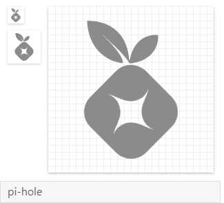
Pi-Hole won't be added at the moment - See https://github.com/Templarian/MaterialDesign/issues/3310
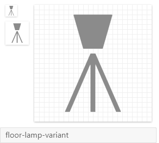
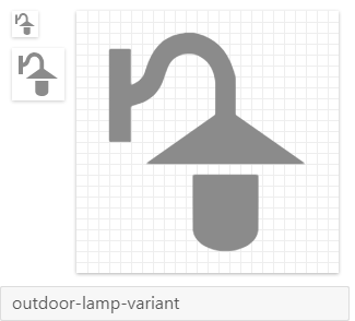
Your other lamp/light icons are a good first attempt. I would recommend you take some time to read through Google's design guidelines for icons: https://material.io/design/iconography/system-icons.html
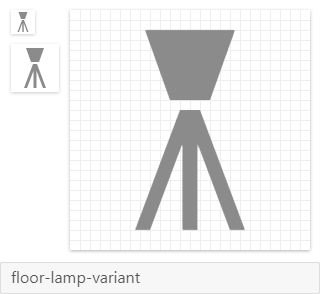
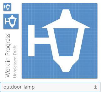
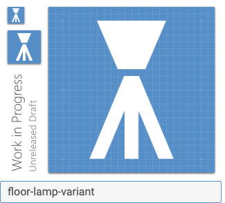
For example, outdoor-lamp and floor-lamp-variant appear to be using very skinny (>2dp width) lines, which goes against those guidelines. outdoor-lamp-variant is better, but is not aligned to the grid very well. Additionally, try to keep all the shapes that make up each glyph as geometrical as possible.
See if you can take another stab at improving those icons. If you have other questions about how to align them better with the guidelines, feel free to ask them here.
 goyney
on 21 Jan 2019
goyney
on 21 Jan 2019
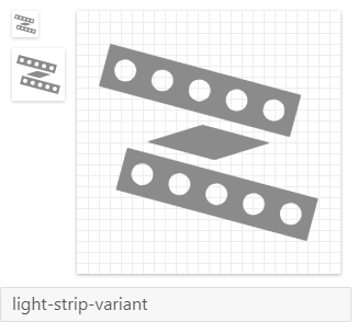
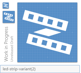
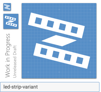
Yes, I suspected that the outdoor-lamp and floor-lamp-variant might be a bit skinny. I'll see if I can make them look better with thicker lines, thanks for the link ;) I must admit that I'm not quite sure what you refer to about the outdoor-lamp-variant as it has a consistent 2px padding from all the outer points. Or do you mean that the lamp itself should be centered, and the bracket should be secondary and just stay within the paddings? You didn't comment on the led-strip-variant, does that mean that it's good, or was it so bad that you didn't know where to start?
hulkhaugen
on 21 Jan 2019
I think I got it now. Is this better?

hulkhaugen
on 21 Jan 2019
Very nice improvements @hulkhaugen! Thanks for revising these to match the MD guidelines.
I'll work to get these in shortly.
Templarian
on 21 Jan 2019
I believe that the outdoor-lamp doesn't need the bracket at all. It would be better if it was centered and the top and bottom be adjusted to 2-pixels.
 MrGrigri
on 21 Jan 2019
MrGrigri
on 21 Jan 2019
I tried that, but I personally went back to the bracket as that made it more obvious a lamp. Without it, I found it a bit hard to identify. However, I added it to the zip.
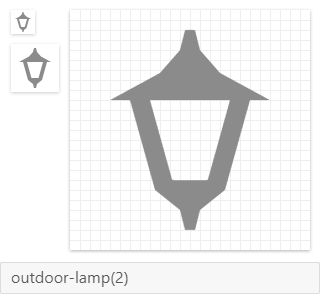
EDIT: I didn't add the outdoor-lamp for using it myself, I just figured it could be a nice addition. Pick whichever you want, or both ;)
hulkhaugen
on 21 Jan 2019
I would still simplify it. Like this. Remember that we try to stay on-grid as much as possible with all points. This helps when rasterizing the logo into a png.
MrGrigri
on 21 Jan 2019
Stay on grid, do you mean as the top of my lamp goes from 12.5px to 13.5px for instance, or do you mean the round shape on the bracket?
As I understand the guidelines, and as I believe I was criticized for from the first post, was to make the other outdoor-lamp-variant go all the way to the outer edges -2px, both sides and top/bottom. As I read the guidelines, it's either/or, unless it's a round shape. Or did I get it wrong?
I personally don't like your example as it's not how they actually look. The bracket is either in the top or the bottom. Then I'd prefer the bracket-less version. But that's my opinion. I also made a quick simpler bracket:

I don't make the rules here, I just came with some suggestions. Do whatever pleases you ;)
hulkhaugen
on 21 Jan 2019
I do not mean to offend. We like what you've come up with, we're just trying to help with MD guidelines. The first rule is 2-pixels everywhere, as much as possible. At the top and bottom of the lamp, you have it terminating in 1-pixel. Second, on-grid means that every point is on a whole number as much as possible. This helps when rastering the icon. You can have curved elements, especially when dealing with object representation and not basic shapes. Also, these outside lamps come in many styles...mine on my house mount in the middle like in my example. And that bracket doesn't really matter much as the general shape is more than recognizable by itself. Especially when used in context.
MrGrigri
on 21 Jan 2019
Yes ok, I understand what you're saying now. Normally, those detail on such lamps are sharp like an arrow, so a 2px width would look bulky I think, but I'm not able to test it out now. That being said, those are guidelines and not laws. It's narrowing in towards 1px, it's not a straight 1px line going down or up, so it's almost an triangle. I personally think the ones I provided are ok, with or without the bracket. And I also think I prefer the last sharp bracket I made, but it doesn't show much on a small scale anyway.
Now I have another icon in mind also, and that should be a simple mirror (or glass), not that easy to visualize. What I have in mind is just a square with two or three diagonal lines in one corner to represent reflection. I might add that tonight if I can make something i'm happy with.
hulkhaugen
on 22 Jan 2019
Added the pi-hole icon in the issue marked as a duplicate. 😄
Templarian
on 31 Jan 2019
Cool, thanks. As far as I can see, none of the other icons I created has made it to the pack. Is there a reason for that?
I never got a reply for the very first ´led-strip-variant´ icon I made. Looking at both of them, I think the ideal design might be something in between the two, as the second one has a bit too much detail and looks unclear.
EDIT: I think this looks better than the last one, but if I can use outer points at the top and bottom only 2px from the edge (as the very first example in this post, that looks the best. That one also have only 0.75px lines around the leds on the strip which also is pushing it. Depends on how strict the guidelines are to be followed.
hulkhaugen
on 31 Jan 2019
As i'm impatient and wanted a way to ingrate my own icons now, I made my own (temporary?) icon pack. My icons from this post and a few more are available at: https://github.com/hulkhaugen/hass-bha-icons
hulkhaugen
on 7 Apr 2019
Lots of good discussion in this thread, but at this point, we just need to get some lamps added. 😄
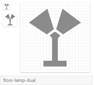
Here are the 5 we're going to accept into the library, each has been brought in line with Material guidelines.


goyney
on 29 Jul 2019
goyney
on 6 Aug 2019
Related issues
Templarian
·
3Comments
 rsandrea
·
3Comments
rsandrea
·
3Comments
 JackDrakkar
·
3Comments
JackDrakkar
·
3Comments
 adambiggs
·
3Comments
adambiggs
·
3Comments
 EdricChan03
·
3Comments
EdricChan03
·
3Comments
Most helpful comment
Very nice improvements @hulkhaugen! Thanks for revising these to match the MD guidelines.
I'll work to get these in shortly.