Materialdesign: Update: Slack
Slack hase a new logo so we'll need to update our icon accordingly.
SVGS can be found here and brand guidelines (for those interested) here.
 PeterShaggyNoble
All 5 comments
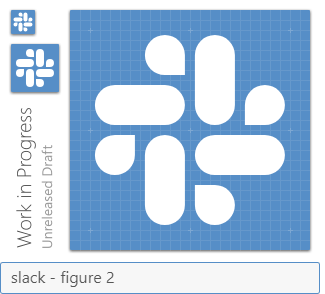
So, there is a slight issue with their logo. It's built on a 19x19 platform. If we place it on-grid at 19x19, slightly off-center to the top-right (figure 1), then the path is much cleaner and will raster better. We could keep it at 19x19 in the center, which wouldn't raster well (figure 2). They also have a 15x15 version, but IMO, that would be too small and have the same issues
My vote is for Figure 1
Figure 1
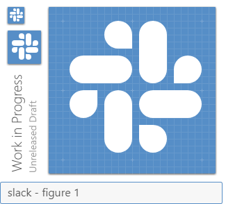
Figure 2
Assets
 MrGrigri
on 17 Jan 2019
MrGrigri
on 17 Jan 2019
So with the Microsoft logo we decided to offset it, I think we should probably follow that for cleaner 1:1 icons even if it's off-center.
 Templarian
on 17 Jan 2019
Templarian
on 17 Jan 2019
And, for consistency with the MS icon, we should probably shift it down & left of centre.
PeterShaggyNoble
on 17 Jan 2019
I agree, figure 1.
 CoDEmanX
on 17 Jan 2019
Templarian
on 18 Jan 2019
CoDEmanX
on 17 Jan 2019
Templarian
on 18 Jan 2019
Related issues
 kimdv
·
3Comments
kimdv
·
3Comments
 jonnyborg
·
3Comments
jonnyborg
·
3Comments
 kaurkaur
·
3Comments
kaurkaur
·
3Comments
 xaviergonz
·
3Comments
xaviergonz
·
3Comments
 buutqn
·
3Comments
buutqn
·
3Comments
Most helpful comment
So with the Microsoft logo we decided to offset it, I think we should probably follow that for cleaner 1:1 icons even if it's off-center.