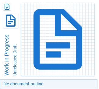
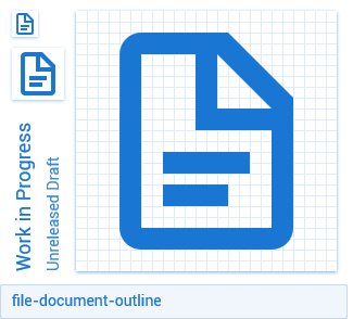
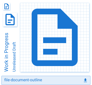
Materialdesign: file-document-outline
An outline version of the file-document icon would be much appreciated. The filled one does not fit all ui designs.
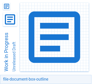
So a combination of these two:


 naofireblade
All 13 comments
Annoyingly there isn't enough space for a 2px gap between the two lines of text on the file one.
 GreenTurtwig
on 26 Apr 2018
GreenTurtwig
on 26 Apr 2018
Wow! Thanks for the fast realization. The gap might be a little bit odd but I think you already provided the best solution.
naofireblade
on 26 Apr 2018
IMO, these parts of the dog-ear look funny.
 MrGrigri
on 27 Apr 2018
MrGrigri
on 27 Apr 2018
Well, it makes the dog-ear look better at small sizes. Here's a preview with the edges flush to the inner borders:
 CoDEmanX
on 27 Apr 2018
CoDEmanX
on 27 Apr 2018
@codemanx you should probably open a new issue to update the existing file-outline if we prefer that one.
GreenTurtwig
on 27 Apr 2018
I think I was probably trying to give it more of a folded over the edge look, but yea can definitely replace it while adding these others.
note** has the same corner.
 Templarian
on 27 Apr 2018
Templarian
on 27 Apr 2018
It does make it look more folded and I like it.
CoDEmanX
on 27 Apr 2018
Either that or you used the existing line from the normal file icon. Not sure which one I prefer now.
GreenTurtwig
on 27 Apr 2018
Can you estimate when this will be included in a relase?
naofireblade
on 8 May 2018
Google's new outline design allows us to have a 2px gap. :smile_cat:
GreenTurtwig
on 16 May 2018
Templarian
on 27 May 2018
The icons are visible on materialdesignicons.com but not part of the download package 2.4.85. Is that correct?
naofireblade
on 14 Jun 2018
They will be packaged on the next release but are available now in formats other than the webfont. We're recommending moving away from the webfont and using individual vectors.
 JamesCoyle
on 15 Jun 2018
JamesCoyle
on 15 Jun 2018
Related issues
 emanf
·
3Comments
emanf
·
3Comments
 bckp1993
·
3Comments
bckp1993
·
3Comments
 xaviergonz
·
3Comments
xaviergonz
·
3Comments
 kimdv
·
3Comments
kimdv
·
3Comments
 JackDrakkar
·
3Comments
JackDrakkar
·
3Comments
Most helpful comment
Google's new outline design allows us to have a 2px gap. :smile_cat:
