Materialdesign: solder-station / soldering-iron

 dkraft
👍1
All 8 comments
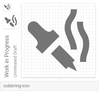
The fumes could be improved and the tip is hard to see at the smallest size
 Croutonix
on 25 Mar 2018
Croutonix
on 25 Mar 2018
Looks a bit like a pipette. Maybe make the handle a bit narrower and also use maybe 1 or 1.5 pixel width for the smoke lines?
 CoDEmanX
on 26 Mar 2018
CoDEmanX
on 26 Mar 2018
Another try:
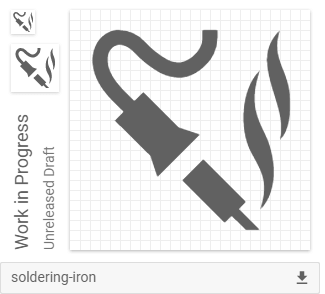
Maybe there too much details this time. Also the tip is still hard to see and the fumes are too thin.
Croutonix
on 4 Apr 2018
👍1
Yeah it feels like a bit too much, although the cable adds to the recognizability and the smoke it better than in the first version.
CoDEmanX
on 15 Apr 2018
Is the icon added yet?
 MiguelAngelLV
on 4 Jun 2019
MiguelAngelLV
on 4 Jun 2019
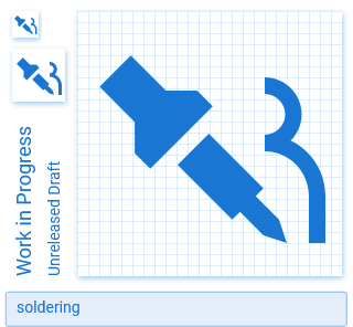
Hmm, the first one looks more like an eye-dropper, the second one isn't very Material. I think we'll need to see some other options for this to get included. Moving it to the Backlog until that happens.
 goyney
on 23 Jul 2019
goyney
on 23 Jul 2019
 CoDEmanX
on 25 Jul 2019
CoDEmanX
on 25 Jul 2019
👍2
goyney
on 9 Aug 2019
Was this page helpful?
0 / 5 - 0 ratings
Related issues
 alvaroc1
·
3Comments
alvaroc1
·
3Comments
 Templarian
·
3Comments
Templarian
·
3Comments
 EdricChan03
·
3Comments
EdricChan03
·
3Comments
 ButchMonkey
·
3Comments
ButchMonkey
·
3Comments
 emanf
·
3Comments
emanf
·
3Comments
Most helpful comment
My take with some modified smoke from the smoking icon:
soldering-iron.zip