Materialdesign: Update 'format-page-break' icon
Google has updated their 'Page break' icon today in Google Docs.

All 11 comments
It actually looks like a lot of the icons on slides, sheets, and docs were changed/fixed to match MD guidelines. In general they all seem... thicker?
Yeah, I caught them in the middle of an update. I opened one document this morning and then another a little while later. The later had the update and the former did not.
Should probably have a look through the UI and check for any changes/additions. Noticed a few so far, one for reset-image and an official Google Keep icon for example.
All icons are in one sprite sheet here: https://ssl.gstatic.com/docs/common/material_common_sprite27.svg
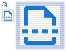
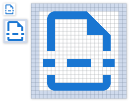
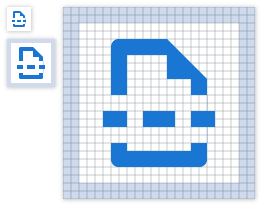
So looking at their image, it's only 14 X 16 pixels. We could make one that is larger and looks better IMO. I'll show all three here. format-page-break.zip
3 Dashes

4 Dashes

Google Original

Yeah, I agree with giving it a resize. Should keep it more inline with the other file icons. All the icons seem to be scaled down for the smaller space in the menus.
4 dashes looks great!
Shouldn’t that one be assigned to me because it’s not the google version?
It's basically the Google icon. I think we could argue, but it's same derived icon. Prefer the 4 even dots than 3.
4 dashes is quite different from Google's version though, also the overall proportions.
Most helpful comment
So looking at their image, it's only 14 X 16 pixels. We could make one that is larger and looks better IMO. I'll show all three here. format-page-break.zip
3 Dashes
4 Dashes
Google Original