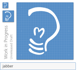
Simplified version of an original Jabber logo made to look better as an icon:
 andrewnenakhov
All 14 comments
Probably better to use the product logo / icon that Cisco uses?
Example: https://play.google.com/store/apps/details?id=com.cisco.im
 Templarian
on 24 May 2017
Templarian
on 24 May 2017
@Templarian Jabber logo from above is not Cisco Jabber logo. Actually it's a bit complicated: original name of XMPP protocol was Jabber and it's official logo was that from a link above. Then it turned out that Cisco owns Jabber trademark so protocol changed official name to XMPP and had an X-shaped official logo. However, unofficial 'jabber' name is still more popular than XMPP name and unofficial Jabber logo is still widely used in XMPP clients & stuff (in fact, more often than XMPP logo). So this "jabber" icon has no relation to Cisco Jabber product and it's logo.
andrewnenakhov
on 24 May 2017
@andrewnenakhov Thanks for the background. Was not aware.
Templarian
on 24 May 2017
Actually, XMPP Standards Foundation has an agreement with Cisco for the "Jabber" trademark (I don't know about the logo), and even to sublicense it.
Maybe @stpeter, the former Executive Director and current Treasurer of XSF can say more on this. (If I'm not bothering him :P and he's free)
 subpub
on 1 Jun 2017
subpub
on 1 Jun 2017
Thanks for your patience - I was AFK on vacation when you @-mentioned me.
Your question is answered here: https://www.jabber.org/faq.html#logo
Let me know if you need further assistance. :-)
 stpeter
on 13 Jun 2017
stpeter
on 13 Jun 2017
 goyney
on 26 Nov 2018
goyney
on 26 Nov 2018
@goyney this one is flipped original logo, it should look the other direction, and lines are too thin to be used in 24x24 icon. Try using my original svg file in first message.
For some reason I can't make editor generate image from this path data, but it should look like this:

I made lines thicker and reduced the number of horizontal strokes to better fit the image.
andrewnenakhov
on 26 Nov 2018
@andrewnenakhov Thanks for catching the flip, that is fixed.
Unfortunately, we do not modify brand icons to adjust their appearance, so the thickening of the logo would not be an acceptable edit. Thanks for the suggestion, though.
goyney
on 26 Nov 2018
@goyney Google wasn't shy to modify shapes of their own logos to better fit material design icons style, if they could make them better readable. Examples are maps, earth, Android, hangouts, cardboards - which all have big or small deviations from original brand icons, mostly to be better readable is such a small form.
andrewnenakhov
on 26 Nov 2018
Google owns those logos so they can make changes as they see fit. We don't, so we have to play by the branding guidelines of each company.
goyney
on 26 Nov 2018
@goyney I'm pretty sure XSF can be contacted to adapt this special simplified logo... I'll contact someone there about this.
andrewnenakhov
on 26 Nov 2018
Even if XSF agree to this, they would need to provide an official variant otherwise this would set a precedent for future requests to modify other brand logos that don't work at 24*24.
>
"Can you add an icon for Not Brand Echh?"
"That icon won't fit into the size we use for our icons."
"Can't you just modify it to make it fit?"
"Unfortunately, we do not modify brand icons to adjust their appearance."
"But you did for Jabber."
"That's a special case; we asked XSF and they gave us permission to modify it."
"Well, then, why don't you just ask Disney if you can modify this one?!"
 PeterShaggyNoble
on 27 Nov 2018
PeterShaggyNoble
on 27 Nov 2018
You don't need permission from the XMPP Standards Foundation to use the Jabber.org logo (sorry, it's complicated). Let me know I can do anything to help here since I run jabber.org.
stpeter
on 2 Jan 2019
Templarian
on 30 Jan 2019
Related issues
 ButchMonkey
·
3Comments
ButchMonkey
·
3Comments
 Kanga-Who
·
3Comments
Kanga-Who
·
3Comments
 xaviergonz
·
3Comments
xaviergonz
·
3Comments
 emanf
·
3Comments
emanf
·
3Comments
 bckp1993
·
3Comments
bckp1993
·
3Comments
Most helpful comment
Google owns those logos so they can make changes as they see fit. We don't, so we have to play by the branding guidelines of each company.