I believe the only mailbox icon has the flag up. How about a similar icon with the flag down
 psfales
All 13 comments
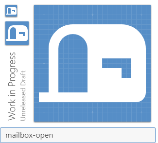
This could probably be improved upon, but the simple solution would just be this:


mailbox-closed.zip
 GreenTurtwig
on 11 Apr 2017
GreenTurtwig
on 11 Apr 2017
My first thought was "what kind of scale icon is that?". It's a little hard to grasp if you don't know what it is supposed to be.
 CoDEmanX
on 11 Apr 2017
CoDEmanX
on 11 Apr 2017
My thoughts exactly on the normal Google "mailbox" too.
GreenTurtwig
on 12 Apr 2017
Hmm ... does an outlined flag work any better?


Probably not.
 PeterShaggyNoble
on 12 Apr 2017
PeterShaggyNoble
on 12 Apr 2017
I don't like that at all. I believe that @GreenTurtwig did a great job and that in context it'll work.
 MrGrigri
on 12 Apr 2017
MrGrigri
on 12 Apr 2017
@PeterShaggyNoble Yeah, I tried that, as well as having just the lower half outlined. Tried quite a few combinations of things actually, but the simple solution always looked the best which is a shame.
GreenTurtwig
on 12 Apr 2017
what about an inverted mailbox? I mean flag down essentially means there's no mail, so the mailbox could also be outlined? but honestly @GreenTurtwig has the best iteration I think.

 kumvert
on 12 Apr 2017
kumvert
on 12 Apr 2017
Isn't it missing a foot to stand on?
CoDEmanX
on 14 Apr 2018
No, the stock icon doesn't have that.
GreenTurtwig
on 14 Apr 2018
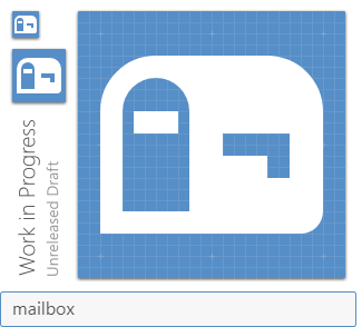
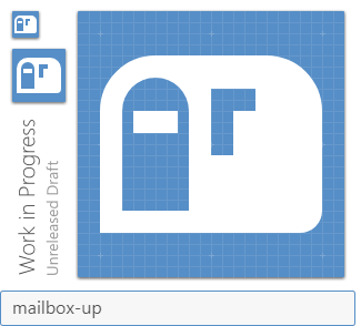
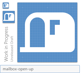
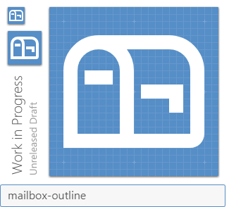
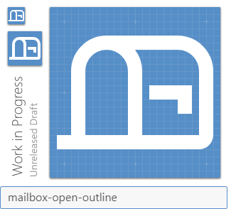
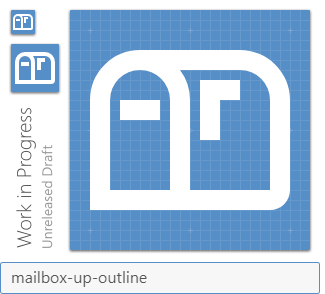
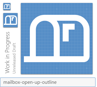
Update: Added *-up-* variants.
This is one that I came across. I know that we generally don't do perspective, but I believe it's needed for this icon. We have discussed it amongst ourselves and feel this one will work.
MrGrigri
on 15 Nov 2018
No secret that I hate the current mailbox icon. So replaced the existing one and added these new ones.
Great work on these @MrGrigri! 😸
 Templarian
on 19 Jan 2019
Templarian
on 19 Jan 2019
For anyone that finds this, yes they break the perspective rule, but in this scenario I believe it's fine to correctly convey the individual variations in an easy way.
Templarian
on 19 Jan 2019
Seeing as the old one was a stock icon should we not include it somewhere?
PeterShaggyNoble
on 21 Jan 2019
Related issues
 danielhickman
·
3Comments
danielhickman
·
3Comments
 emanf
·
3Comments
emanf
·
3Comments
 adambiggs
·
3Comments
adambiggs
·
3Comments
 Kanga-Who
·
3Comments
Kanga-Who
·
3Comments
 rsandrea
·
3Comments
rsandrea
·
3Comments
Most helpful comment
Seeing as the old one was a stock icon should we not include it somewhere?