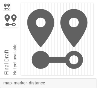
Materialdesign: Distance between places
Some icon inspired by some of these from flaticon
 filipebezerra
All 19 comments
 seems doable
 CoDEmanX
on 6 Feb 2017
CoDEmanX
on 6 Feb 2017
Yeah, that's right. Nice shot @CoDEmanX
filipebezerra
on 6 Feb 2017
@Templarian what kind of information do you need?
filipebezerra
on 6 Feb 2017
@filipebezerra Basically needed to know more specifically which idea would fit best for you. Looks like we have an idea for it now.
 Templarian
on 6 Feb 2017
Templarian
on 6 Feb 2017
Cool, thanks for your great work buddy
filipebezerra
on 6 Feb 2017

 MrGrigri
on 6 Feb 2017
MrGrigri
on 6 Feb 2017
I don't know @MrGrigri, but sincerely I liked @CoDEmanX icon.
filipebezerra
on 6 Feb 2017
@filipebezerra all @CoDEmanX did was place one fo the images, you provided as a link, into this discussion. That icon, as is, is not to MD standards. I am trying for a more abstract approach with the filled-in and not filled-in circles. But ultimately, it's the community and @Templarian who decides. Here is another one that I'm trying out as well.

MrGrigri
on 6 Feb 2017
Right, the referred icons are just the Idea, we have to design an icon following the MD guidelines
filipebezerra
on 7 Feb 2017
Why not just one pin and a double-edged arrow underneath?
 JapanYoshi
on 11 Feb 2017
JapanYoshi
on 11 Feb 2017
Hey guys, any updates here?
filipebezerra
on 6 Mar 2017
This is the one we want to add (4 upvotes) by Griri. I removed the grouping with some invisible layer:
CoDEmanX
on 14 Apr 2018
Templarian
on 14 Apr 2018
@Templarian
Tried another way. I feel it's not that 'tight' as the previous version.
Distance.zip
 Yuanruili
on 6 Mar 2019
Yuanruili
on 6 Mar 2019
@Yuanruili, all icons need to be exported as a single compound path and can be used in our preview generator.
Files
MrGrigri
on 6 Mar 2019
I do like this.
MrGrigri
on 6 Mar 2019
@MrGrigri Thank you~
Yuanruili
on 6 Mar 2019
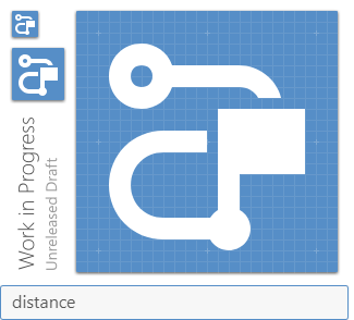
I feel like @MrGrigri's version adds a bit too much dimensionality, and is harder to parse than the simpler one.
JapanYoshi
on 8 Mar 2019
I agree with Yoshi, it's a bit too busy. Even with context it took me a second to see what it was supposed to be.
 PeterShaggyNoble
on 8 Mar 2019
PeterShaggyNoble
on 8 Mar 2019
Related issues
Templarian
·
3Comments
MrGrigri
·
3Comments
 alvaroc1
·
3Comments
alvaroc1
·
3Comments
 emanf
·
3Comments
emanf
·
3Comments
 EdricChan03
·
3Comments
EdricChan03
·
3Comments
Most helpful comment
@filipebezerra all @CoDEmanX did was place one fo the images, you provided as a link, into this discussion. That icon, as is, is not to MD standards. I am trying for a more abstract approach with the filled-in and not filled-in circles. But ultimately, it's the community and @Templarian who decides. Here is another one that I'm trying out as well.
distance-between.zip