Materialdesign: License Plate icon
License Plate icon
 smileapplications
All 12 comments
This could be really difficult to do. Countries have different shapes, some are a lot wider, mostly Europe, than they are in the US, Australia, Japan, e.t.c. This would cause issues with the limited amount of space available for icons.
 GreenTurtwig
on 14 Dec 2017
GreenTurtwig
on 14 Dec 2017
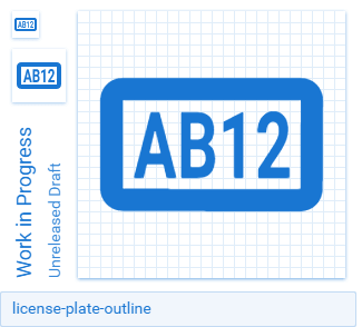
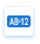
I needed this icon for a project I'm working on and created one. This is the best I could do, as @GreenTurtwig mentioned, there are quite a few considerations to account for so I figured simple is best. This is my first contribution, so if the svg is poorly formatted please let me know. I created it with Inkscape.
 percula
on 25 Apr 2018
percula
on 25 Apr 2018
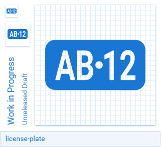
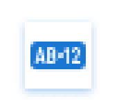
I also made a slightly different solid version. The solid version allows for more room to put a dot in the middle of the numbers, typical of many license plates.
percula
on 25 Apr 2018
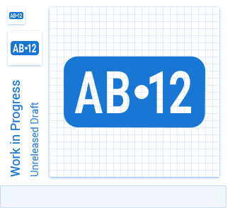
Previews:
 PeterShaggyNoble
on 25 Apr 2018
PeterShaggyNoble
on 25 Apr 2018
@PeterShaggyNoble Maybe increase the (inner) size by 1px and move the outer part in the outline version 0.5px into the margin? The border looks kinda thick.
 CoDEmanX
on 26 Apr 2018
CoDEmanX
on 26 Apr 2018
@CoDEmanX, I think you meant to tag @percula there.
PeterShaggyNoble
on 26 Apr 2018
Indeed, but my idea doesn't really work out:
This is meh too, despite being sharper:
The filled one by percula is not legible on a normal density screen:
CoDEmanX
on 27 Apr 2018
Tried to tweak it a little, but still not great:
CoDEmanX
on 28 Apr 2018
I like the sharper font you used, much more legible on a small icon.
percula
on 28 Apr 2018
It's still the same font you put in there, I only moved things a bit around to get a better grid alignment and used a larger circle.
CoDEmanX
on 29 Apr 2018
Closing because the Consider Closing label was added more than 10 days ago.
 MrGrigri
on 8 Nov 2018
MrGrigri
on 8 Nov 2018
Because this was just requested again recently, I'd like to add some comments for anyone who comes across this again in the future.
We are not going to be adding this as an icon. We have already taken the stance that we will not add arbitrary letter-based icons anymore (such as rejected request to add an "IP" icon), which means we aren't going to add one with random letters/numbers. Additionally, from the examples above, it is not possible to create something meaningful and identifiable within the confines of Material's guidelines.
 goyney
on 13 Mar 2020
goyney
on 13 Mar 2020
Related issues
 kaurkaur
·
3Comments
kaurkaur
·
3Comments
 JackDrakkar
·
3Comments
JackDrakkar
·
3Comments
 vishnu1991
·
3Comments
vishnu1991
·
3Comments
 bckp1993
·
3Comments
MrGrigri
·
3Comments
bckp1993
·
3Comments
MrGrigri
·
3Comments
Most helpful comment
Because this was just requested again recently, I'd like to add some comments for anyone who comes across this again in the future.
We are not going to be adding this as an icon. We have already taken the stance that we will not add arbitrary letter-based icons anymore (such as rejected request to add an "IP" icon), which means we aren't going to add one with random letters/numbers. Additionally, from the examples above, it is not possible to create something meaningful and identifiable within the confines of Material's guidelines.