Material: switch: disabled has wrong color
Bug
Since Release 1.1.11 a disabled switch is no longer colored in the theme color. I think the related issue is this one https://github.com/angular/material/issues/8518
Detailed Reproduction Steps:
- Version 1.1.10 https://codepen.io/anon/pen/MLRYVX disabled switch is in primary color
- Version 1.1.11 https://codepen.io/anon/pen/qgwEYe disabled switch is in default grey color
Happens for every AngularJS Version
- AngularJS: 1.5<
- AngularJS Material: 1.1.11 and 1.1.12
- OS: All
- Browsers: All
 ngehlert
All 8 comments
This seems to be the correct behavior, the grey is an indication that the control is disabled. Why do you expect a disabled control to have a primary color?
 codymikol
on 20 Feb 2019
codymikol
on 20 Feb 2019
@codymikol because it was this way basically forever in Angular Material and I didn't see a note that explains/notifies me about this new behavior.
I have certain switches but the user does not have the permission to change it, thus it is disabled. If it is completely grey however the user has basically no idea whether it is actually on or off. Who decides whether right is on or right is off if there is no color indication?
And it is just way easier to distinguish if there are multiple switches, which one is actually active and which one is not.
For regular input fields I use a "readonly" status, but that is not available for this switch.
Is there a workaround to force the primary color? (That does not involve overwriting the css style since this is kind of annoying if you need to take md-warn and md-primary themes into account. No hardcoded colors possible in my setup)
ngehlert
on 20 Feb 2019
The new behavior matches the Material Design Spec for switches.
If your users have a hard time understanding the switch UI (which is not uncommon), then using an md-checkbox is likely going to work better for them as the UX there is more clear.
The preferred workaround is to override the styles, but if that is an issue due to dynamic themes or another reason, you could try the approach in this CodePen which is to set pointer-events: none; on the switches that you want to look enabled but not react to mouse clicks. This appears to disable keyboard interaction as well, but you should verify that in your app. I would also check that gestures don't toggle switches with this class, if they do, you could try touch-action: none; as well.
 Splaktar
on 20 Feb 2019
Splaktar
on 20 Feb 2019
did the material design spec change or was it just "wrong" implemented before 1.1.11?
ngehlert
on 21 Feb 2019
It wasn't implemented correctly. The spec did change between 2014 and 2017 (I don't think that the switch spec changed much), but we're sticking with the final version from 2017 with AngularJS Material.
Splaktar
on 21 Feb 2019
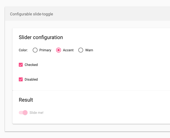
@Splaktar But according to Angular Material (2) the disabled switch still has it's colors, but lighter
https://material.angular.io/components/slide-toggle/examples
ngehlert
on 21 Feb 2019
Yep, there are many changes in the Material Design 2018+ spec. We updated the home page and a number of issues recently to explain that AngularJS Material be staying on the 2014-2017 spec while the Angular Material project will be the place to find components based on the 2018+ spec.
Splaktar
on 21 Feb 2019
well that are some good news for people that use angular upgrade and have Angular JS (and Material 1) and Angular (and Material 2) in the same application....
Thanks for your clarification and answers 👍
ngehlert
on 21 Feb 2019
Related issues
 rdantonio
·
3Comments
rdantonio
·
3Comments
 ghost
·
3Comments
ghost
·
3Comments
 LeoLozes
·
3Comments
LeoLozes
·
3Comments
 kasajian
·
3Comments
kasajian
·
3Comments
 epelc
·
3Comments
epelc
·
3Comments
Most helpful comment
well that are some good news for people that use angular upgrade and have Angular JS (and Material 1) and Angular (and Material 2) in the same application....
Thanks for your clarification and answers 👍