Material-ui: [docs] useAutocomplete issue in dark mode
- [X] The issue is present in the latest release.
- [X] I have searched the issues of this repository and believe that this is not a duplicate.
Current Behavior 😯
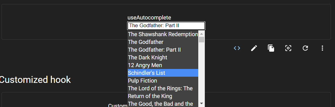
When viewing useAutocomplete in dark mode, the input box doesn't adapt to the theme (stays white) while other fields do. I think this should be changed. Screenshot is given below. Also, it would fit the dropdown better (that is theme dependent, see printscreen).
Expected Behavior 🤔
I believe the input box should follow the theme and therefor look something like printscreen below.

Steps to Reproduce 🕹
- Go to https://next.material-ui.com/components/autocomplete/#useautocomplete
- Change to dark theme
- View the result
Context 🔦
This is a same type of issue #19268, that I believe would benefit from the same kind of solution.
Your Environment 🌎
| Tech | Version |
| ----------- | ------- |
| Browser | Chrome 85 |
 hmaddisb
All 5 comments
from browsing through the components in the docs, I stumbled upon this case as well (print screens below), which we maybe can include this in the same issue? Or should this be a separate one?

As seen above, two fields are still white. In addition, you can see that two fields are actually "invisible" in dark mode (shown below).

https://next.material-ui.com/components/text-fields/#customized-inputs
hmaddisb
on 23 Sep 2020
@hmaddisb thanks for reporting the issue. I think the main purpose of the example was illustrating how the hook can be used, not that much how the component itself look, but we can definitely improve it! What do you think of these changes:
diff --git a/docs/src/pages/components/autocomplete/UseAutocomplete.js b/docs/src/pages/components/autocomplete/UseAutocomplete.js
index 7d0f17275d..6ff94a1200 100644
--- a/docs/src/pages/components/autocomplete/UseAutocomplete.js
+++ b/docs/src/pages/components/autocomplete/UseAutocomplete.js
@@ -9,6 +9,8 @@ const useStyles = makeStyles((theme) => ({
   },
   input: {
     width: 200,
+    backgroundColor: theme.palette.background.paper,
+    color: theme.palette.getContrastText(theme.palette.background.paper),
   },
   listbox: {
     width: 200,
diff --git a/docs/src/pages/components/autocomplete/UseAutocomplete.tsx b/docs/src/pages/components/autocomplete/UseAutocomplete.tsx
index c572b9ff03..78e010709e 100644
--- a/docs/src/pages/components/autocomplete/UseAutocomplete.tsx
+++ b/docs/src/pages/components/autocomplete/UseAutocomplete.tsx
@@ -10,6 +10,8 @@ const useStyles = makeStyles((theme: Theme) =>
     },
     input: {
       width: 200,
+      backgroundColor: theme.palette.background.paper,
+      color: theme.palette.getContrastText(theme.palette.background.paper),
     },
     listbox: {
       width: 200,
We can improve the other input examples too by providing this override. Would you be interested in opening a PR for this? :)
 mnajdova
on 23 Sep 2020
mnajdova
on 23 Sep 2020
@mnajdova mnajdova Can I work on this issue ?
 GauravKesarwani
on 23 Sep 2020
GauravKesarwani
on 23 Sep 2020
@GauravKesarwani sure, feel free to pick it up 👍
mnajdova
on 23 Sep 2020
great work!
hmaddisb
on 24 Sep 2020
Related issues
 ghost
·
3Comments
ghost
·
3Comments
 newoga
·
3Comments
newoga
·
3Comments
 rbozan
·
3Comments
rbozan
·
3Comments
 chris-hinds
·
3Comments
chris-hinds
·
3Comments
 iamzhouyi
·
3Comments
iamzhouyi
·
3Comments
Most helpful comment
@mnajdova mnajdova Can I work on this issue ?