Material-ui: [TimeLine] Center the TimeLineContent to occupy less vertical space
- [x] I have searched the issues of this repository and believe that this is not a duplicate.
Summary 💡
When the TimeLineContent contains more text it is occupying more space. For TimeLine align(right and left) its okay. But for 'alternate' we can make the content to be at center so that it wont be occupying more vertical space.
If we can move the code a bit top(Not touching the above icon) and icon somewhat below to look like middle of the content which looks good and also it wont be awkward.
If moving the TimeLineContent above sides with the above template we can have a arrow to TimeLineContent to the Icon/dot.(I dont think is required as we can understand clearly if the icon is at middle of the content). This is just another suggestion.
Examples 🌈
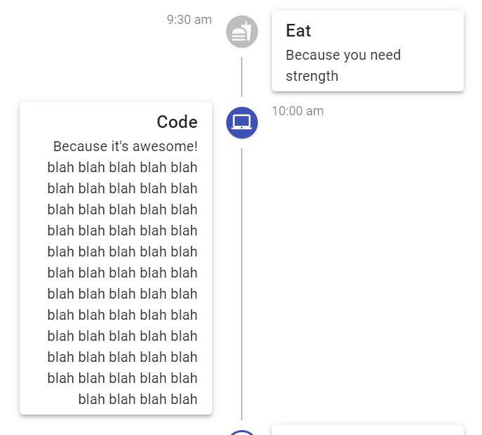
Something Like this

Motivation 🔦
 JitendraBhamidipati
All 4 comments
You can already do this thanks to @mnajdova's great work: https://codesandbox.io/s/staging-sun-lttwr
It would be nice to showcase this either in a new demo or maybe editing the current one. cc @oliviertassinari
 joshwooding
on 10 Jul 2020
joshwooding
on 10 Jul 2020
@joshwooding Yeah, I think that updating the current demo would be great. I would also like to remove the Paper from the demo, the shadows quickly become ugly when overused. I would also rename the demo to ## Complex timeline, it's still Material Design, default look.
For a new demo, I think that a new customization demo would be better.
 oliviertassinari
on 10 Jul 2020
oliviertassinari
on 10 Jul 2020
PR incoming if no one is working on this :)
 annabic
on 10 Jul 2020
annabic
on 10 Jul 2020
Oh..just in one night. Awesome thanks for such quick responses. Just a small thing I just gone through the example and made the changes to it like removing the top connector for first node and bottom connector for last node. It was bit ugly.
tranparentConnector: {
    backgroundColor: "transparent"
  }
<TimelineConnector className={classes.tranparentConnector} />
Adding these two will look good for the example. You can see the demo
JitendraBhamidipati
on 10 Jul 2020
Related issues
 ryanflorence
·
3Comments
ryanflorence
·
3Comments
 FranBran
·
3Comments
FranBran
·
3Comments
 rbozan
·
3Comments
rbozan
·
3Comments
 ericraffin
·
3Comments
ericraffin
·
3Comments
 revskill10
·
3Comments
revskill10
·
3Comments
Most helpful comment
@joshwooding Yeah, I think that updating the current demo would be great. I would also like to remove the Paper from the demo, the shadows quickly become ugly when overused. I would also rename the demo to
## Complex timeline, it's still Material Design, default look.For a new demo, I think that a new customization demo would be better.