Material-ui: [ToggleButton] Bring component closer to MUI Button
- [x] I have searched the issues of this repository and believe that this is not a duplicate.
Summary 💡
Toggle Button has a fixed height for example - it would be cool if it works more closely like the normal MUI Buttons, which also support basically three pre-set sizes.
Examples 🌈
By removing the height and giving it a padding like the button it will look the same and behave more naturally

Motivation 🔦
This helps when overwriting basic sizes and paddings of Buttons to also affect ToggleButtons automatically.
 Primajin
All 17 comments
@Primajin Great idea, I think that the closer the Button/ButtonGroup and ToggleButtons components are, the better
 oliviertassinari
on 5 May 2020
oliviertassinari
on 5 May 2020
I will Solve this issue please assign it to me
 rehanmohiuddin
on 6 May 2020
rehanmohiuddin
on 6 May 2020
ToggleButton.js updated and solved the issue please check and pull the request
https://github.com/mui-org/material-ui/pull/20967#issue-415649413
rehanmohiuddin
on 10 May 2020
Hey there, sorry to exhume this but I was on vacation and couldn't test it right away.
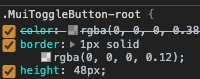
So the initial idea of this issue was that the ToggleButton would inherit the same paddings and measurements as the normal Button. So that when you have a normal Button and a ToggleButton next to each other, they look alike.
We now removed the fixed height, but have a fixed padding of 11px in all directions now, making the ToggleButton 48px height - a normal Button has a vertical padding of 6, making it 36px height by default.
Actual:

Expected:

This one uses a vertical padding of 5 for example.
What do you think?
Codesandbox to play with: https://codesandbox.io/s/material-demo-ti75s?file=/demo.tsx
Edit: Also the border colors of an outlined Button and a ToggleButton are different and should ideally be the same (the one of the Button)
Primajin
on 18 May 2020
@Primajin Use the small variant, you will get the same 36px height.
oliviertassinari
on 18 May 2020
OK cool - but that means the Buttons vs. ToggleButtons are one step apart in terms of size and only matching when having a medium Button with a small ToggleButton - other sizes won't fit 🤔
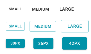
30 / 36 / 42 vs. 36 / 48 / 56
Actual:

Expected:

Primajin
on 18 May 2020
Yes, exactly
oliviertassinari
on 18 May 2020
Hmm OK, I would have expected them to be the same height when giving same size parameter.
Or at least when they are apart one step, then be consistent 6px steps so 36 / 42 / 48 - but that would leave you with either an extra small ToggleButton of 30 or an extra large Button of 48 on either side of the spectrum.
Primajin
on 18 May 2020
I just found this after putting some ToggleButtons next to normal ones and noticing the height difference.
I also tried color="secondary" on both ToggleButton and Group, but this is also not yet supported?
I also note that even if we use the size to make the height the same as a normal button, the text size comes out different, normal buttons are a point bigger.
 RalphSleigh
on 23 May 2020
RalphSleigh
on 23 May 2020
It also doesn't take color.
 djmccormick
on 29 May 2020
djmccormick
on 29 May 2020
Should we merge these two components? 🤔
oliviertassinari
on 29 May 2020
Yes, I'd definitely vote for that.
Primajin
on 30 May 2020
I also just realized that while the selected button has full white text in dark mode (as the normal button) in light mode it only has grey - although the normal button is black in light mode
Primajin
on 5 Jun 2020
@Primajin If you are referring to the <Button color="default">, we plan to drop it in v5: #17530.
oliviertassinari
on 6 Jun 2020
Ahh OK good to know. We can also think about bringing the two components together in V5 then it's not such a breaking change in v4.
I could think of a wrapper for button that creates a button group (just like a radio group) and that has props to determine if the group is OR or XOR and then either just drop ToggleButton all together or make this an alias - like we have with Textfield.
What do you think?
Primajin
on 6 Jun 2020
@Primajin To be honest, I have never look into how the reunion could happen. I might not have the time to either. Maybe @mbrookes as the original author of the component could continue the exploration and the potential it has?
oliviertassinari
on 6 Jun 2020
@Primajin
I would have expected them to be the same height when giving same size parameter.
The default (medium) sizes for Button and ToggleButton are from the MD spec. Unfortunately they've removed the diagrams showing the specific dimensions, but you can measure them.
@oliviertassinari
Should we merge these two components?
I see this comment regularly, but with no further explanation. Do you mean import the Button in ToggleButton and restyle it, rather than using ButtonBase? It's possible I suppose, but I'm not sure how much benefit you would gain vs the extra baggage need to manage all the unwanted props and styles.
To be honest, I have never look into how the
reunion could happen.
Ah, that explains it! 😉
Maybe @mbrookes as the original author of the component
I think perhaps you mean @phallguy? (I updated the styles for MDv2.)
 mbrookes
on 6 Jun 2020
mbrookes
on 6 Jun 2020
Related issues
 reflog
·
3Comments
reflog
·
3Comments
 mb-copart
·
3Comments
mb-copart
·
3Comments
 ryanflorence
·
3Comments
ryanflorence
·
3Comments
 ghost
·
3Comments
ghost
·
3Comments
 mattmiddlesworth
·
3Comments
mattmiddlesworth
·
3Comments
Most helpful comment
I will Solve this issue please assign it to me